Created a conversion-based,
user-friendly website for Stories+
Stories+ enables marketers to advertise and differentiate their brands by using an interesting way for creating stories.
- Advertising
- Brand Positioning
- Illustration and Iconography
- Research
Stories+ empowers brands to showcase social content across the open web. They needed a website reflecting their vibrant identity and audience expectations. We delivered a visually stunning, user-friendly redesign driven by in-depth research.
Conceptualizing and designing a website for Stories+ by following the business model in the given niche, that is advertising and marketing. We also had to apply the fundamental knowledge of Research, Information Architecture (IA), Wireframes, Visual Design and Prototyping to create highly user-friendly experiences.
- Intuitively educating users about the unique offerings of the product.
- Achieving an innovative brand identity with the help of a new website and thereby engaging users in an interesting manner.
- Developing the website on WordPress with diversified animations was one of the most demanding deliverables.
- Using subtle animations to effectively communicate the offerings of Stories+.
- Helping the users to appreciate the product effortlessly and deliver an unforgettable experience.
- Designing intuitive and consistent website, mobile web.
- Evoking a playful and fun visual feel by keeping it practical and efficient at the same time.

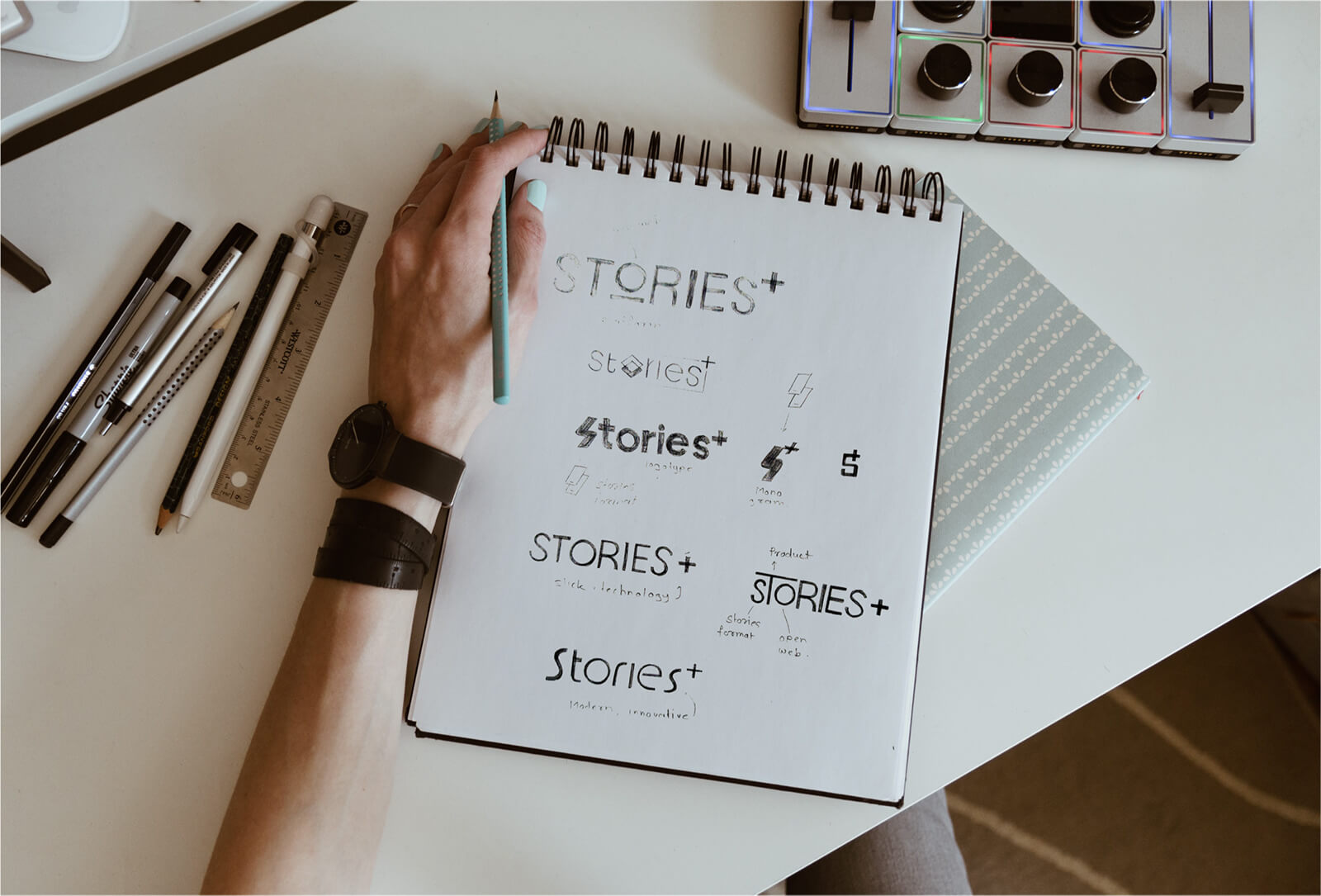
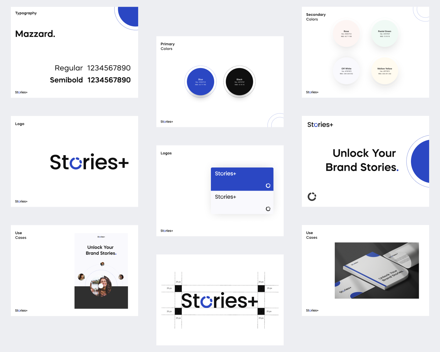
Our design process began with moodboarding, ensuring alignment with the client’s vision. Once the style was finalized, we crafted a logo, icons, and illustrations, creating a cohesive visual identity for Stories+.
As a platform offering a visual breakthrough to brands worldwide, Stories+ needed a logo that reflected its global impact while remaining visually relevant. We designed a minimal yet distinctive logo, versatile enough to function as both an icon and a full-length logo, ensuring seamless brand integration.
Just like Stories+ itself, the icons and illustrations were designed to tell a story. We created a visually engaging set that enhanced user experience, making scrolling more intuitive and enjoyable. Each element was carefully designed to complement and amplify the accompanying copy, ensuring clarity and engagement. Strategically placed across various sections, the icons and illustrations effectively conveyed key messages, enriching the overall experience.
Design is just not about aesthetics but it is also about functionality. Hence, while working on this project, our team ensured a user-centric approach by combining the structure and experience in a balanced way to accomplish the goals.
During the first phase, we collected the user requirements for defining the product and to align the strategy. The research helped us to develop an understanding of the competition in the existing domain. With the help of this analysis, we created user personas and user stories.
Considering all the inputs gathered during the research phase, we created wireframes and high-fidelity prototypes. We followed an iterative design process that enabled us to get early and rapid resolutions.
We were quite specific in our approach while designing the website pages, mainly the landing page. Also, we ensured that the user-experience and even the platforms remained intuitive by putting the following to practice:
- Navigation Bar or the header has tabs that are at the same hierarchical level along with the highlighted CTA: Contact Sales. This guides the users to take the next action to achieve their intent on the website.
- Sections of landing, experience and platform page answers the questions like why Stories+ is needed, how we help business and what we do. It also shares the visual experience of how the stories would look and how they will impact the brand’s identity.
- The copies used in sections resonate with the user’s problems and connect with what they are looking for.
- Showcasing testimonials from similar demographics built trust in the brand and influenced the users to try the product.
- Highlighting their products like Stories+ player and analytics which help the users to convert ads into stories and compare the story performance in real time.
- As the product is unique in the world of marketing, therefore, we added a standalone section on pre-sale FAQ that displays results for anything post-sale to support the page.
- The final website, mobile web, was well received by the clients. Scroll animations and micro-interactions that we created for them stood out and differentiated them from their competitors.
- All the pages are kept concise and minimal to have a cognitive experience. This helped in ensuring easy navigation and thereby focused on the features and functionality of the product.
- Our creativity, imagination and hard work was rewarded as we got the final website of Stories+ featured on land-book as the best landing page inspiration.
Our Role
Our role was to design a website that educates users, showcasing Stories+ services and core philosophy effectively.
Product Design
Content