Enhancing financial services:
A redesign of Ren Payments
Ren is a cutting-edge, real-time integrated payments ecosystem that empowers banks, fintechs, and payment processors to implement a comprehensive and effective payment strategy.
- Fintech
- Illustration and Iconography
- Marketing Website
- Personality and Tonality Setup
- Web App/Website
- Web development
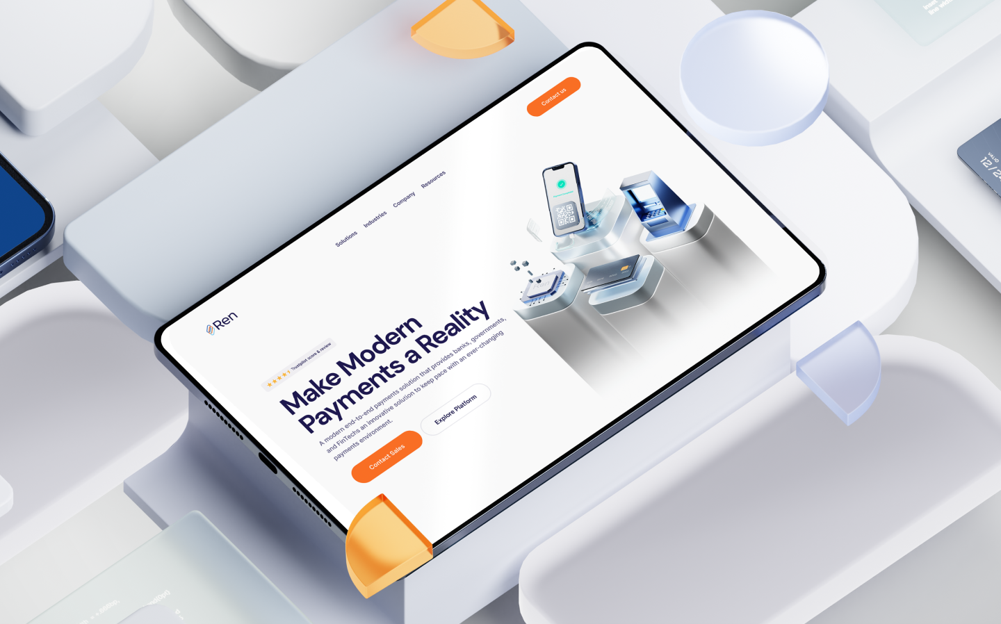
Our objective was to revamp Ren Payments’ digital presence, ensuring a seamless and intuitive user journey while highlighting their commitment to innovation.
Ren Payments faced challenges with a platform that lacked cohesive branding, modern aesthetics, and intuitive user flows. These issues hindered engagement, diluted their innovative edge, and created confusion among users navigating their services.
The outdated design and inconsistent experience were major barriers to showcasing Ren’s value proposition effectively in a competitive market.
We devised a sleek, user-first design system tailored to redefine user experiences across web and mobile platforms.
This involved enhancing functionality, crafting cohesive branding, and integrating dynamic visuals to create a seamless, engaging interface.
Our approach emphasized user-centric design principles, ensuring intuitive navigation, vibrant aesthetics, and clear communication of Ren Payments’ value proposition. The result was a platform that not only met functional requirements but also elevated user trust and satisfaction.
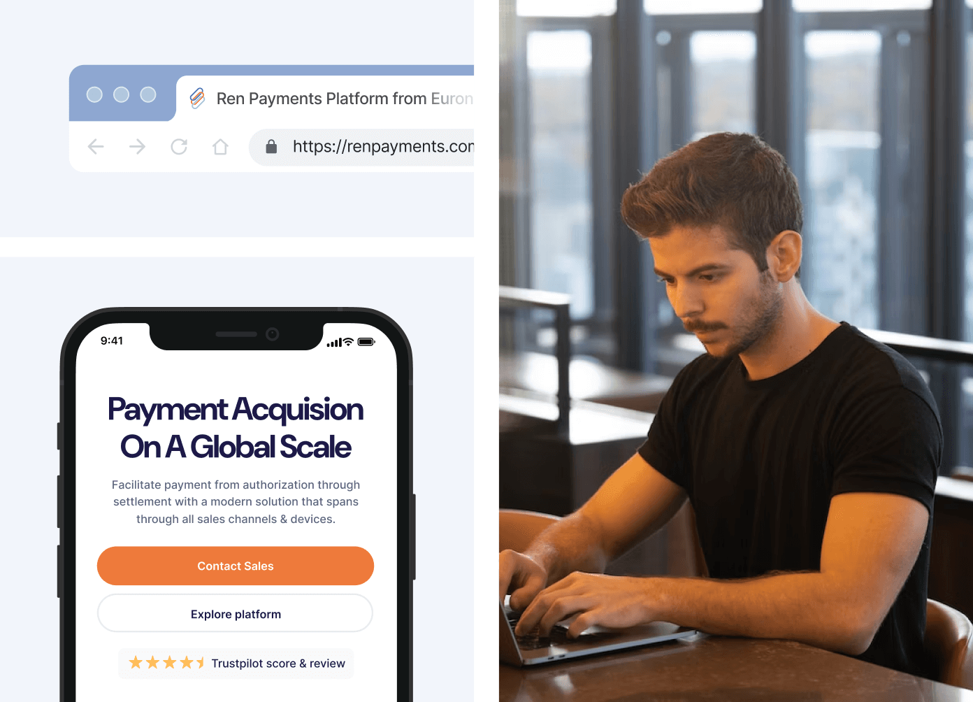
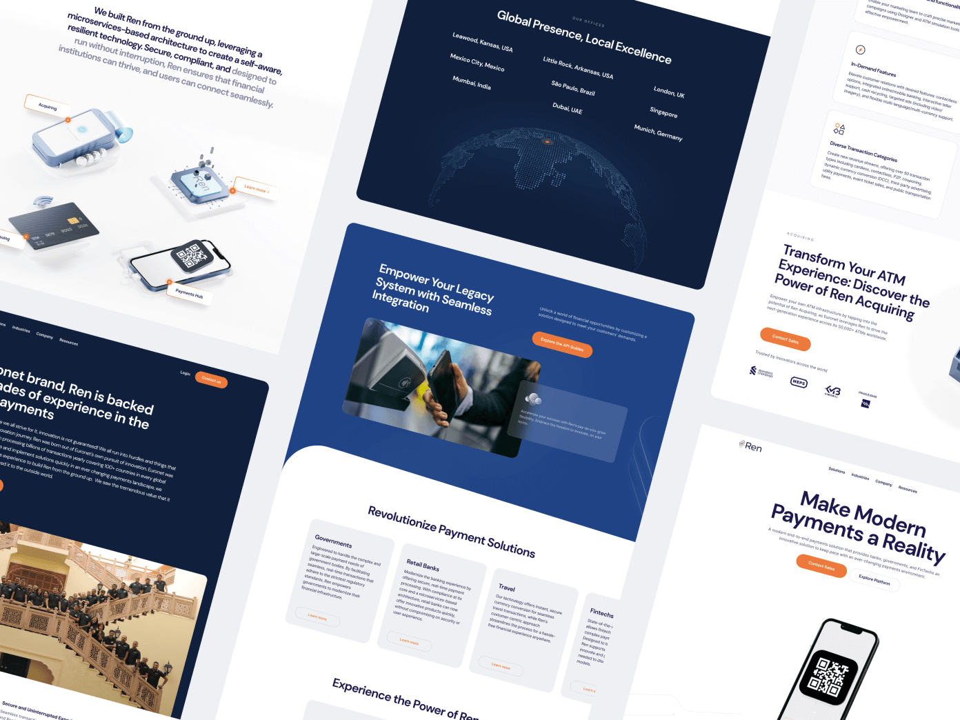
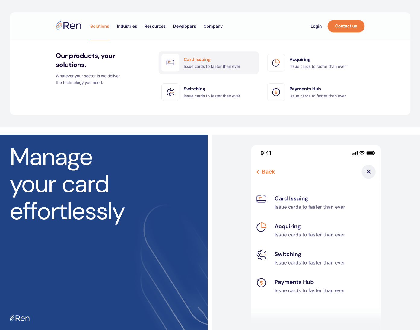
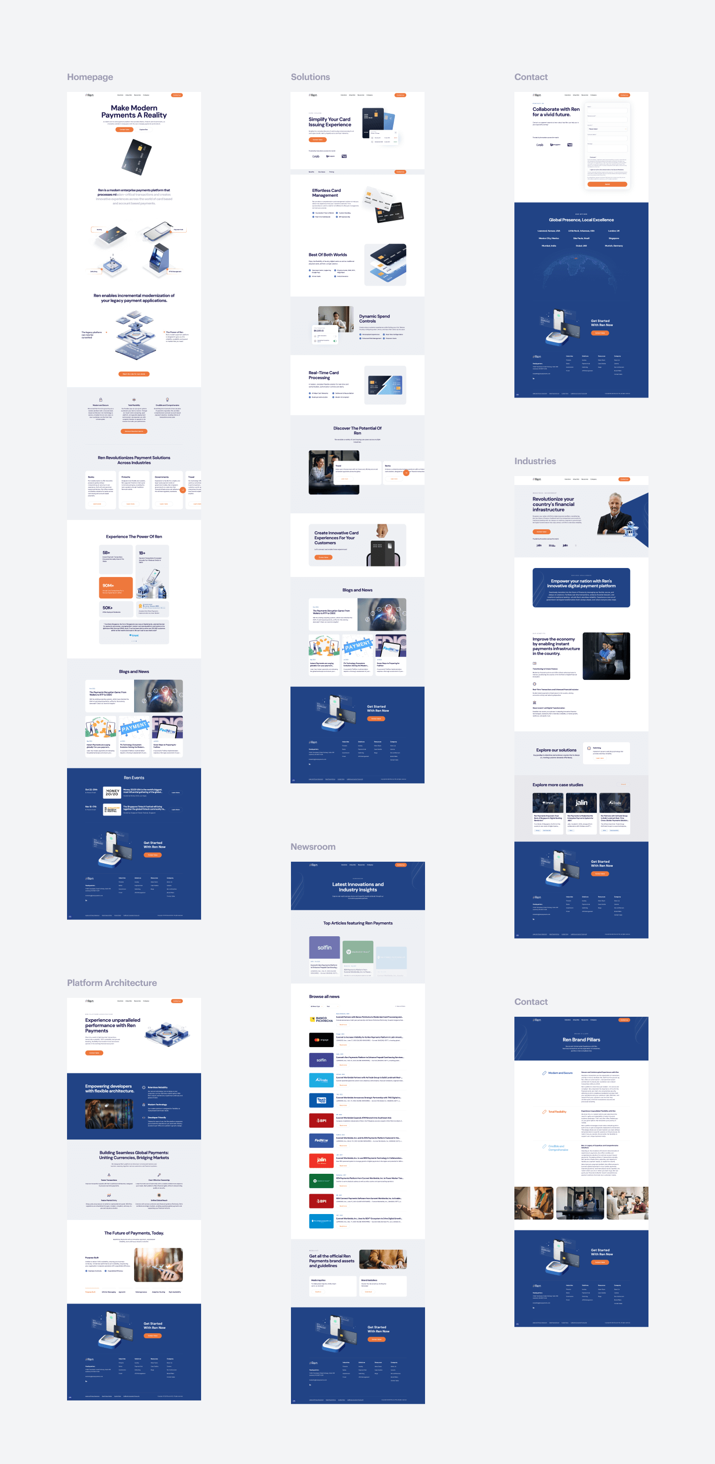
We developed wireframes to bring structure and clarity to the redesign, focusing on a modern layout and establishing a captivating design system. These wireframes ensured seamless navigation and served as a blueprint for the audience-centric experience.
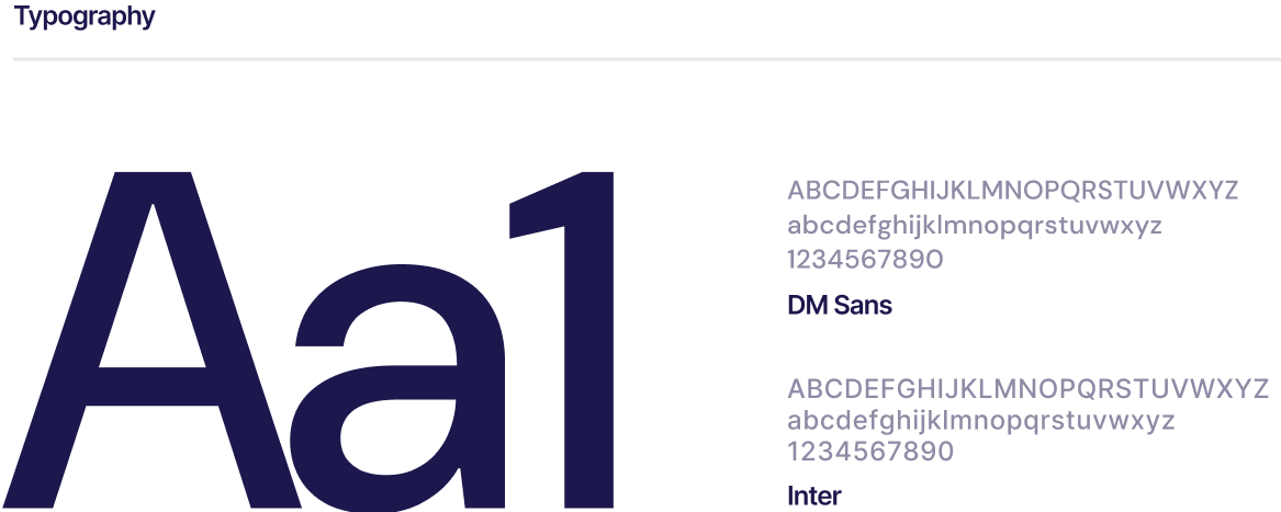
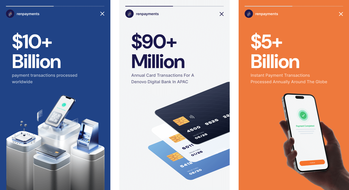
We built the design system around Ren’s existing colors—blue and orange—and typography choices, DM Sans and Inter. This comprehensive system included guidelines for consistent application across the website, from spacing and layouts to typography hierarchy.
The blue and orange palette was strategically employed to highlight key elements, ensuring a vibrant and professional aesthetic. Fonts were chosen for readability and modern appeal, creating a cohesive and engaging user experience.
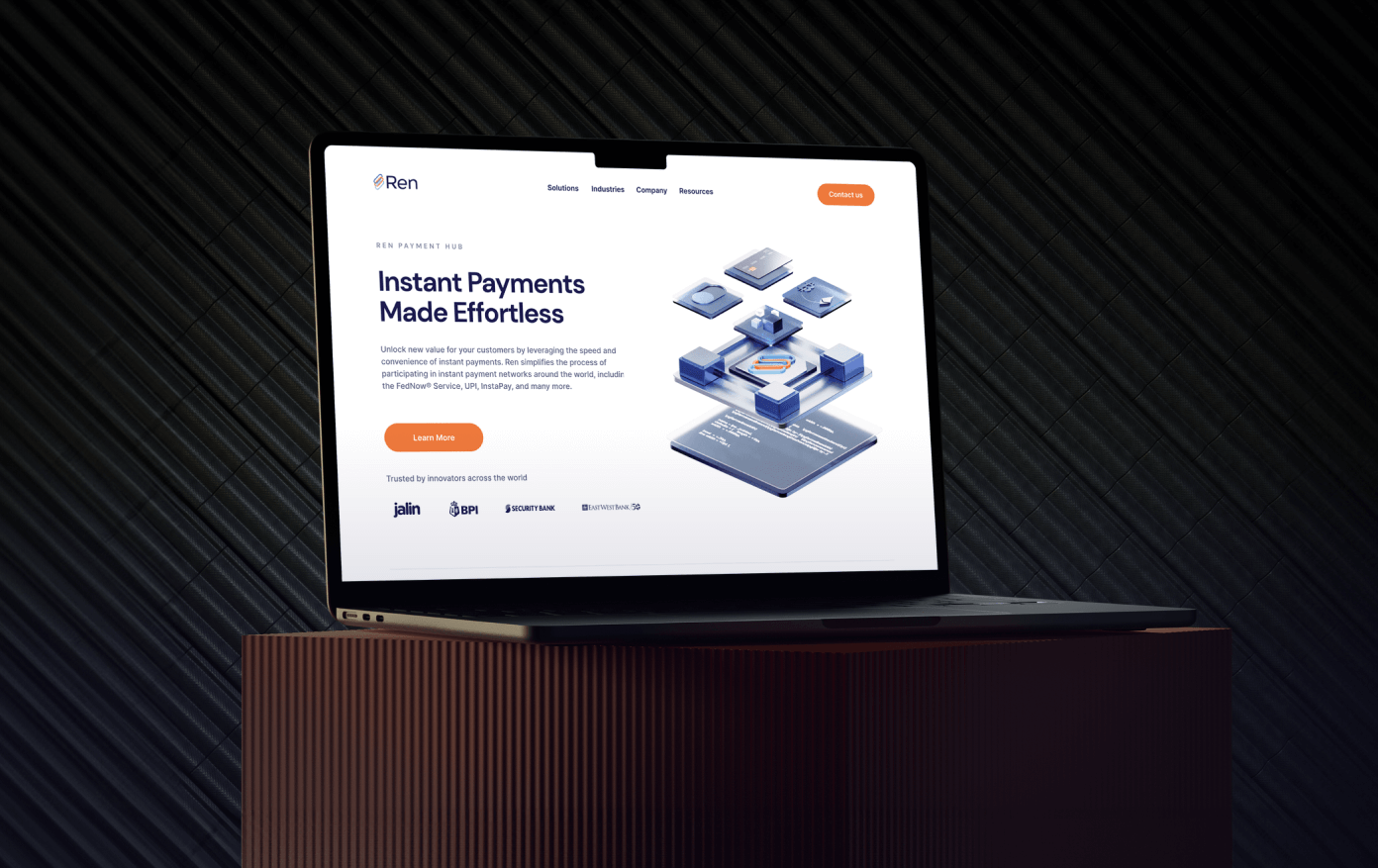
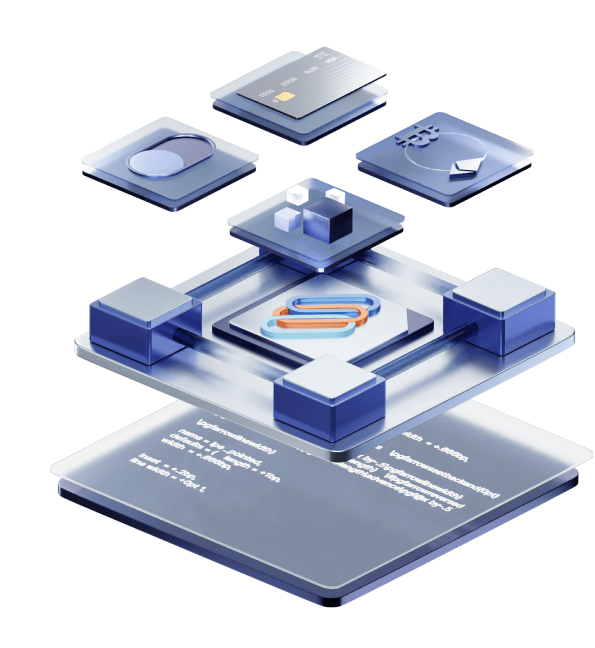
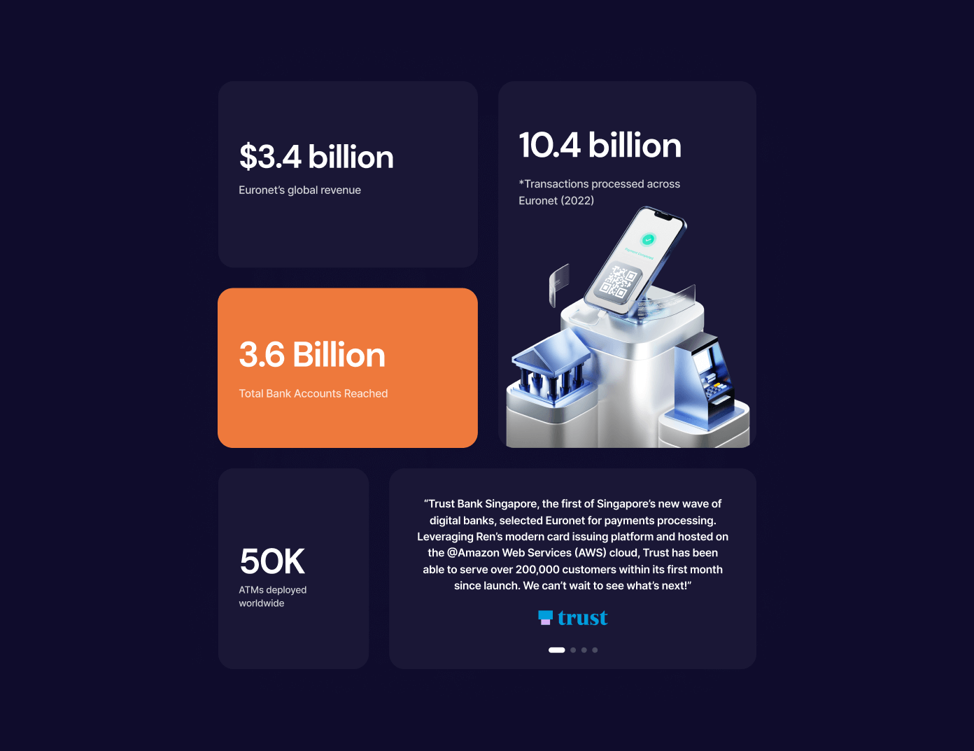
To showcase the future of financial services and add a modern touch to Ren Payments, we incorporated dynamic 3D assets. These assets provided a visually compelling representation of Ren’s innovative solutions. Key hero elements were animated to make them eye-catching and to offer better explanations of the platform’s capabilities.
This approach balanced demonstrating technical excellence with a creative spark, making the design both functional and engaging.
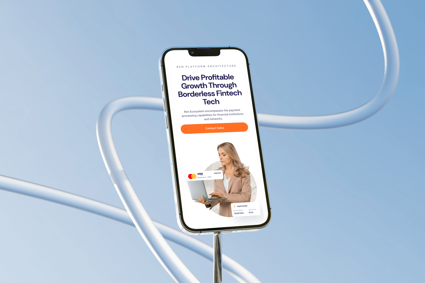
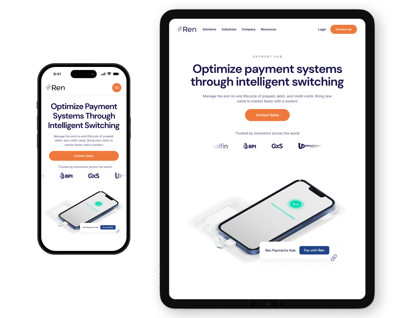
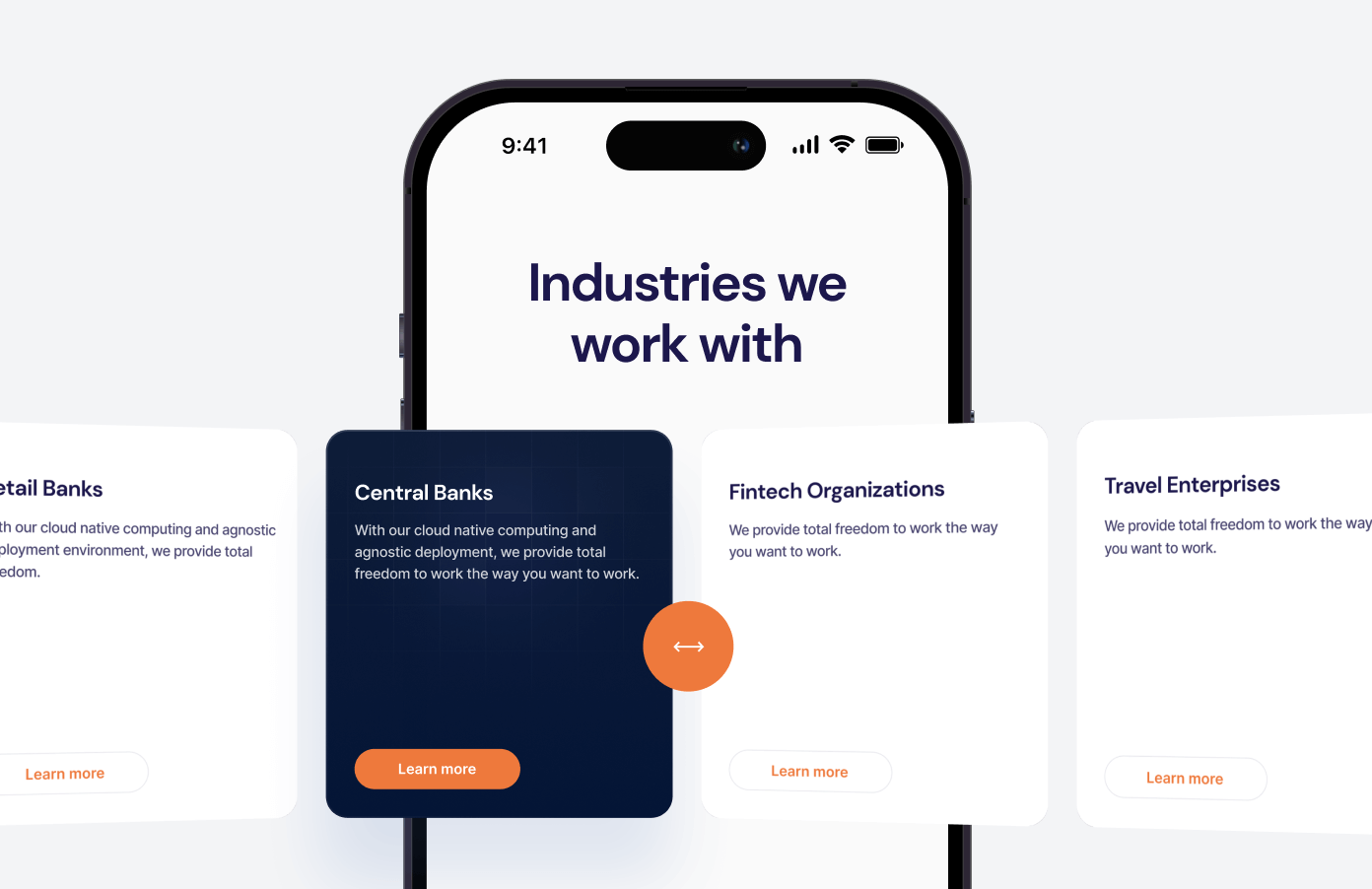
We ensured the website was fully responsive across all devices, from desktops to tablets and smartphones. This adaptability provided users with a consistent and seamless experience, regardless of screen size.
By prioritizing ease of use and intuitive navigation, we minimized drop-offs, ensuring users could engage with Ren Payments’ services effortlessly and without frustration.
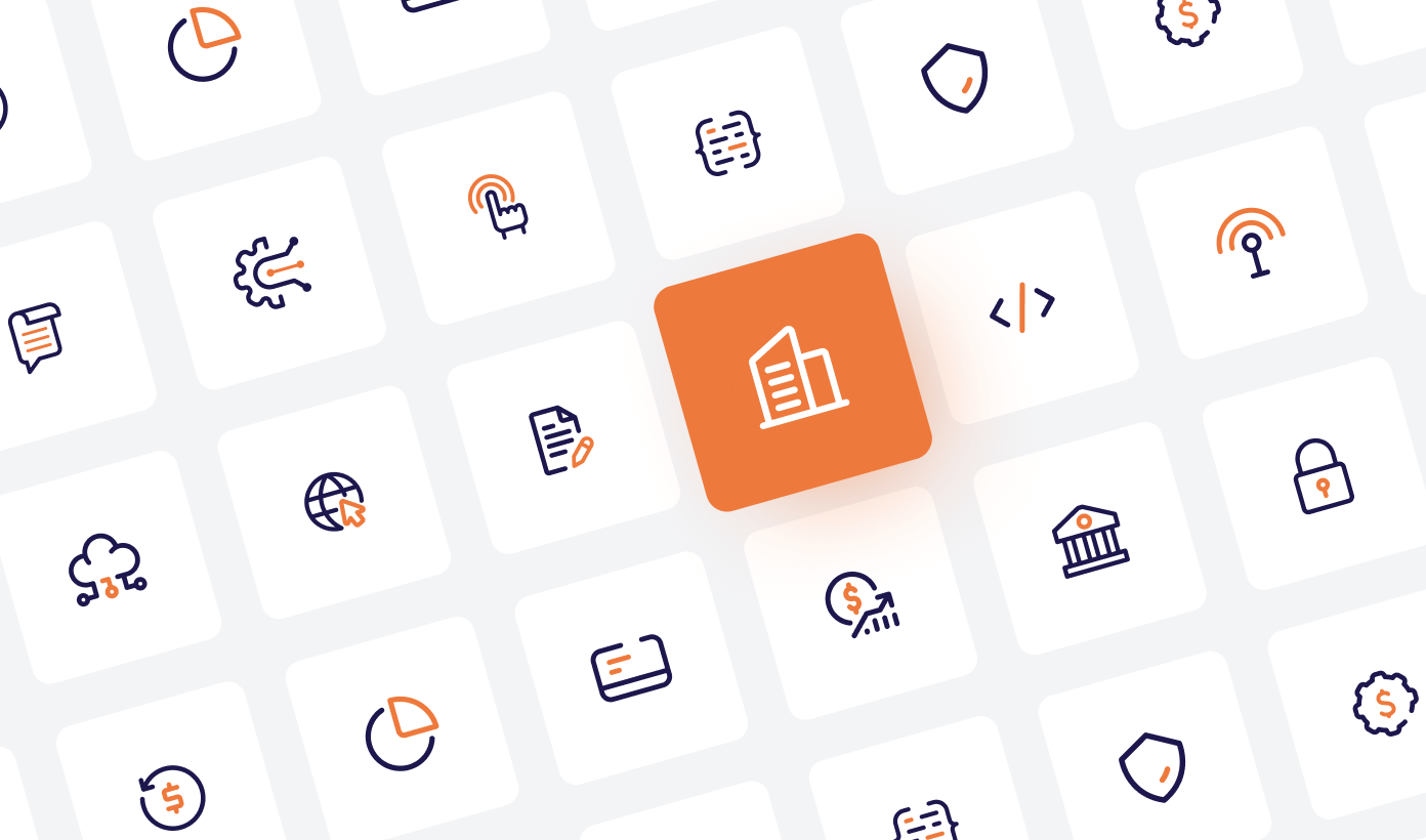
We created a comprehensive icon library to showcase and highlight Ren’s diverse services and benefits. Each icon aligns with the brand’s distinctive identity and carries specific meanings, helping users grasp the essence of the content at a glance. This approach enhances usability and ensures that key messages are conveyed effectively.

The redesign was highly appreciated by the Ren Payments team, who valued the timely and successful project completion. The fresh, modern look effectively conveyed the brand’s identity, significantly enhancing new user acquisition and building trust with their audience.
The updated platform reflects Ren’s commitment to innovation, making a lasting impact in the competitive payments industry.
Our Role
Our role was to redefine Ren Payments’ digital presence through web and mobile redesign, crafting a user-centric design system, and delivering engaging, innovative solutions.
Product Design
Development
Content