Enhancing Snabbit’s value
and market visibility

Snabbit is India’s first quick-service platform, connecting users with professionals for home services like cleaning, laundry, mopping and more, making urban living more convenient and hassle-free.
- Information & Internet
- Q-Commerce
- Technology
- Brand Positioning
- Illustration and Iconography
- Marketing Website
- Personality and Tonality Setup
Snabbit, a leading home cleaning service brand, required a website that reflected its vibrant identity and met customer expectations. Brucira delivered a visually stunning and user-friendly redesign, grounded in thorough audience research.
Our primary challenge was to ensure that Snabbit’s brand identity was accurately reflected in its digital presence, maintaining its vibrant and dynamic personality across the website.
We needed to optimize user experience by simplifying navigation and improving usability, creating a seamless and intuitive customer journey. Additionally, understanding audience expectations was crucial—analyzing customer behavior and preferences to enhance engagement and ensure the platform resonated with its users effectively.
We started with moodboarding and wireframing, shaping a design that truly reflects Snabbit’s vibrant brand identity. After multiple iterations, we finalized an intuitive UI/UX, streamlining navigation for a the end user. The final website design incorporated custom illustrations, enhancing engagement and visual storytelling.
Beyond the website, we also designed marketing collateral, ensuring brand consistency across various touchpoints and strengthening Snabbit’s presence both online and offline.

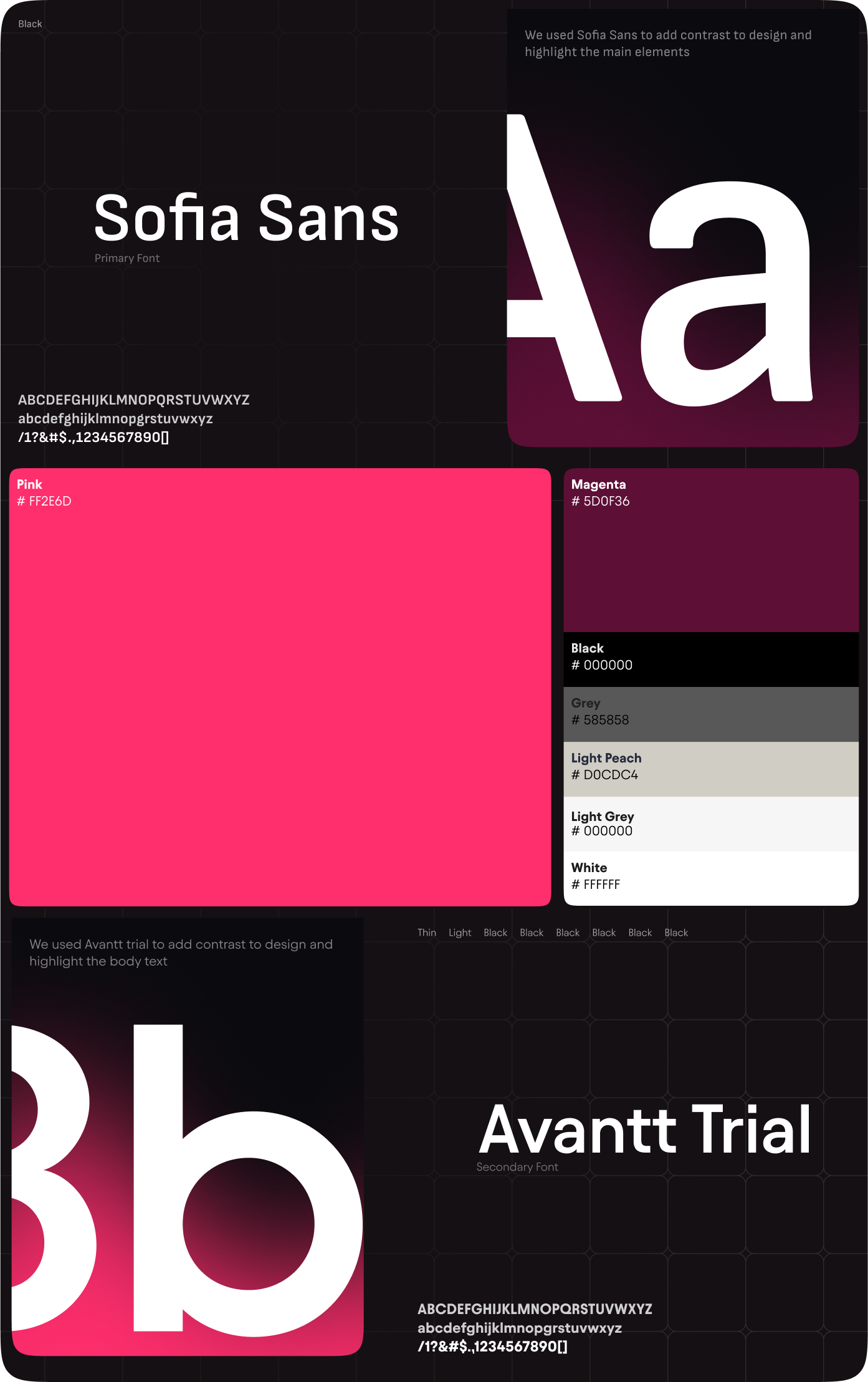
After understanding the Snabbit team’s requirements, we began by creating a moodboard that captured their vision. Once finalized, we moved on to the design phase, carefully selecting typography and a color palette that complemented the pink Snabbit wanted to retain.
For typography, we chose Sofia Sans, known for its modern yet approachable feel, ensuring readability and clarity. Alongside it, Avantt added a touch of elegance and structure, balancing the brand’s playful yet professional identity.
We designed high-fidelity wireframes for Snabbit to establish a clear structure and layout, ensuring seamless placement of elements across the landing page while maintaining a visually cohesive and intuitive user experience.
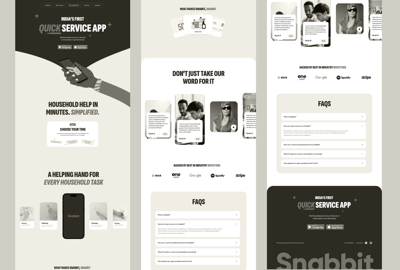
We created a visually appealing and modern website, ensuring Snabbit’s services are front and center. The design highlights categories prominently, making navigation seamless.
A clear, structured process was incorporated to guide users effortlessly, showcasing how they can engage with Snabbit’s services in an intuitive and engaging way.
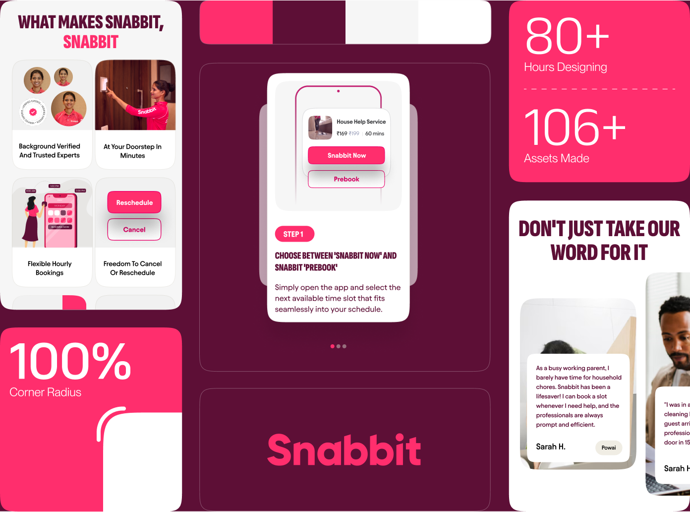
Our design approach was rooted in collaboration, ensuring open communication with the client to fully understand their needs and pain points. Every element of the website was strategically crafted to drive user conversion, with information presented in a clear and organized manner.
The entire process was intuitively structured, guiding users seamlessly through Snabbit’s services. Benefits and ratings were prominently highlighted, while brand elements added a touch of delight and engagement, making the experience both functional and visually appealing.
We refined the wireframes through multiple iterations, ensuring a well-organized design and seamless user experience while aligning with Snabbit’s brand identity and design goals.
We designed Snabbit’s website to be fully responsive, ensuring a seamless experience across mobile, tablet, and desktop. The layout adapts effortlessly to different screen sizes while maintaining visual consistency and usability.
Every element was optimized to provide a smooth, accessible, and engaging experience, ensuring users can interact with the website effectively, regardless of their device.
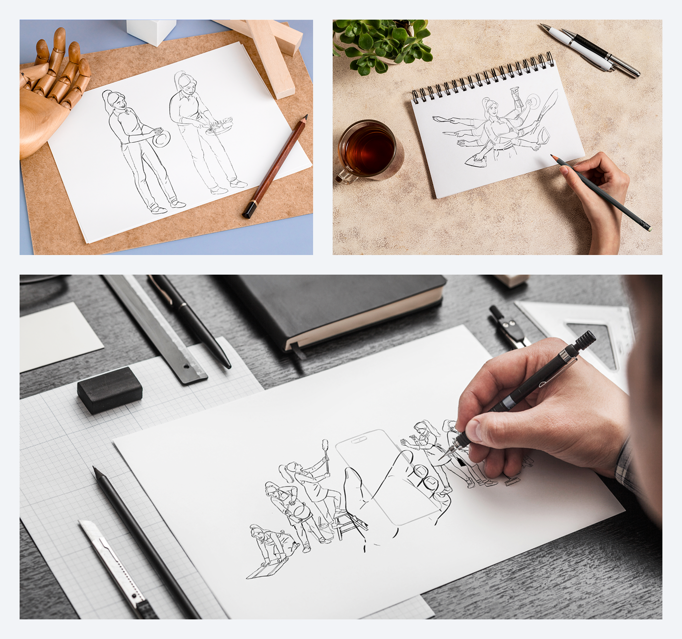
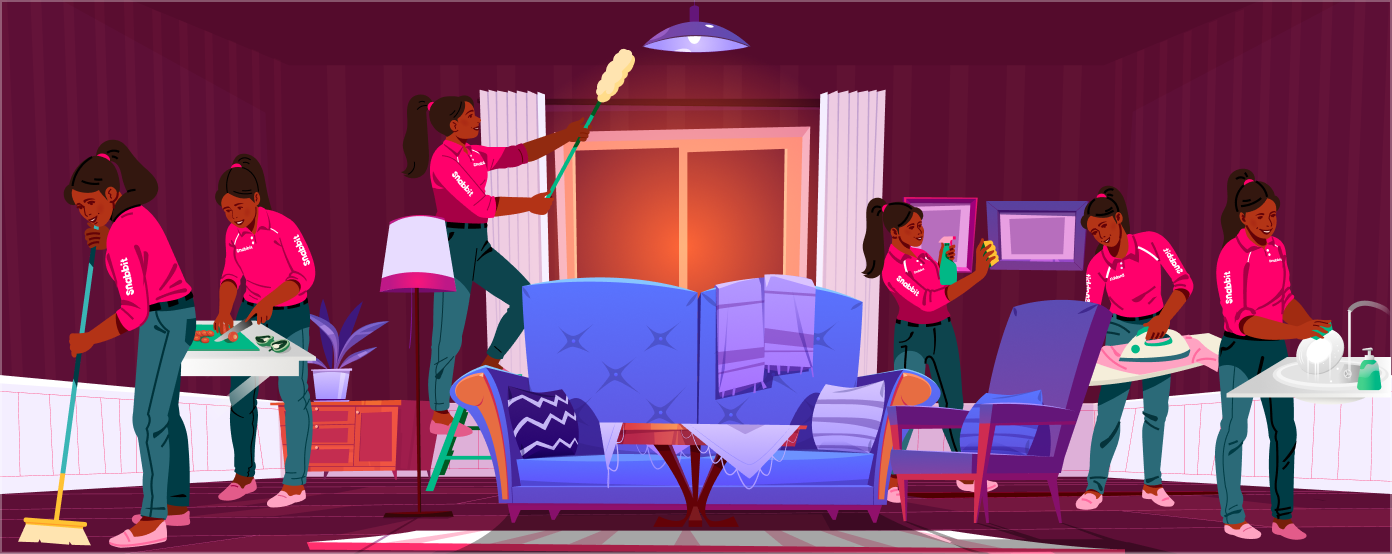
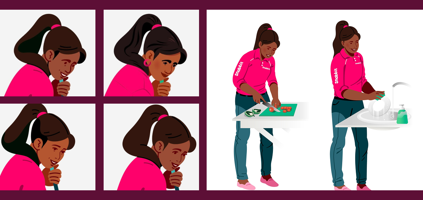
To define the final illustration style, we started by creating a moodboard to understand the client’s vision. The selected style blended clean professionalism with warmth, ensuring a visually engaging and approachable design.
We also developed custom character designs to personify Snabbit’s services, making them more relatable, engaging, and relevant for users.
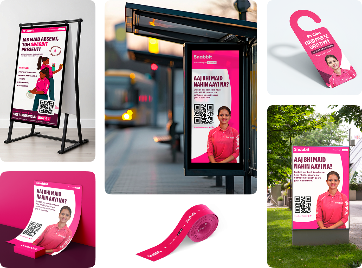
With a clear brief in hand, we designed a canopy, standees, flyers, bus shelter posters, pole banners, and other OOH advertising materials, ensuring consistency with the illustration style and brand elements we created for Snabbit.
Each collateral was carefully crafted to enhance brand visibility while maintaining a cohesive and engaging visual identity across different marketing touchpoints.
The Snabbit team loved the fresh, dynamic identity, appreciating how it sharpened their messaging and set them apart. This transformation strengthens brand recall, enhances engagement, and positions them for growth. We’re excited to see how it fuels their success.
Our Role
Our role was to make the Snabbit brand visually engaging, ensuring it stands out with a distinct and impactful presence.
Product Design
Content