Empowering Kindly Health to Revolutionize Men's Sexual Health
Asia's Exclusive Sexual Health Platform
Kindly Health provides end-to-end solutions for sexual and reproductive health for men. The platform offers convenient at-home diagnostic services for sperm analysis, erectile dysfunction, and much more.
Kindly Health is on a mission to empower modern India to live more fulfilled lives by enabling healthy & happy sex lives.
What
we did
Web redesign
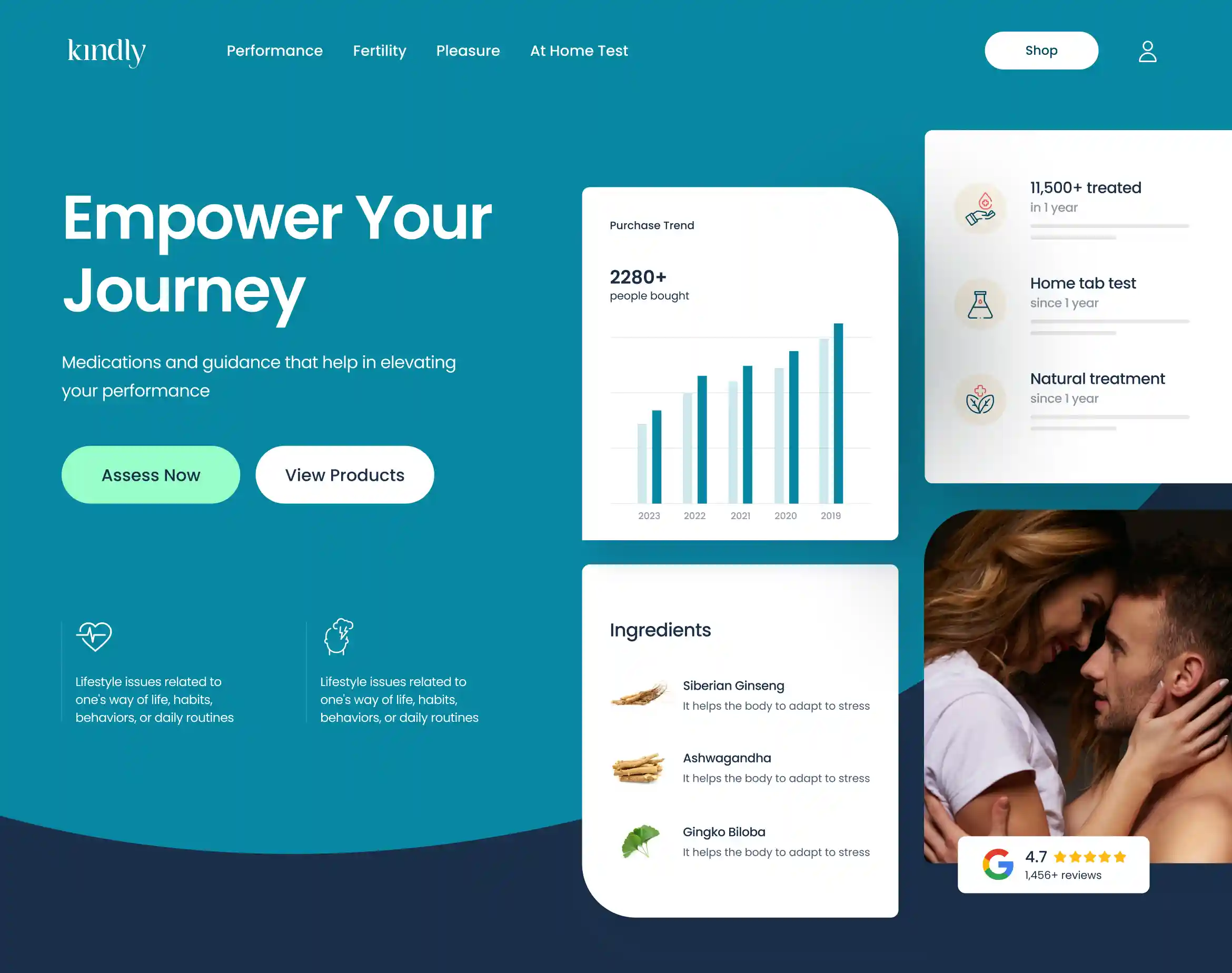
We crafted a visually appealing user interface, enhancing the overall user experience through a refreshed layout, lively colours, and fonts.
Mobile web redesign
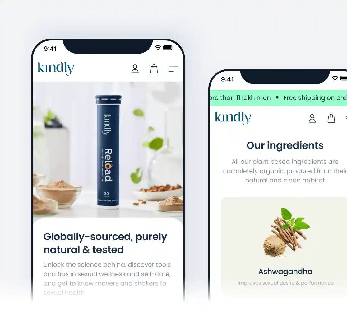
We streamlined the website for mobile devices by condensing content and prioritizing essential information, resulting in a fully responsive design.
Design System
Established guidelines, components, and best practices for consistent, cohesive design in product development, promoting brand unity.
Objective
Our foremost objective for Kindly was to enhance conversion rates, user engagement, and brand presence. To achieve this, we designed a contemporary interface, improved both website and mobile navigation, integrated multimedia elements, and fostered trust and confidence among users.
Boosted conversions with streamlined web navigation
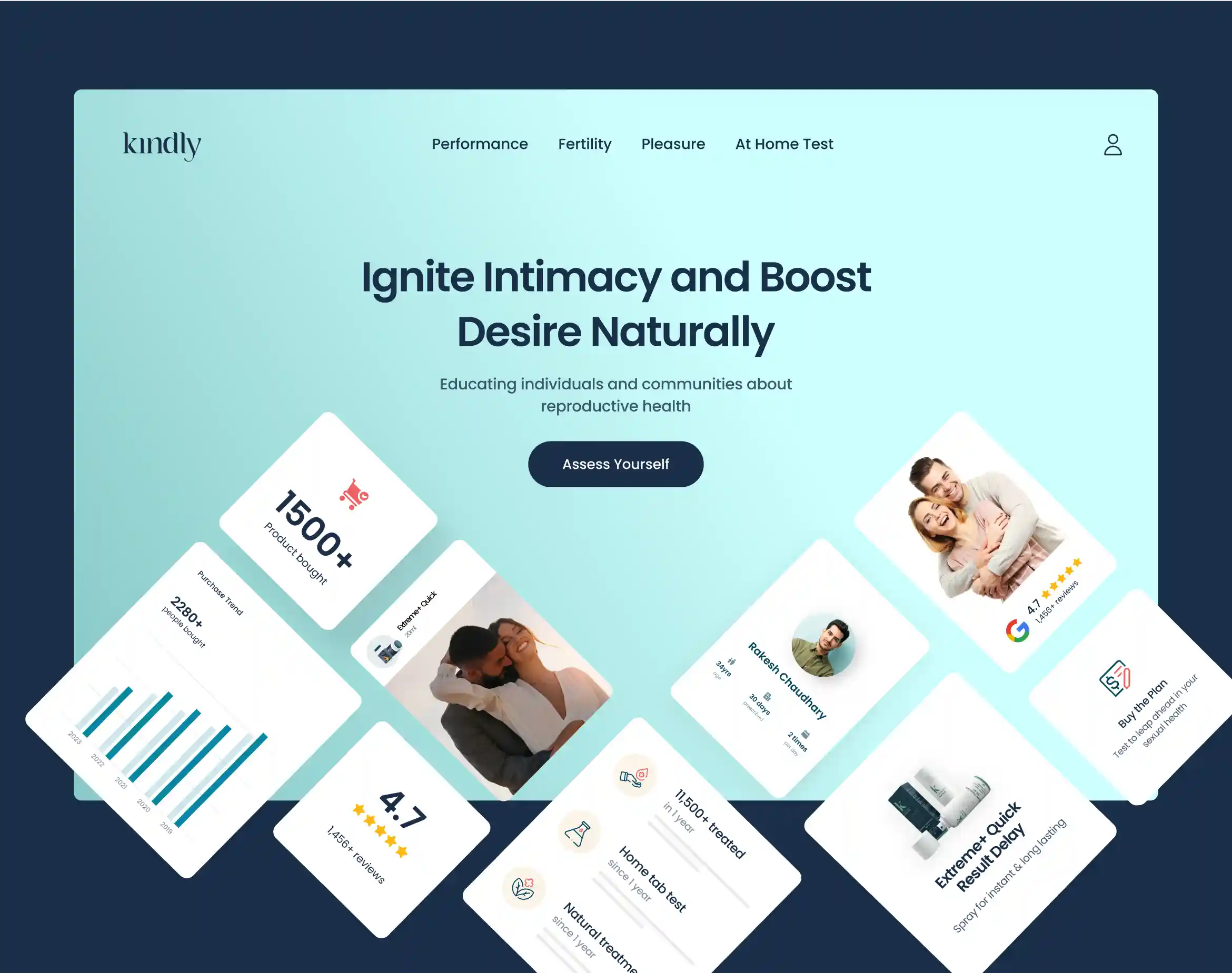
Improved user experience by facilitating easy navigation. We crafted a compelling headline and sub-headline designed to resonate with the target audience. Prominent and visually distinct CTA buttons, labelled "Assess Yourself" and "View Products," were strategically placed to encourage user interaction.

The
Approach
We initiated the revamp process by establishing design goals, objectives, and identifying the target audience. We gained a thorough understanding of the problem the design aimed to address and the improvements it should deliver.
Subsequently, we conducted market research and competitive analysis to acquire valuable insights. Following this research, we engaged in brainstorming and ideation sessions to generate potential design solutions informed by our findings.
Created wireframes to picturise the Information Architecture
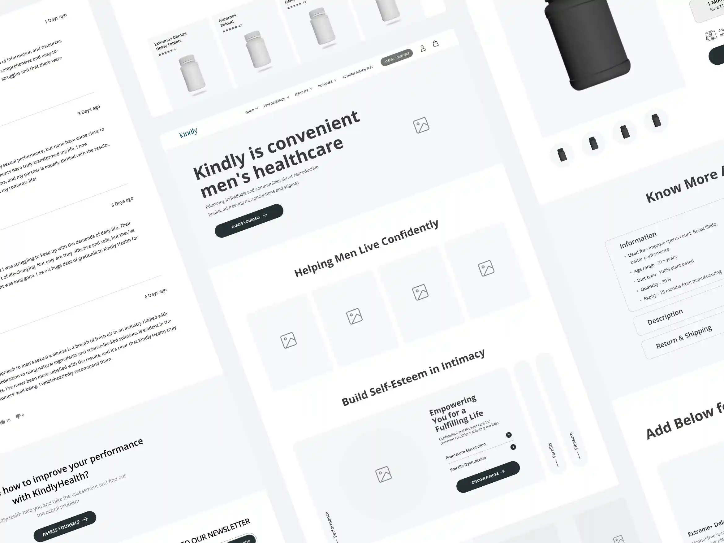
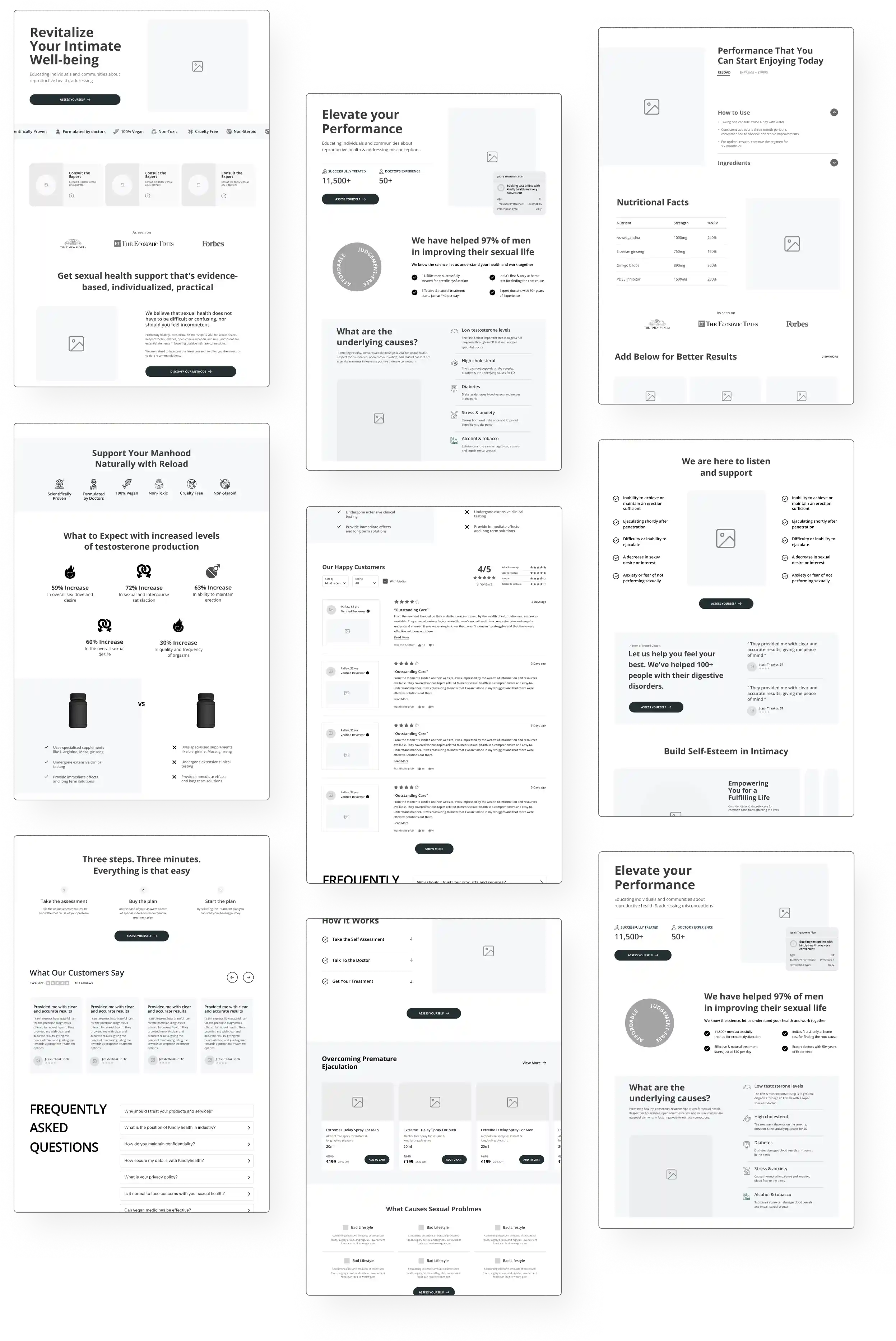
We produced and modified wireframes, enabling us to conceptually map out the Information Architecture. Over the course of the redesign, we not only generated these wireframes but also continually fine-tuned and improved them.
These iterative refinements were instrumental in achieving a final design that was not only more refined but also highly effective and user-friendly, ultimately optimizing the overall functionality of the design.
Worked with multiple User Interface iterations
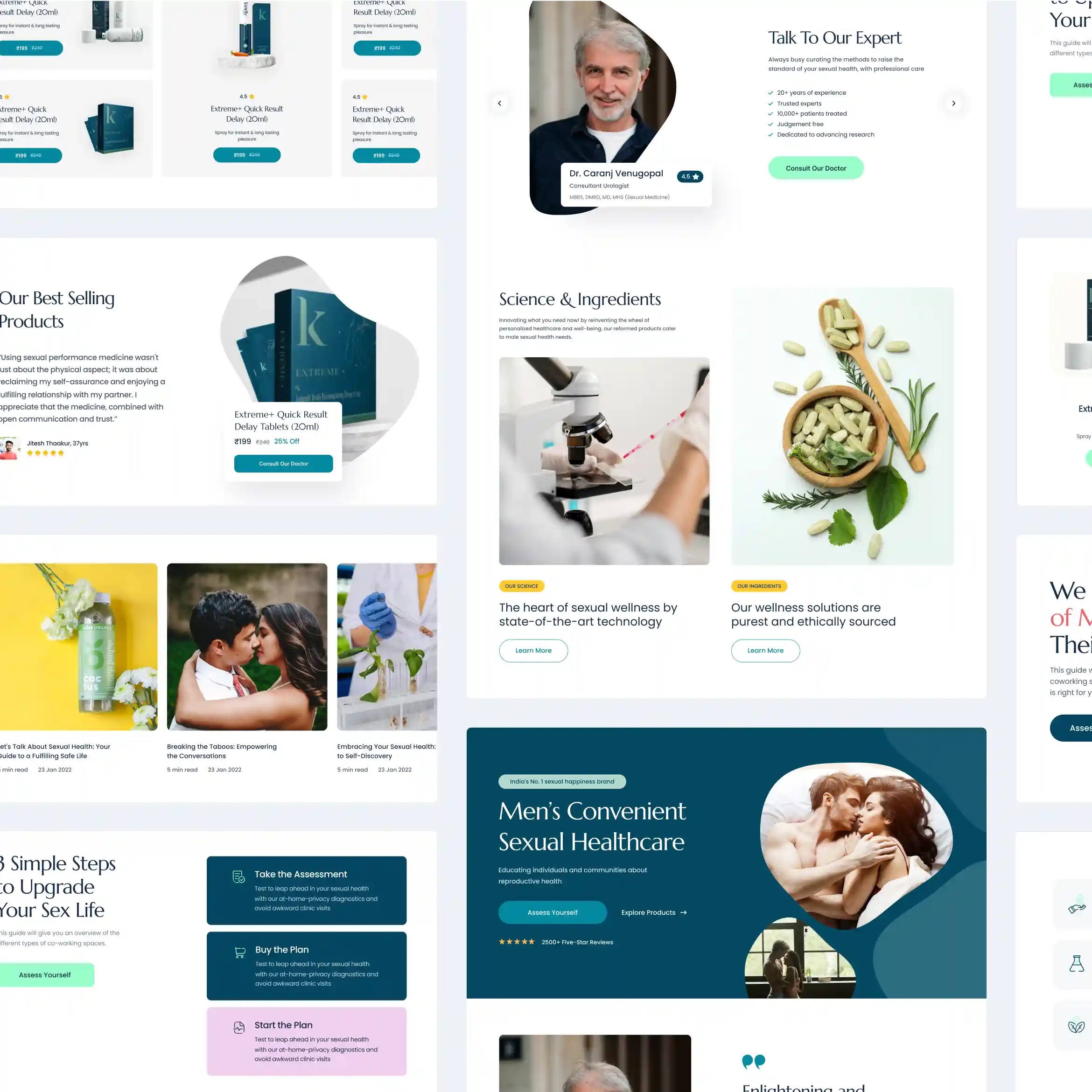
Beginning with our wireframes, we embarked on a series of UI iterations that played a pivotal role in aligning our final design vision. We continually refined these iterations based on invaluable client feedback, meticulously incorporating elements to meet specific project requirements.
Our overarching goal was to infuse our iterations with a contemporary, invigorating ambience, dispelling any reservations associated with sexual health.
We strived to instil user confidence by integrating social proof, testimonials, and ratings, all while adopting a colour scheme that exuded subtlety and trustworthiness.
Our broader aim was to normalize the conversation around intimacy.
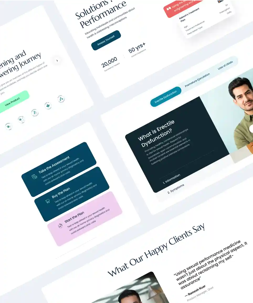
Created a distinctive and recognizable visual identity for Kindly to set it apart from its competitors
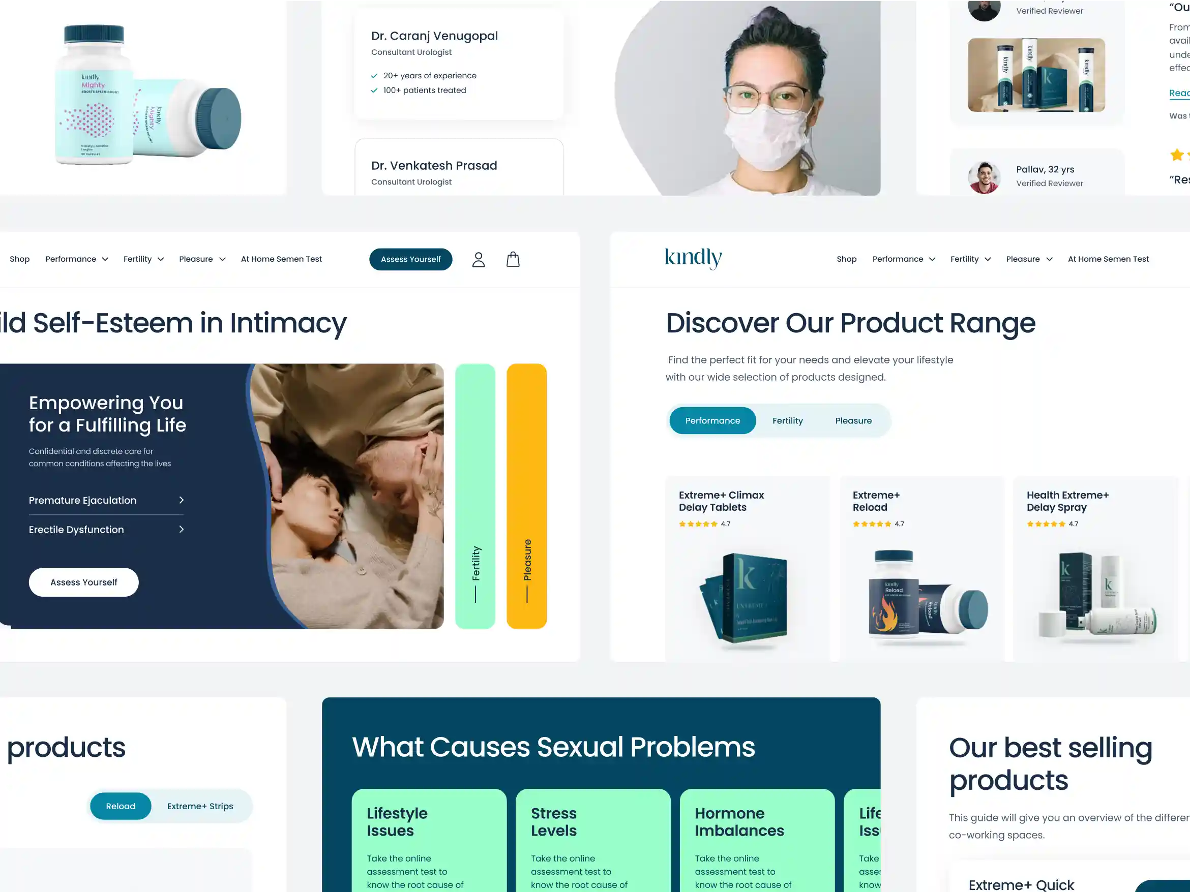
We meticulously designed the website with a clean and uncluttered layout. This approach was intentionally chosen to provide a user-friendly experience and effectively set Kindly apart from its competitors. Through the strategic use of ample white space, we achieved a design that is highly user-friendly.
This clean layout enhances the overall aesthetics of the pages, creating a sense of space and order that makes the content more inviting and easily digestible for visitors.
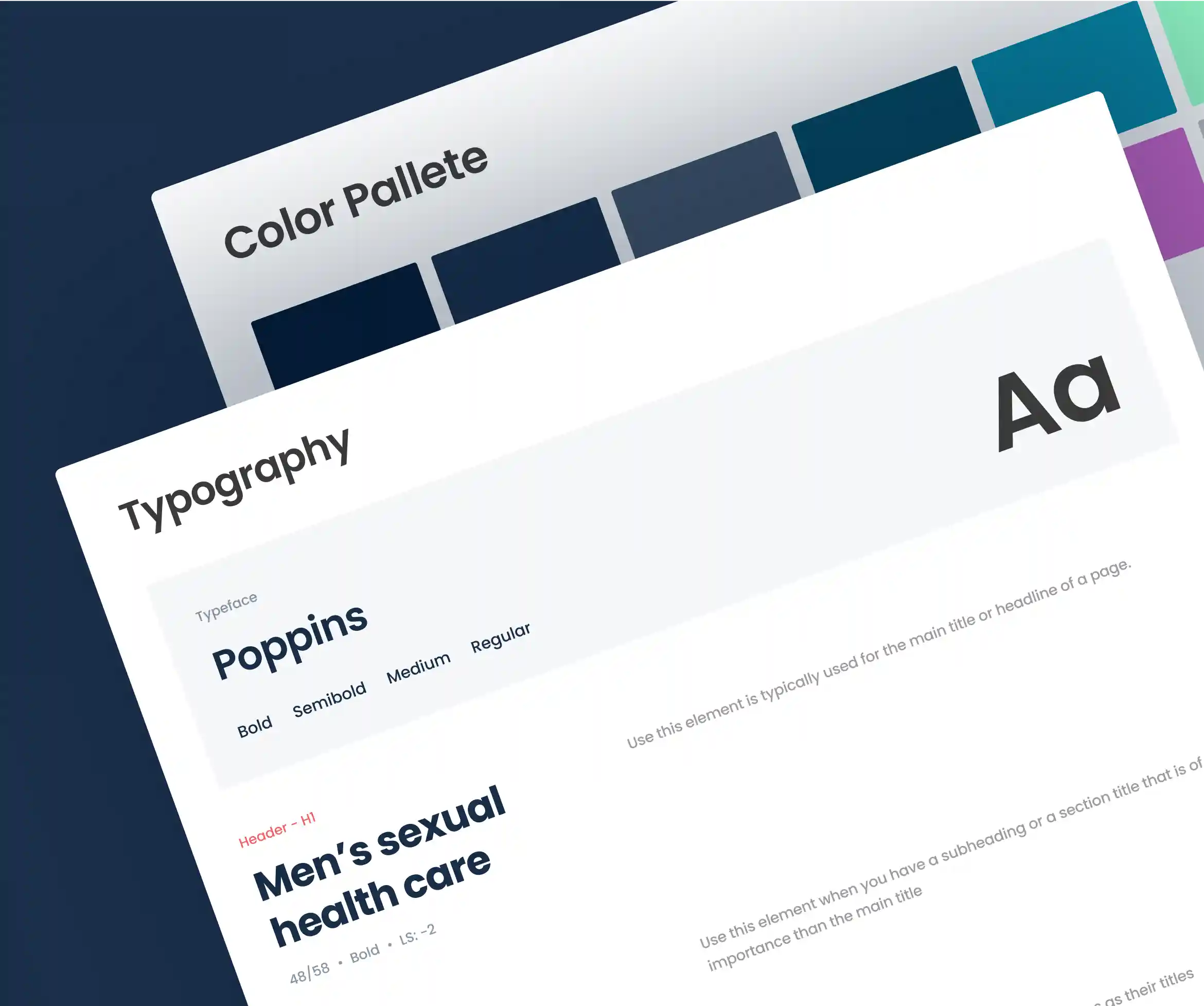
Crafted a Cohesive Design System
Our design system was meticulously developed to harmonize with the defined brand colours. By carefully matching the styling with existing pages, we ensured a seamless and unified visual identity.
The selection of blue shades instils confidence and trustworthiness, while accents of orange and purple were strategically integrated to emphasize key points and lend prominence. In addition, we seamlessly incorporated neutral colours to achieve a contemporary look that seamlessly blends with the existing colour scheme, resulting in a cohesive and visually appealing design system.

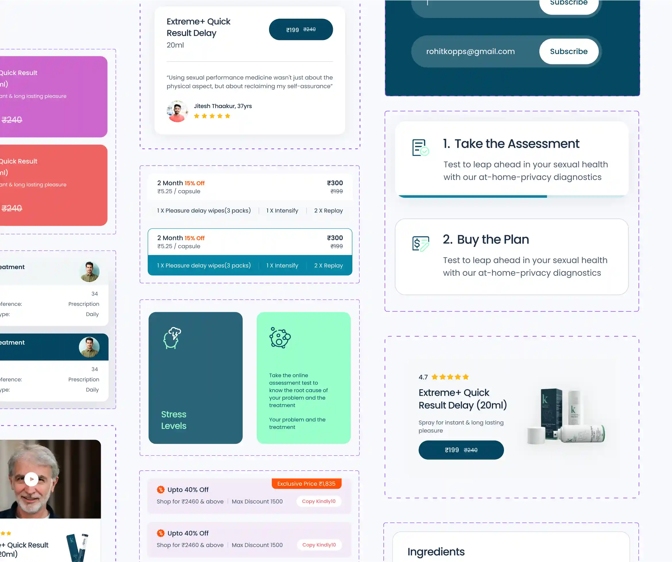
Our design process included the development of versatile components that could be effectively and repeatedly employed in various sections of the website. These components were thoughtfully crafted to ensure consistency and cohesiveness throughout, particularly in areas such as product cards, testimonials, FAQs, and coupons.
Best
Experience
We successfully met the product objectives based on client feedback, maintaining a minimalistic design aesthetic.
The
Impact
The revamp of Kindly Health's platform was met with acclaim. We were commended for our innovative design approach and seamless project execution. We're delighted to have exceeded their expectations, and our on-time project delivery played a crucial role in achieving their objectives.
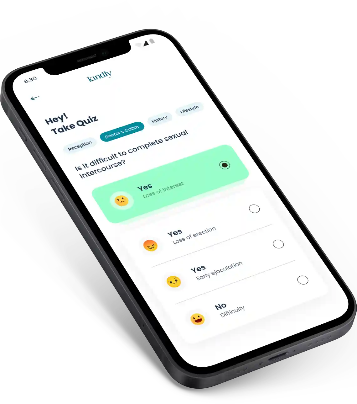
The introduction of a modern and clean design has proven to be instrumental in enhancing Kindly Health's visibility, resulting in increased user engagement and revenue through the discovery of their health quiz and new products.
Brucira not only delivered a visually stunning design but also ensured the project was on time. Their professionalism and commitment to excellence were truly impressive. Their ability to understand the sensitivity of our brand and translate it into a stunning design was remarkable. We couldn't have asked for a better partner in achieving our project's success.


