Powering the next generation education with Vedantu
Vedantu enables students to learn live with India's best-curated teachers
Backed by Accel Omidyar Network TAL Education Group, Accel Omidyar Network TAL Education Group, Orios Venture Partners and many more, Vedantu is a LIVE online learning platform that connects students and teachers to achieve the best results.
Using Vedantu, students can choose India's best teachers and learn from them via LIVE interactive classes. With its superior learning platform, Vedantu ensures that students can get their doubts solved instantly, take part in quizzes & activities and have a personalised learning experience. By making LIVE learning engaging and fun, Vedantu students consistently perform well and get great results!
Services
we provide
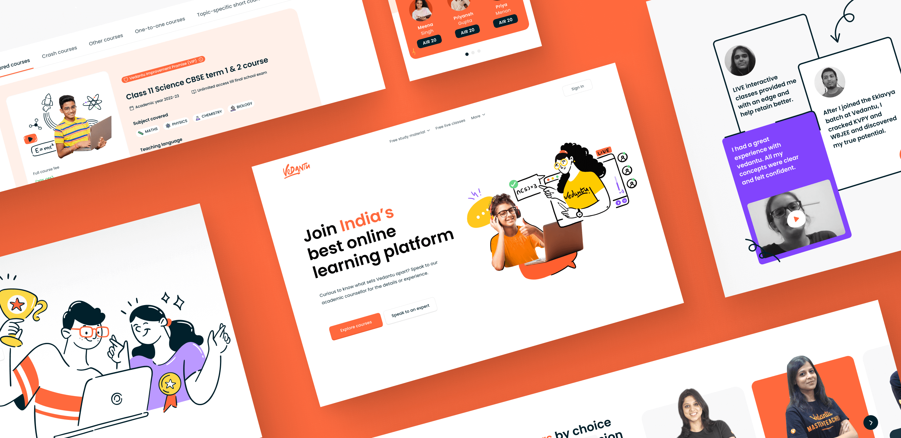
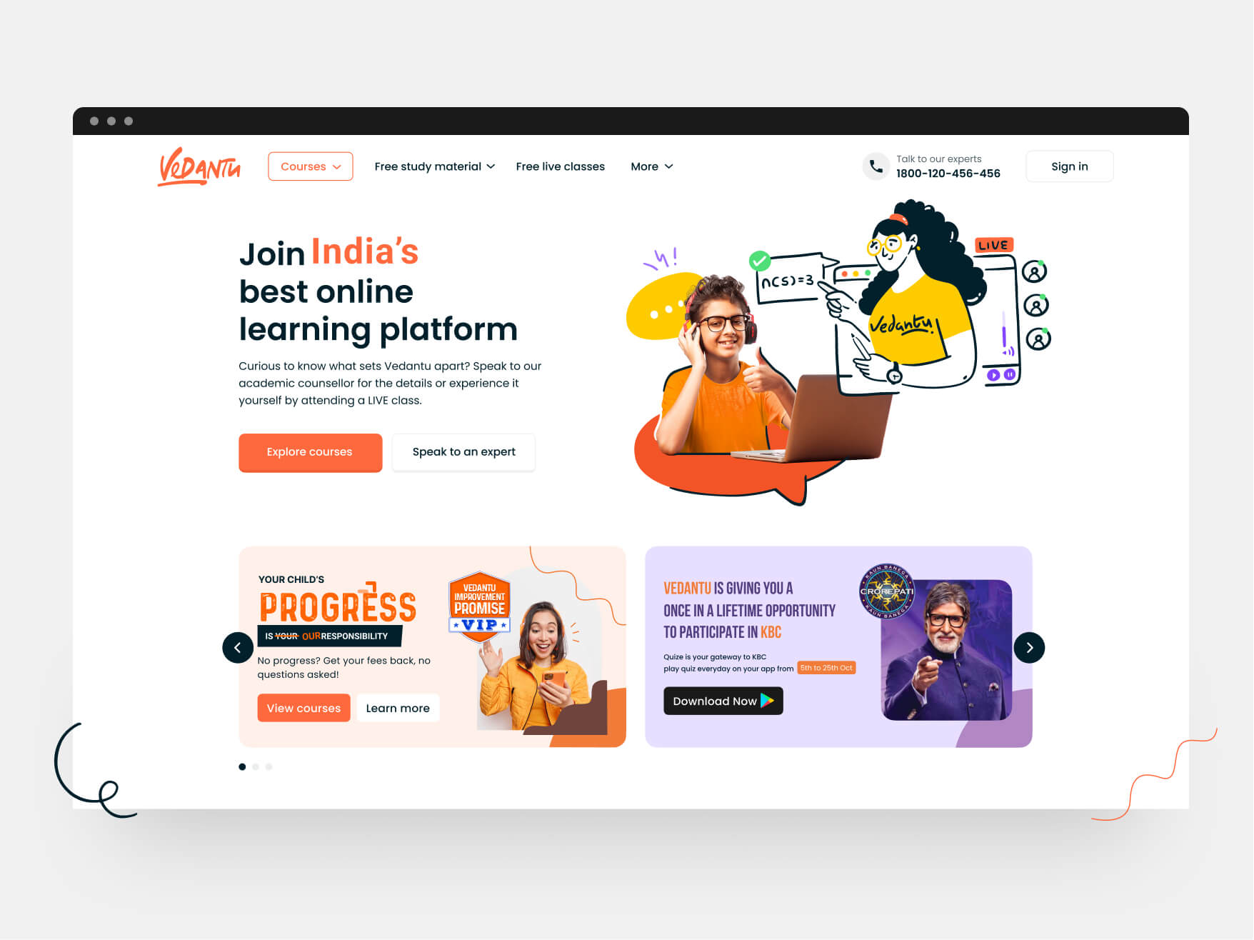
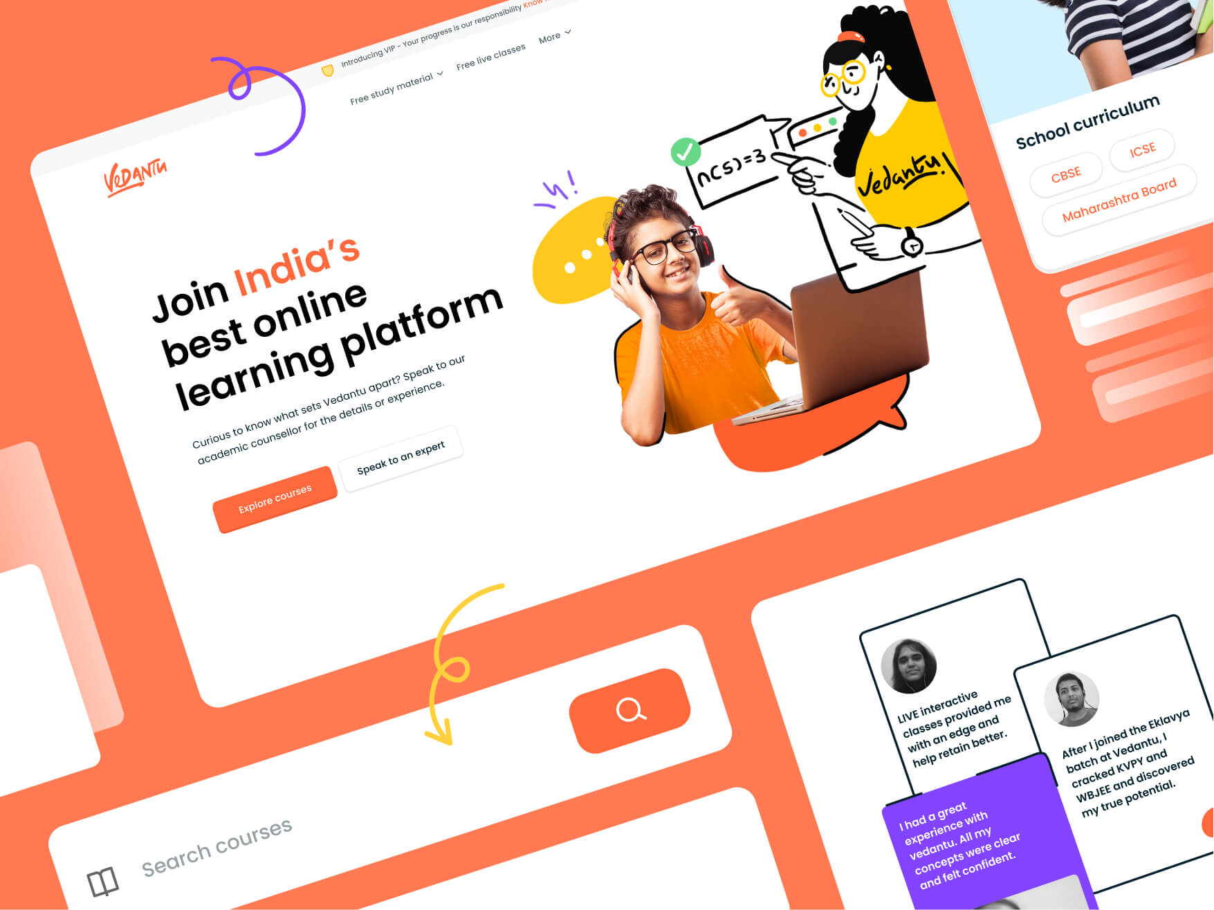
Web redesign
Making the website more visually appealing and modern, increasing website traffic and engagement and Updating the website's content and branding
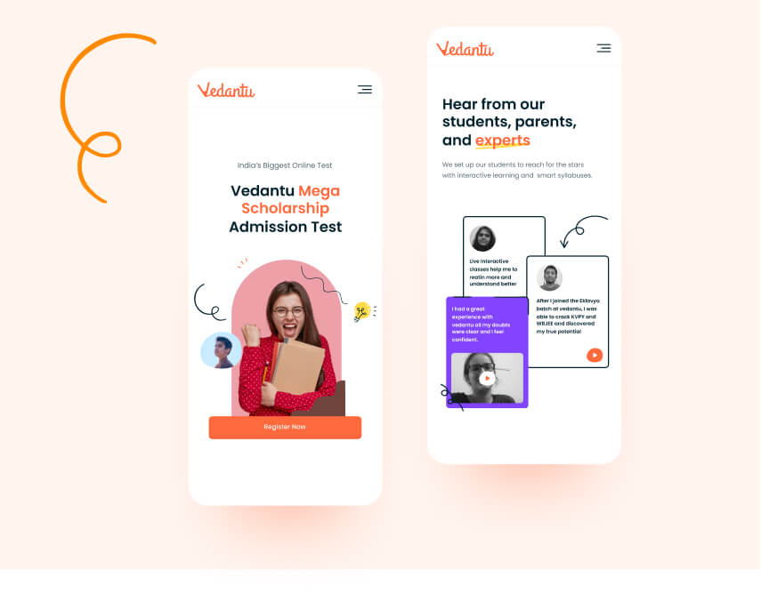
Mobile web redesign
Reducing the amount of content on the mobile version of the website to prioritize the most important information for mobile users
Development
Developed the website and mobile as per the designs taking into account the performance factors
Iconography and illustrations
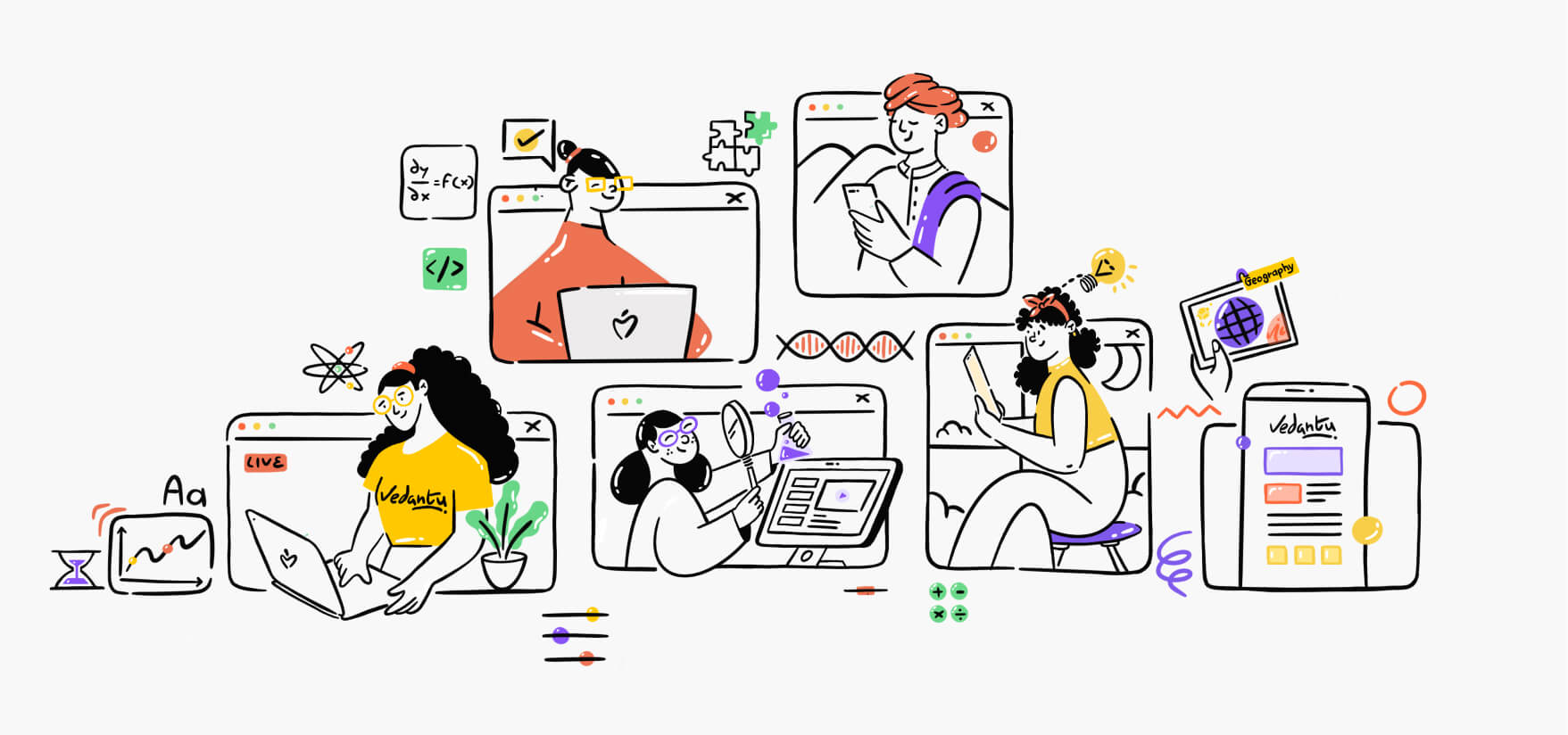
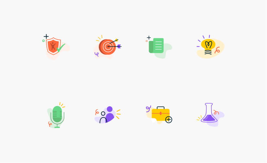
Illustrations are used to clarify complex ideas, add interest and engagement to written content
The
Challenges
Vedantu is a widely known brand in the global market and was recently named a unicorn. Make sure to keep the roots of the original features and USPs while making it modern & playful. Increase the conversion rate from the old website.
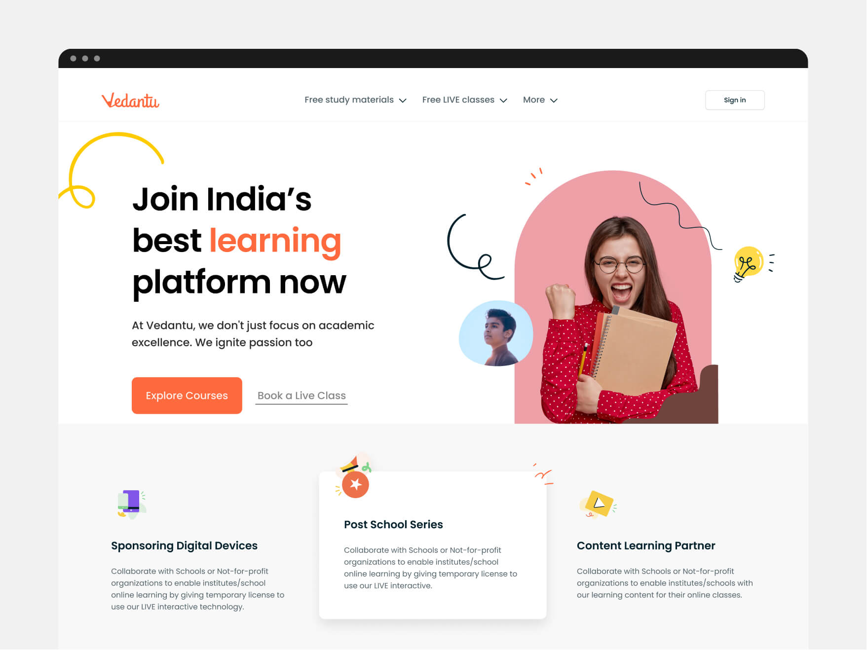
Vedantu wanted to be a playful and friendly brand
Primary challenge was to make the brand standout by using a friendly and a playful tone. This will fascinate more students and make their learning easier and more impactful. This helps to easily memorize and retain the information.
The
Approach
We started with a brief discussion call with the founding team at Vedantu to understand the requirement, collate their vision and mission and align with the same.
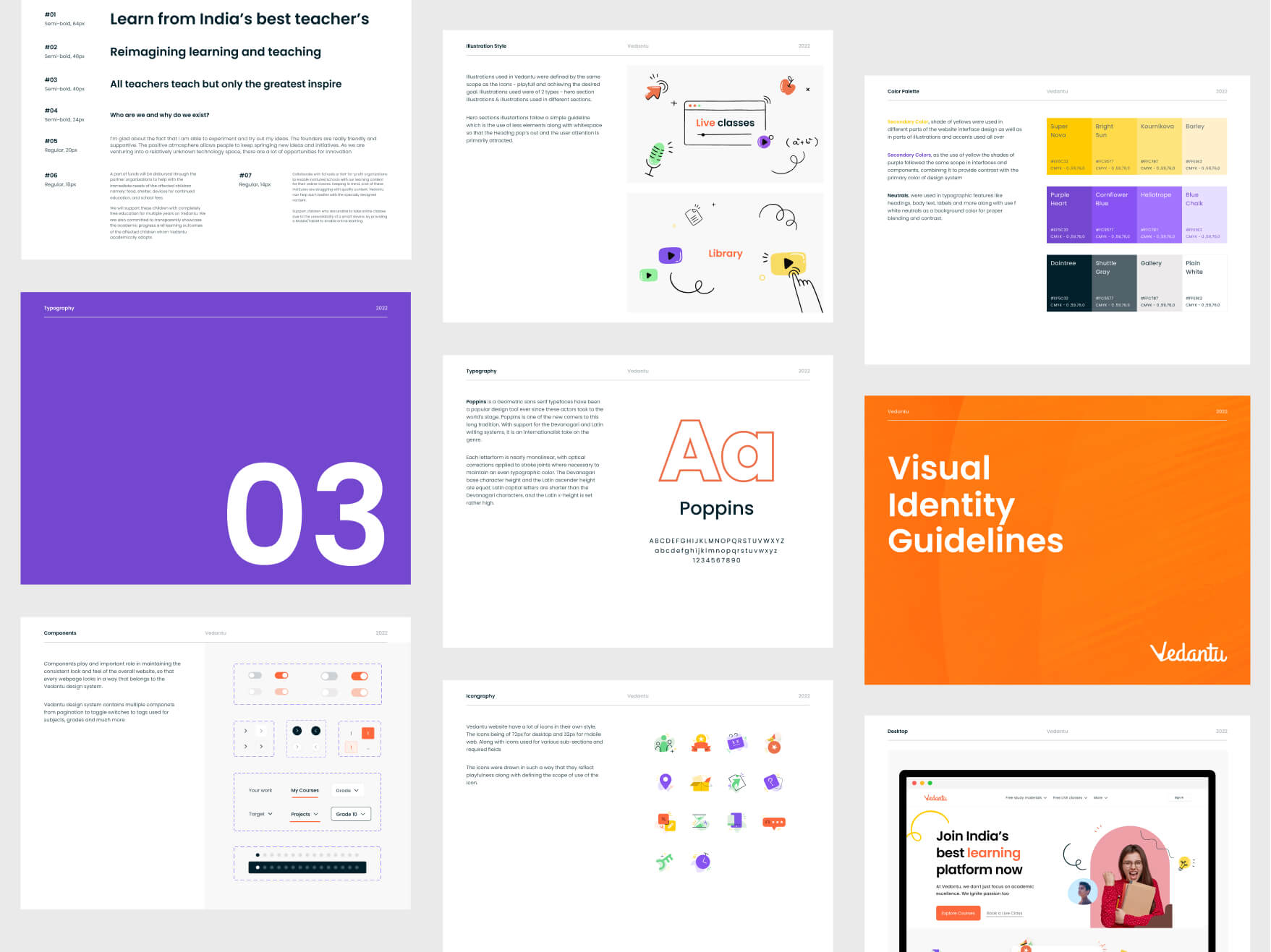
Post this initial discussion, we started working on the low-fidelity wireframing. Simultaneously, we started exploring the typography and the theme for redesign.
This enabled us to set the tone for the overall rebranding for Vedantu. Once this initial iteration was finalized, we started designing the illustrations, icons and the overall web designs.
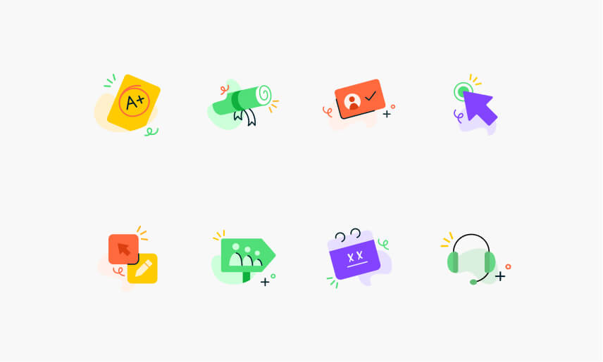
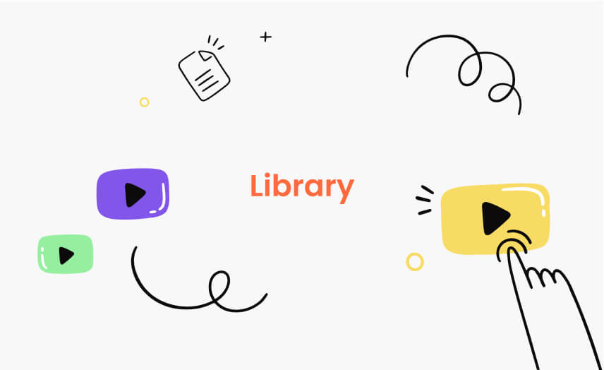
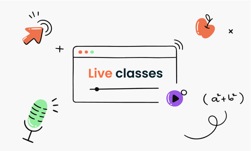
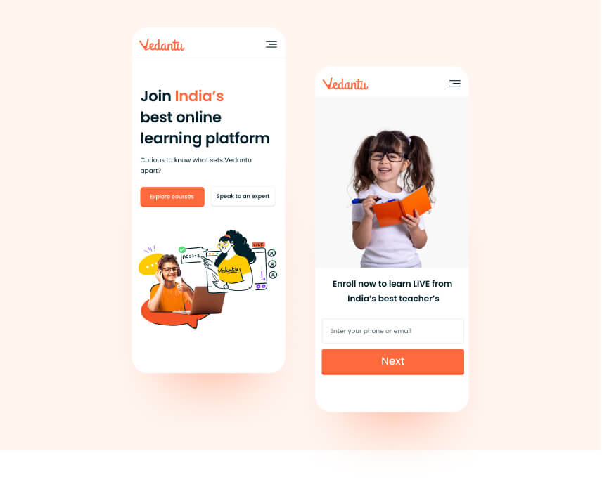
Unique styling to humanize the learning experience
Using the human illustrations incited a personalized feeling and at the same time made the brand more friendly and approachable. This way we projected the brand trustworthy, providing constant support.
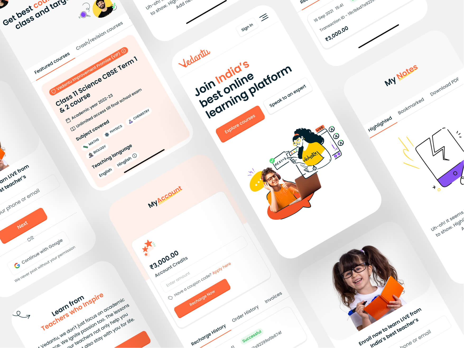
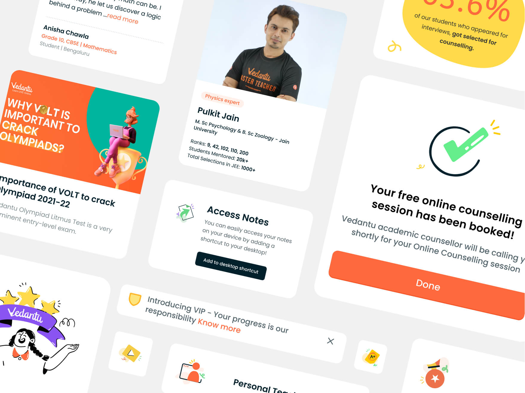
Best
Experience
The primary goal was to gain student's trust and provide support in an effective way
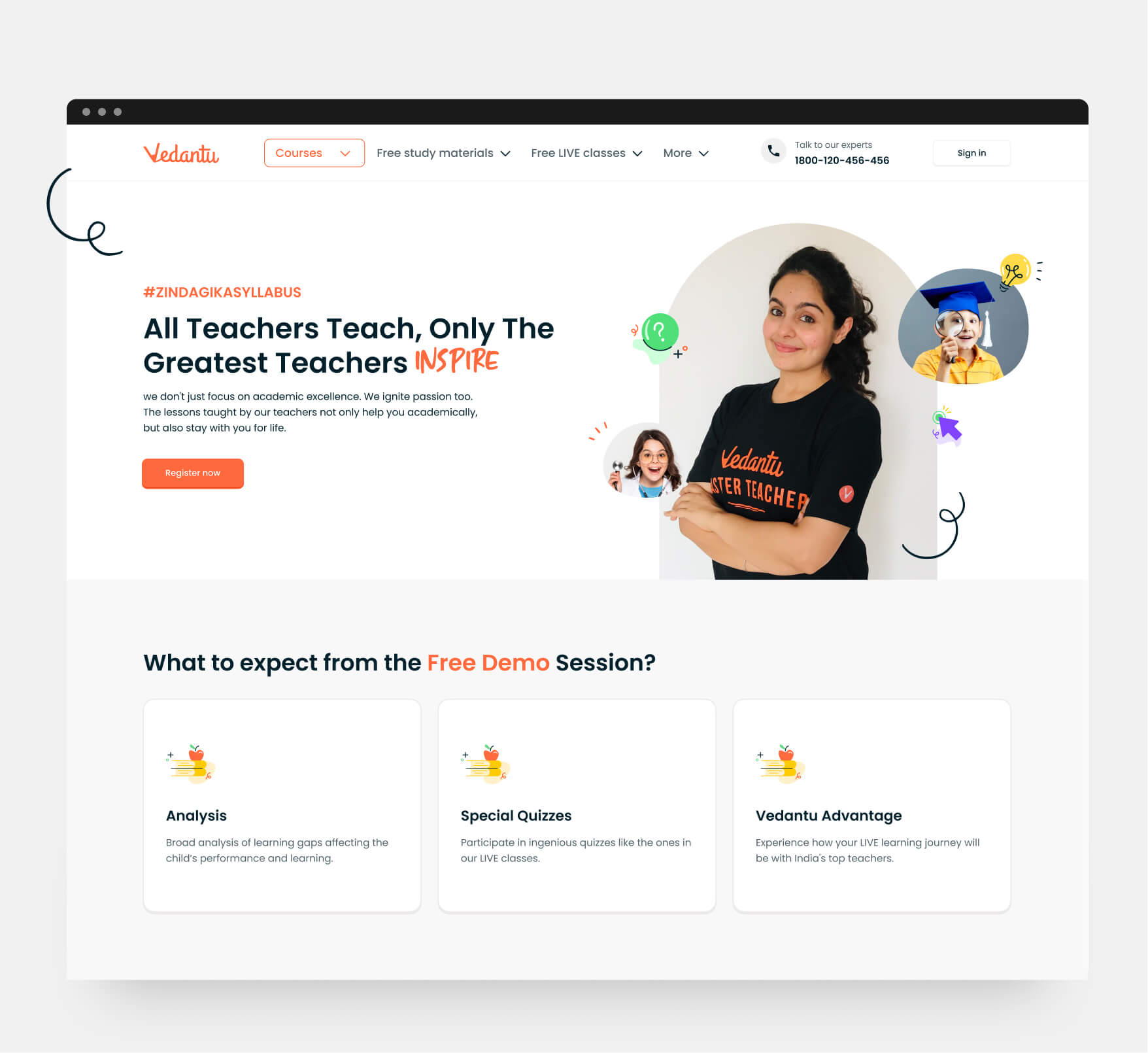
Conveyed the USPs in a lively and innovative way
Their old website was not complementing the modern and minimal needs from the design perspective and we needed to increase the interest and conversion rate for students.
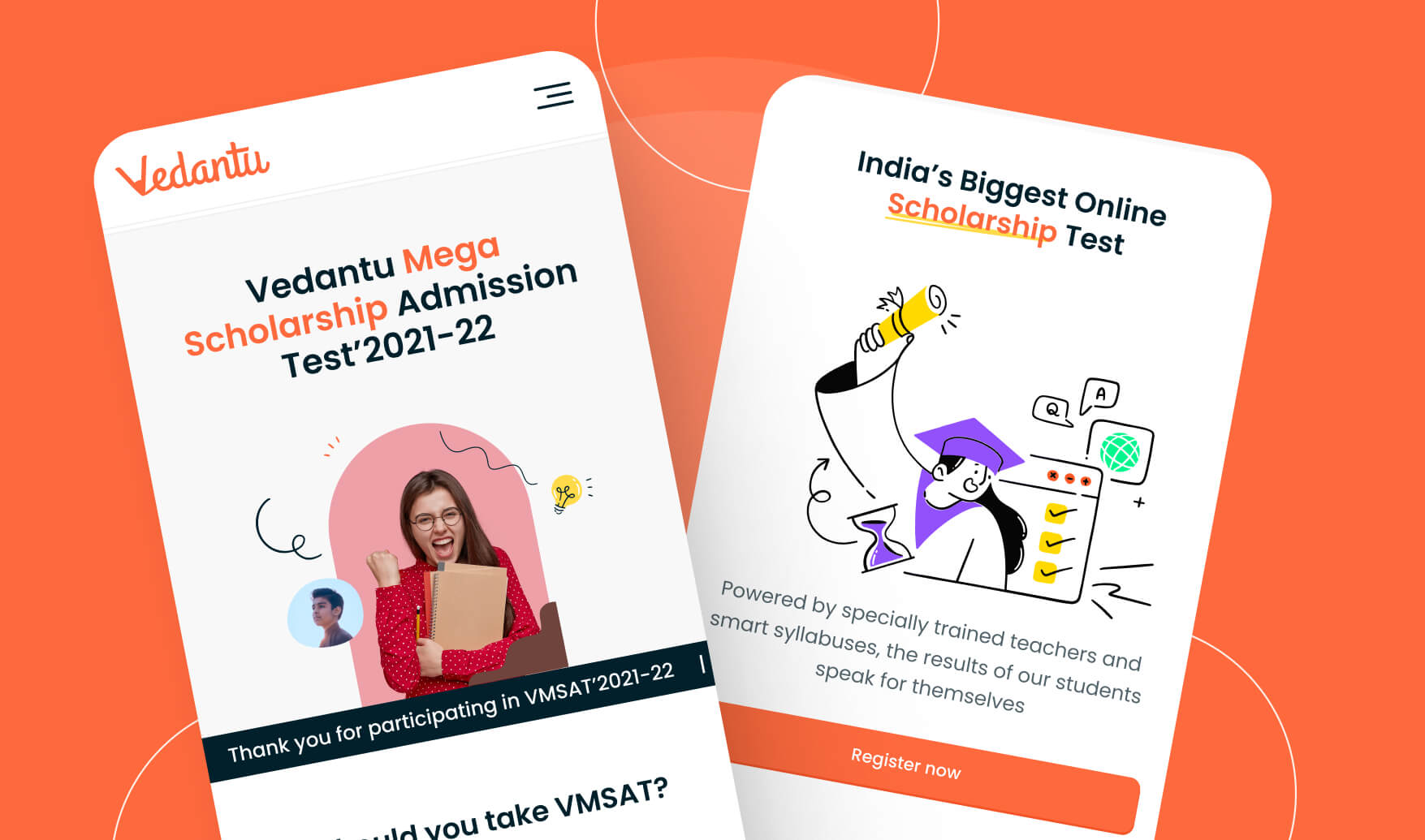
We created a modern website which has a playful feel. We had to ensure that we present the USPs in an interactive yet modern manner to make it appealing.
The
Impact
Our minimal and subtly playful web and mobile redesigns were well-received by the Vedantu team. The illustrations, icons and other imagery that we designed for them also impressed the founding team. Collectively, our efforts resulted in increase in Vedantu's user conversion rate.
It was wonderful working with the Brucira team. We wanted to push the envelope by building a design system that truly embodied the spirit of Vedantu. Brucira helped us find a design language that was unique, bold, and reflected the fun and quirky world of Vedantu.


