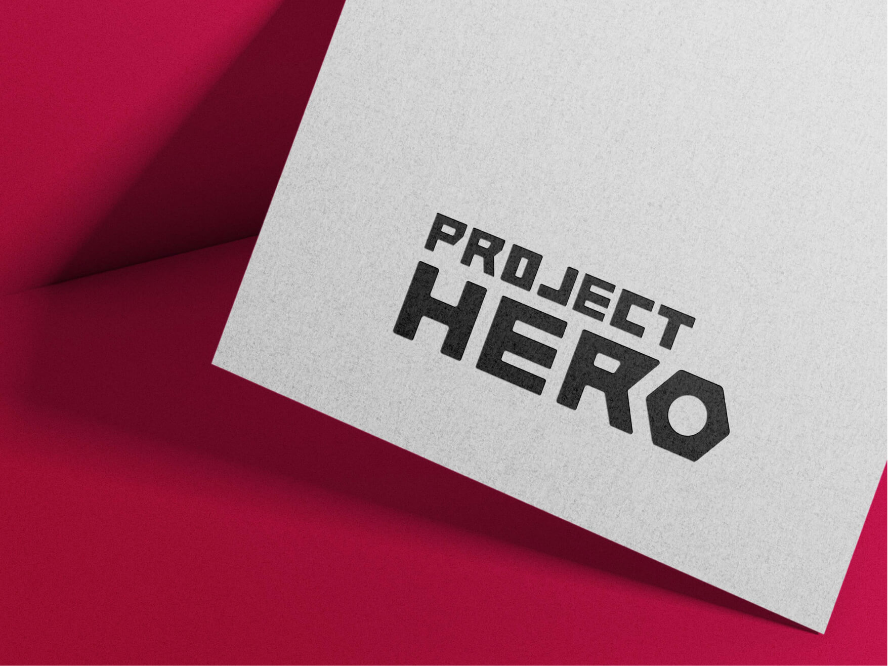
Powering the new logo of ProjectHero

Overview
Project Hero is one of its kind company that connects workers with customers. Using its easy-to-navigate customer app, users can book professionals for a variety of construction site-related services, ranging from cleaning, electrical installation and repair, plumbing, carpentry, and painting, to masonry and construction labouring.
The Project Hero team conducts a detailed background check on professionals before hiring them and they have considerable prior experience.
The logo represents a vital element of every business. It has to stand out to create a brand recall, build trust and define the core goals, and vision of the business. It also needs to visually communicate the touchstones of the business and thereby create its brand.
We designed a minimalistic yet striking logo to distinguish Project Hero as a new product in its segment. It was created using core colours like white, black and brick red to strike semblance and subtle distinction. Out-of-the-box typography, fonts, and visual details were thoughtfully chosen to make it stand out.
Services
- Logo branding


The Need:
As Project Hero is the new product in its niche, we were briefed to create an iconic logo that cuts through its competition.
The overall visual identity has to strike a great first impression, grab attention and establish a connection with its target audience.
The core function of the logo was to create a strong foundation for the potential brand of Project Hero.


The Challenges:
The biggest challenge was to design a logo in a way that the brand is perceived uniquely in the industry. At the same time, it had to invoke trust, and credibility and create a recall in the minds of its target audience.


The Approach:
During the first phase, we understood what the brand Project Hero embodies and identified its long-term goals. Accordingly, we thought about the brand voice, USP and how it needs to be perceived by its target audience.
Next, we researched their industry to understand the logo styles used by the competitors.
We invested some time to sketch plenty of ideas, as it is easy, fast and an effective brainstorming tool.
After multiple rounds of iterations and client feedback, we created digital drafts using vector software.
As we were dealing with the construction-related branding, we decided to go with a shade of brick red and a combination of black and white that complemented well and created a high contrast with the primary colour.


The Impact:
The Project Hero team was satisfied with the way logo branding has come up. The final version of the logo was as per their expectations i.e. to be unique among their competitors.
They also appreciated our efforts, and approach to transforming their brand through our research and creative execution.


