Equipping EasyA Tutors with an Intuitive Platform

Brand Overview
EasyA is a London-based company that offers a unique, modern, and easy approach to mathematical learning for students. Offering on-demand 1:1 math tutoring to students, EasyA ensures that students get the required help they need to ace their exams.
Students are able to connect with their tutors by merely snapping a photo of their maths question. They are then matched to a tutor who can help them. EasyA is founded by two Oxbridge and Ivy League university graduates who used to be former tutors themselves. EasyA is built on the idea that the sooner students get help, the better they learn.
Brucira's Services
- App design
- UI development
- UX development
- Illustrations

The Need
The Covid19 pandemic has made accessibility to virtual education a necessity. Students around the world are studying in virtual classrooms. This shift from physical, in-person teaching to virtual learning has been fraught with difficulties in engaging students.
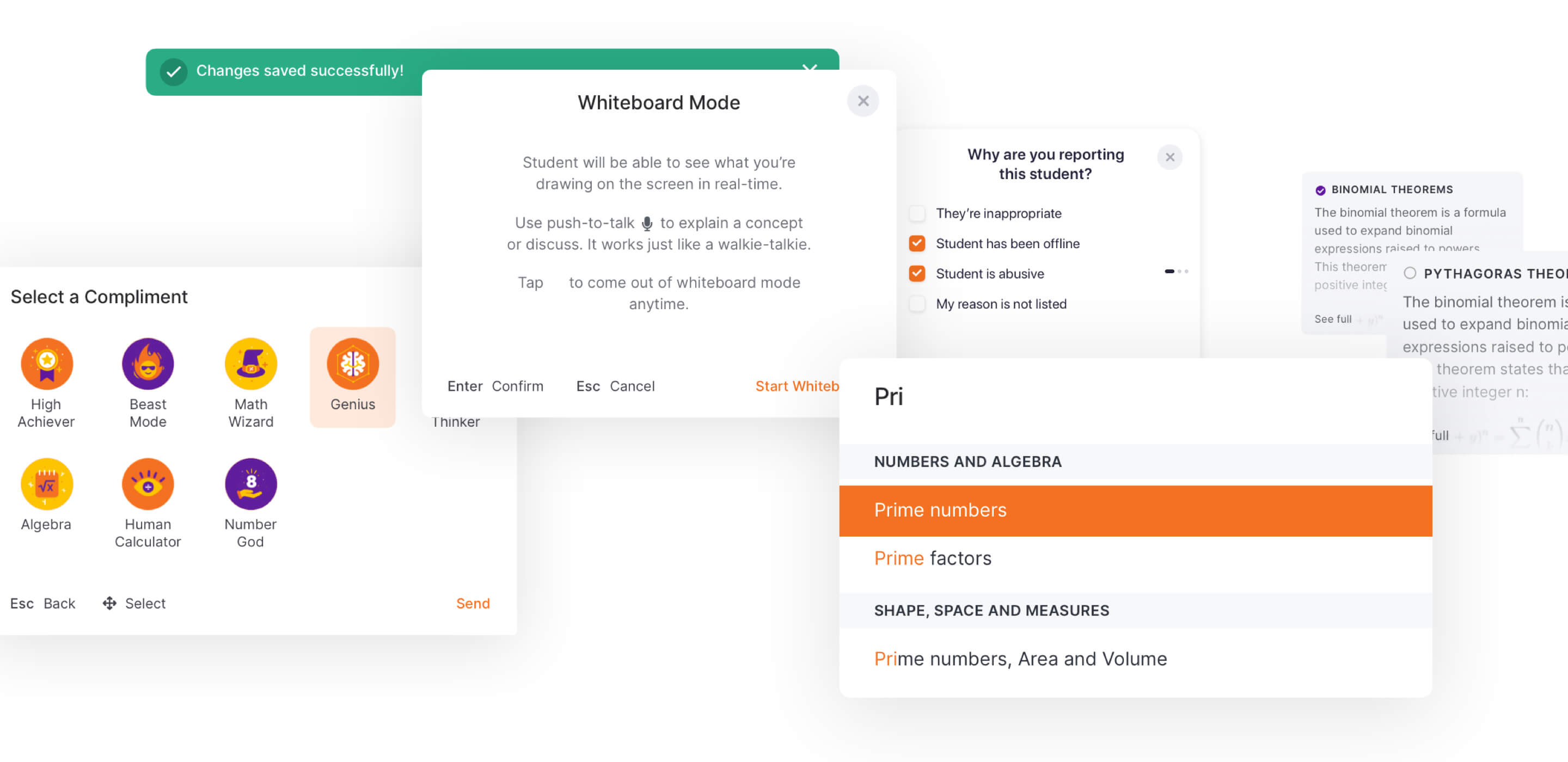
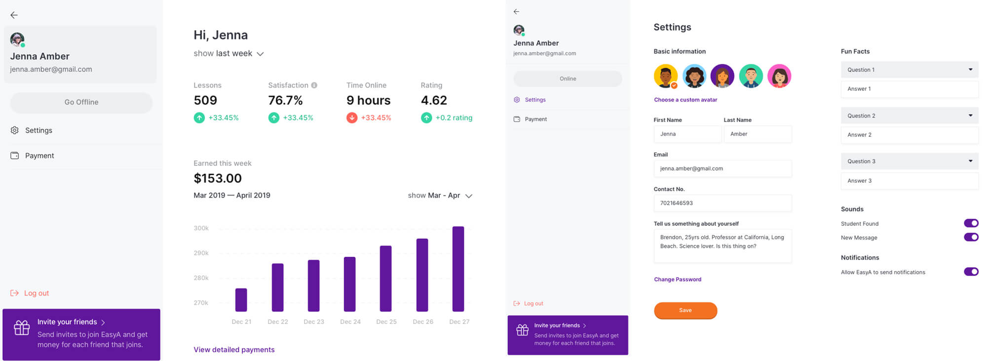
EasyA needed a simple, easy-to-use Tutor dashboard and virtual technology teaching solution for its tutors. This had to be the fastest method to allow for clear student-tutor interactions facilitating an instant problem-solving approach.

The Challenges
Brucira began working on designing an attractive app for EasyA by:
- Accurately understanding the product itself and the reasons behind it.
- Researching the pain points faced by users when interacting with a tutor-student app.
- Understanding app-specific flows and interactions to present the relevant information appropriately on the app-screens.
- Designing the app to be tutor-friendly, i.e. easy and quick to use.
- Creating an interactive, interesting app that would stand out among competitors.
- Ensuring it was responsive across all mobile devices.
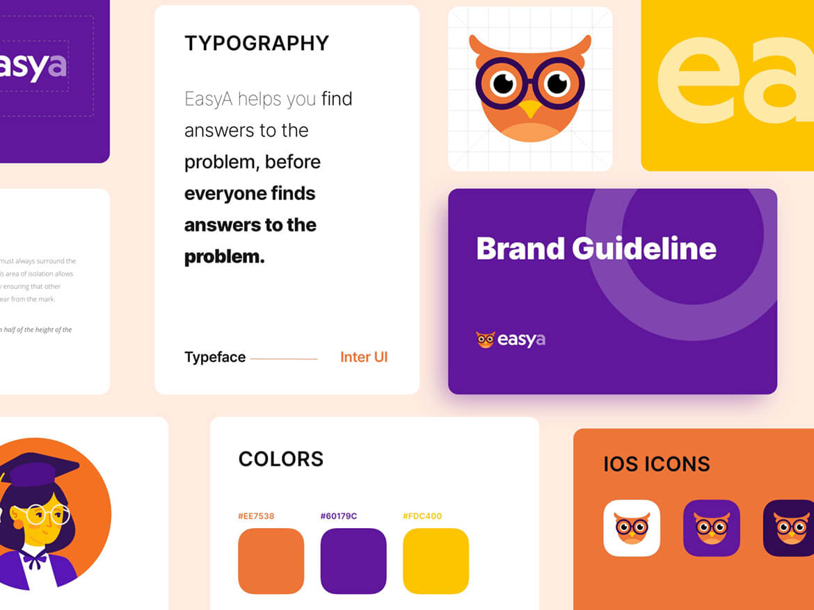
- Communicating EasyA’s brand identity and ideals through the design.

The Approach
Brucira started by understanding the processes needed for a tutor-facing app. In order to create a memorable user experience, we went back to the basics and rebuilt the foundations of the product.
With our navigation framework, we visualized the way tutors move through web apps in order to make their interactions with students easier, meaningful, and intuitive. Interactions needed to be on the same level across functionalities and features — profiles, chats, etc. To ensure the transitions were subtle, we added fundamental interactions for movements between these levels. We also kept in mind that EasyA had existing tutors who needed to easily understand the new processes.
Our main colour palette relied heavily on the contrast between bright, vibrant colours and neutral ones. We defined specific colors for certain states: purple as a connection to students, orange as the main color used for highlights and calls to action. For the backgrounds, we used lighter versions of the main ones.
In order to add to the appeal of the app, we added exciting animations for a tutor tapping into a student to offer a special feeling. This resulted in an upgrade felt by both the students and the tutors. After all, it’s a great feeling to know you can help someone solve their queries!
We kept in mind the functionality of today’s devices while designing something that would be just as viable in the future. The app was designed to be functional and responsive across all mobile devices and this was treated as a priority right from the get go.


The Solution
Available on both iOS and Android, the new EasyA app allows tutors to focus on content that is better organized and more easily accessible. Tutors already face problems explaining difficult concepts to students in the current virtual education environment and we wanted to ensure that this app would help them focus on what was truly important: the students and their problems.
The app allows students to ask a question and receive guidance from their tutors with only a few clicks. In order to ensure that the end-user (the tutor) faces no difficulties, we built it like a native app — where the platform adapts to the device. Across devices, the components remained in the same place, merely adapting to differences in screen sizes.
EasyA tutors also received a bonus feature: Dark Mode. This let the users focus more on the platform without being tiring on the eyes.
We also kept detailed documentation that we updated regularly throughout the design process as a single source of truth. This ensured efficiency in our workflow & avoided any issues if there needed something to be reworked.
The Impact
The EasyA app was appreciated by the client, particularly due to the care taken to ensure workflows and processes were easy-to-use for tutors. The app was functional without compromising on a modern, attractive touch.
Instead of creating something generic for students and tutors, Brucira developed an interactive experience using photos that helps students feel more comfortable and the tutors, more approachable. This allows the students to seek the necessary help for their maths doubts without any hesitation.
Important Links
Brucira's team made our entire platform so exciting. The finesse executed by these professionals in the available time was something that surprised our entire team - including professors and students. Every illustration, every workflow was carefully looked into and beautified by this team. Looking forward for a chance to interact with them again, pretty soon!


