Recreating user-friendly interfaces and extensions for Evoshare
EvoShare is a financial platform that helps users to save for retirement. It is powered by cashbacks that users earn through spending.
- Advertising
- Artificial Intelligence
- Illustration and Iconography
- Research
- UI/UX Design
EvoShare is a financial platform that helps users to save for retirement. It is powered by cashbacks that users earn through spending.
EvoShare is a financial platform that helps users to save for retirement. It is powered by cashbacks that users earn through spending. Whether the user is an employee, employer or a strategic partner, Evoshare helps to save their 401(k) or 403(b) while shopping online and even locally at stores, bars, and restaurants. It also allows users to spend at their favorite businesses, and receive up to 20% cash-back towards their retirement plan through their employer. Moreover, EvoShare also collaborates with many companies in the retirement industry. It contributes to their long-term mission of creating sustainable retirement funds for everyone.
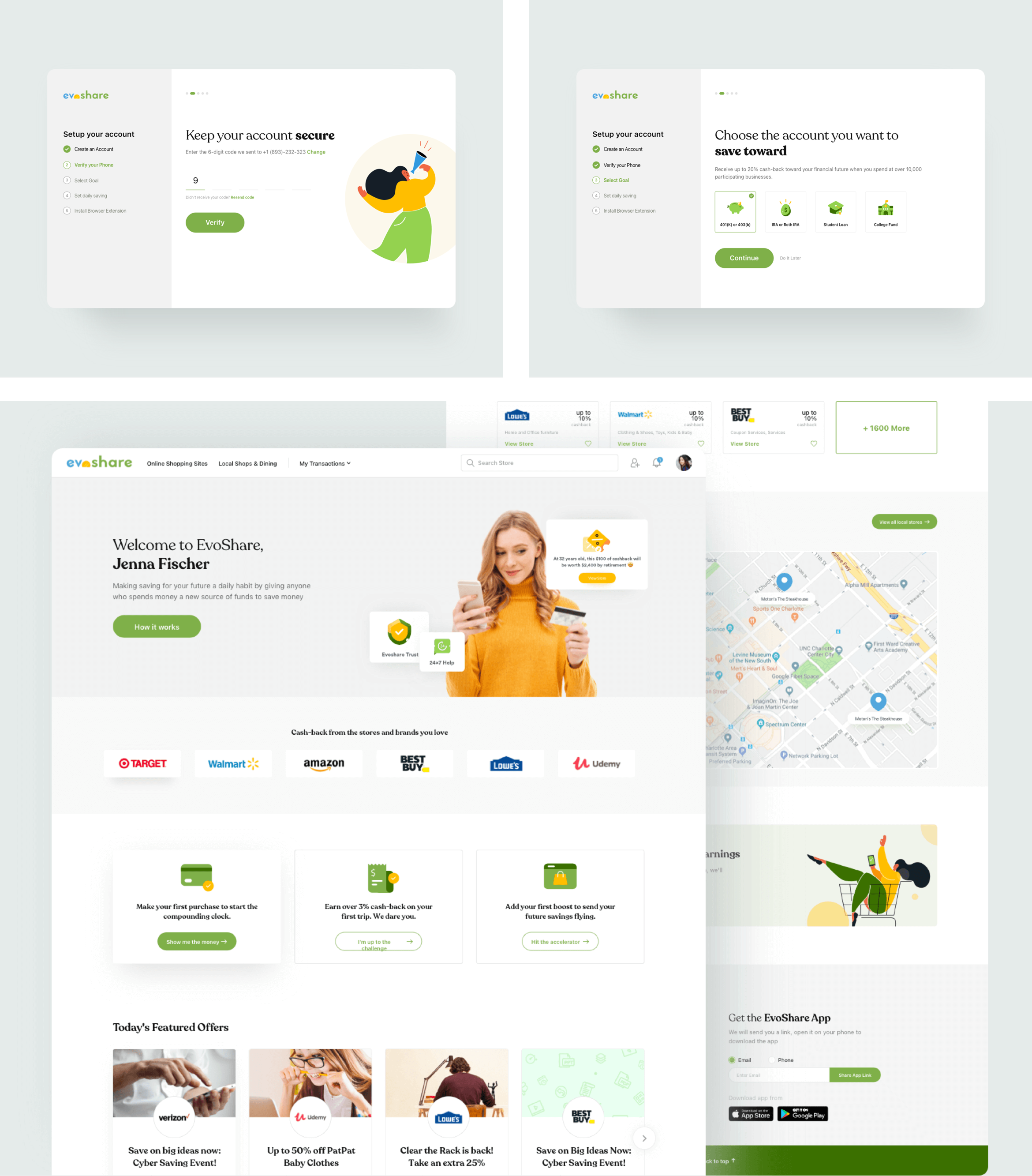

We were briefed to create a website that would motivate users to save for retirement. Powered by cashbacks earned on their spending, users could secure a sustainable source of retirement funds. Hence, it was essential that the product redesign reflects the same all through the website. It would also help the product for converting more leads into active users. We also had to design an interface that was easy to use and comprehensive.
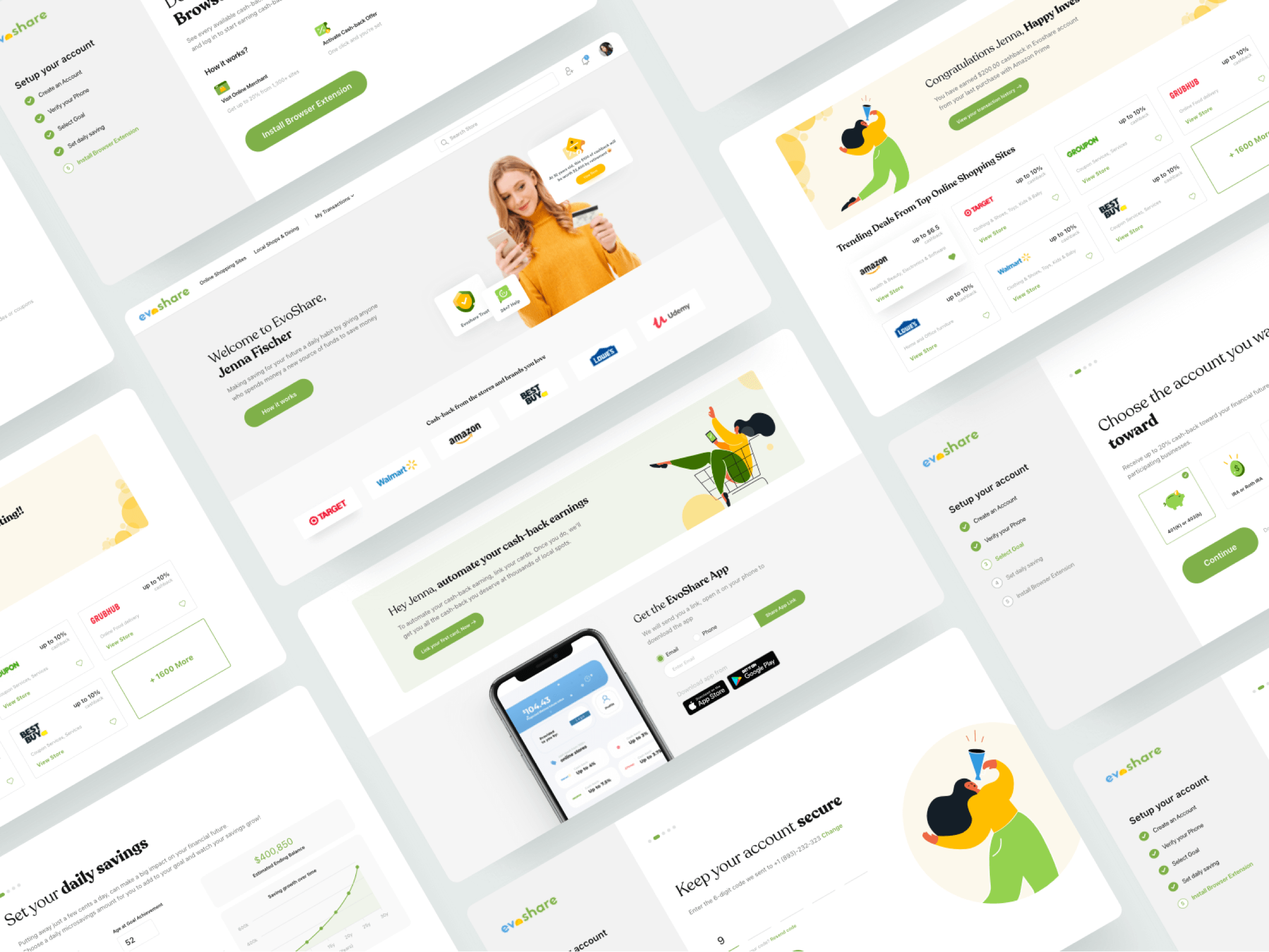
Evoshare was facing some friction with its customers’ experiences with the product. This resulted in a poor activation rate. Therefore, our team decided to redesign their website structure. We revamped it by creating an aesthetically pleasing and highly usable website.
We had to redesign the website, mobile web and extensions in order to achieve the following primary goals:
- Shop Focus: Inspire the user to spend and shop more using evoshare.
- Ease in Discovery: Reduce the user’s efforts to discover the latest and top stores on the product they need.
- Intuitive Interface: Create a highly engaging interface that works the way users expect it to.
- Easy navigation – Switching between the features had to be made more clear and legible
- Access to essential information – Enabling one click access transactions, cashback, user profile with the help of the top static menu.
- Ease to Understand: Creating a user-friendly website rather than a dashboard based website to make the process of shopping more natural.
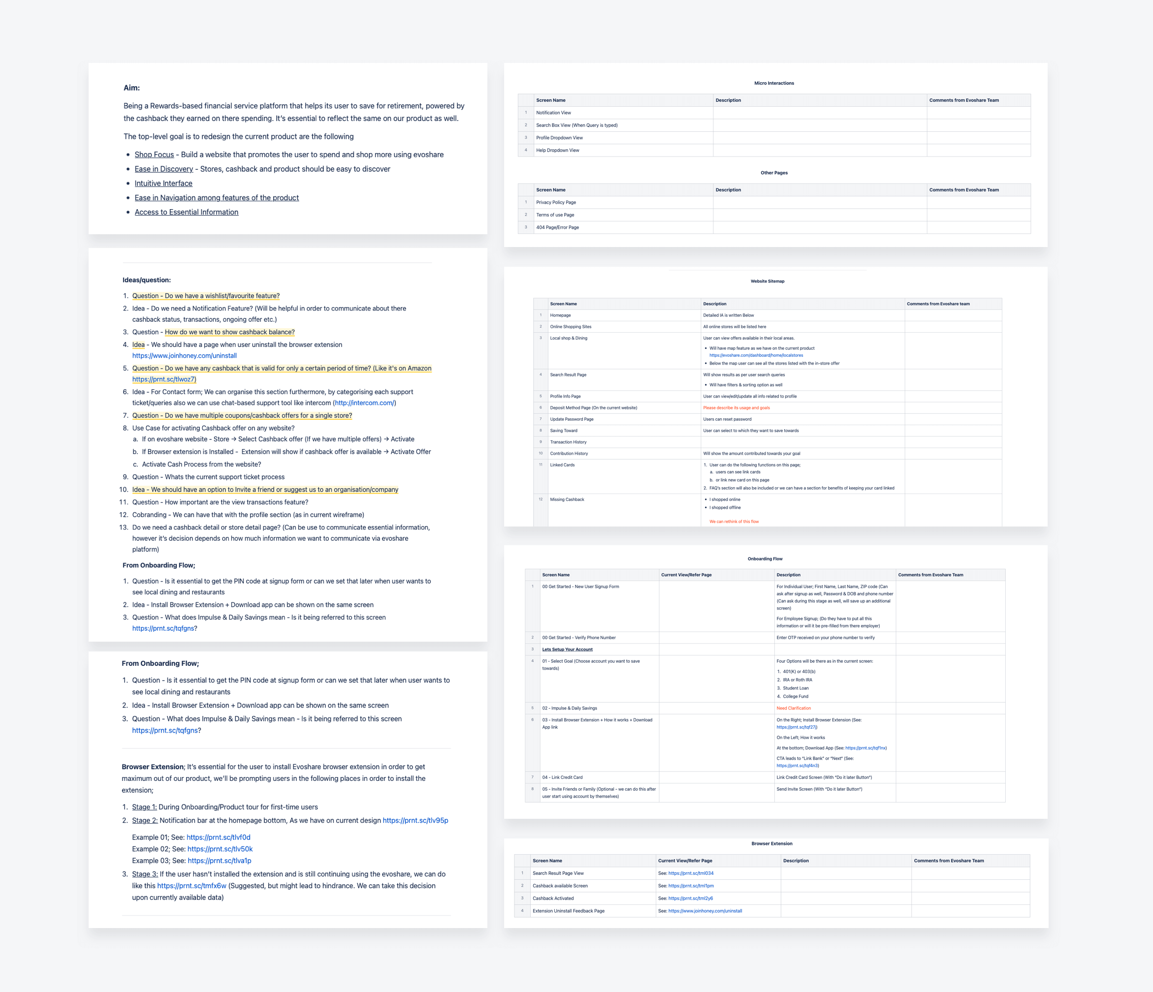
- While working on the project, our team ensured a user-centric approach, combining the structure and experience in a certain way to accomplish the goals.
- During the first phase, we collected the user requirements for defining the product.
- The research helped us to develop an understanding of the competition in the existing domain.
- With the help of analysis, we created two approaches or design directions to proceed further. One was a dashboard based approach (current flow) and second was the website based approach which was preferred by our team.
- After weighing the pros and cons we decided to go with the website based approach as it will help us to create a website that will be more structured, functional and highly usable.
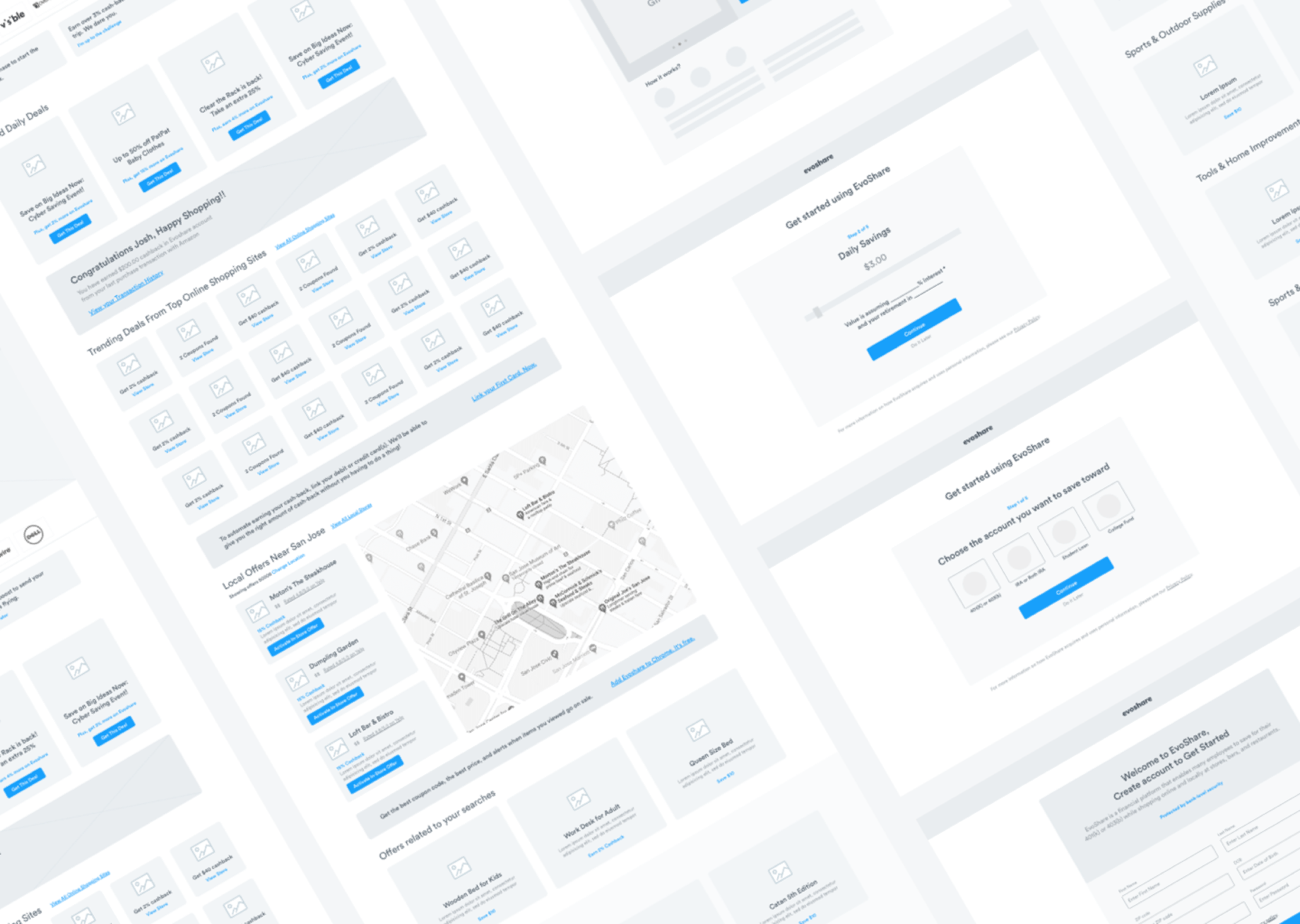
- Considering all the inputs from the research phase, we created wireframes followed by high-fidelity prototypes. We followed an iterative design process that allowed us to resolve problems at an early stage.
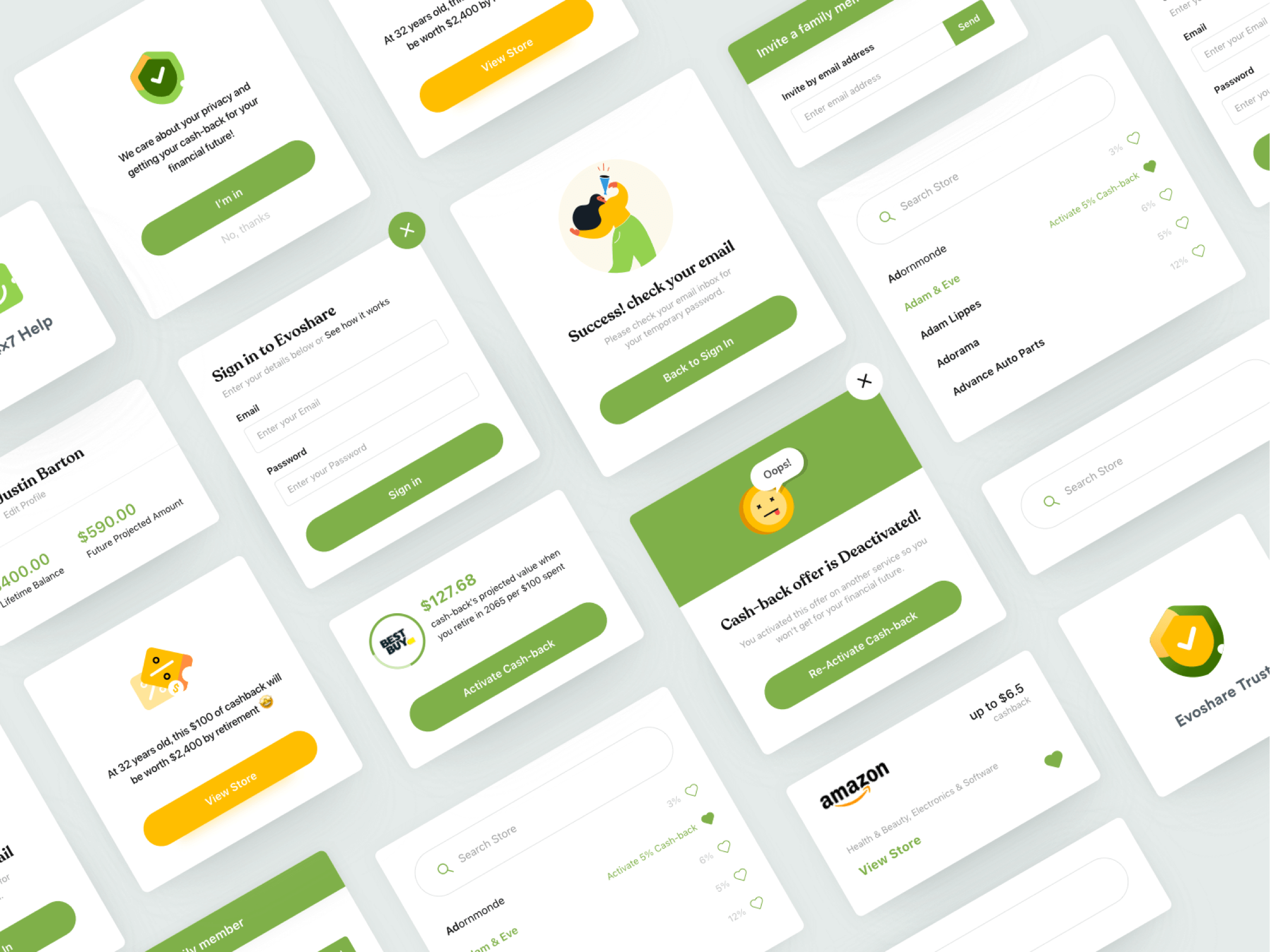
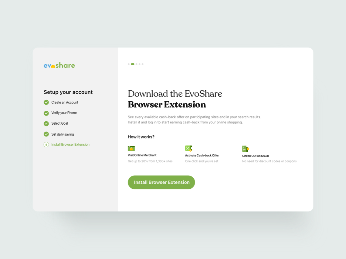
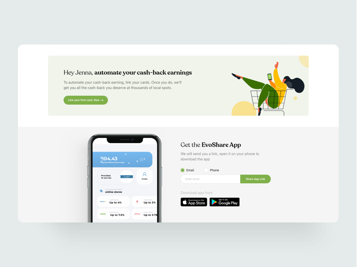
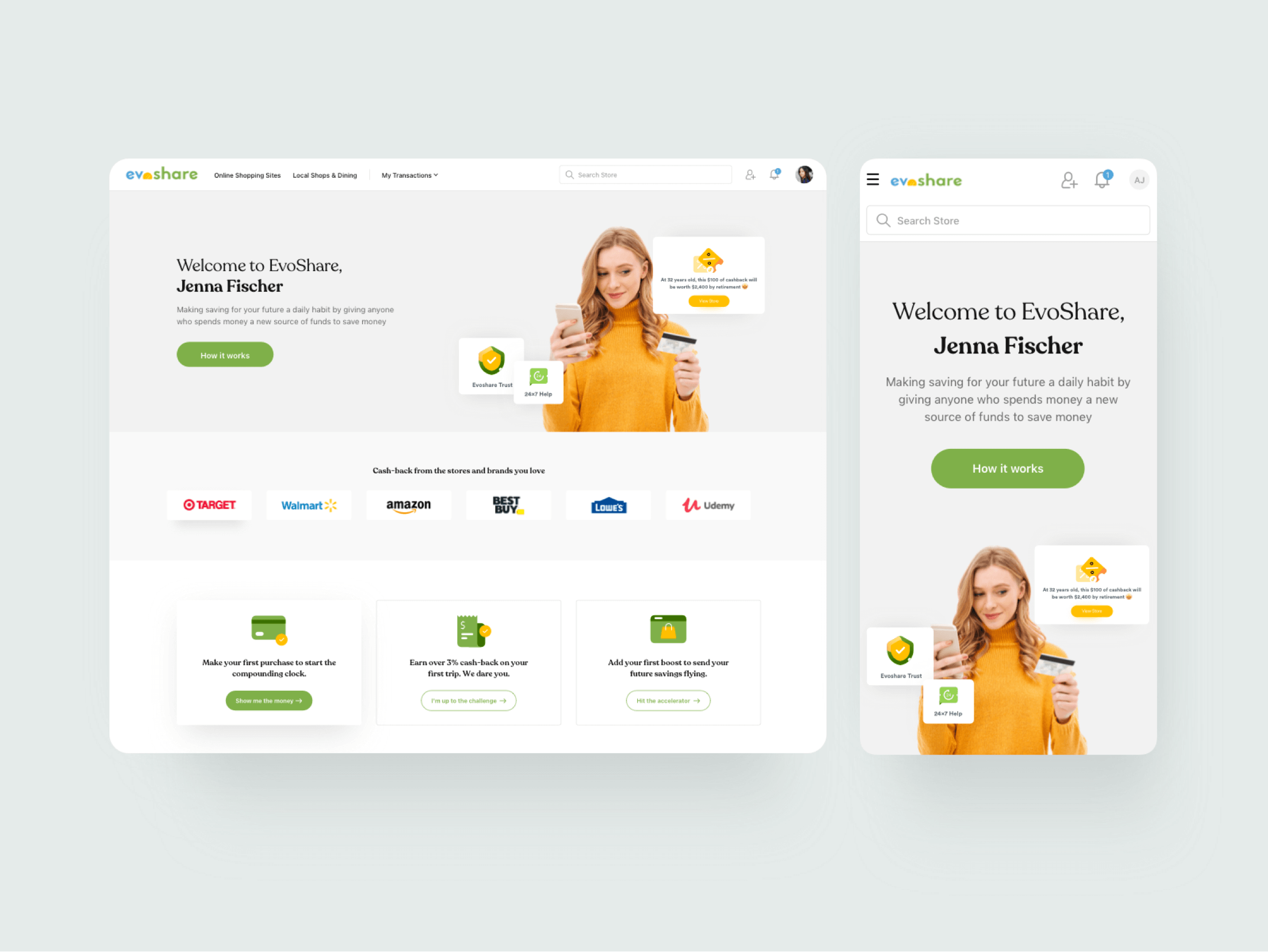
Users and the product of EvoShare were the primary focuses all through this project. Our deliverables were aligned with them in following ways:
- Landing Page gets the maximum traffic. It also receives maximum attention from the user. Hence, it had to consistently reflect the vision of the brand and generate leads for future conversion. Therefore, landing page redesign was done keeping in mind that the users are encouraged to take action and also build their legacy through customer retention and increase.
- We replaced the hamburger menu and left side open drawer navigation bar with the top navigation bar displaying the important or top level navigation links. This simplified user experience and improved accessibility.
- We helped in displaying the search bar prominently in the navigation bar so that the users could conveniently find the stores and discover them without any hassles.
- Whenever users type in the search bar, query suggestions could help them. We kept it in mind and redesigned it to align users with strategic business goals. This also reduced the prompts of the “no results” page.
- We aligned copy and high resolution imagery to accurately display the immediate benefits that the user could avail on using the product. This helped in building trust for potential conversions.
- Call to action inspired users to connect with the brand. So, we ideated and rewrote its copies throughout the website. This helped the users to quickly understand what happens next after tapping the CTA.
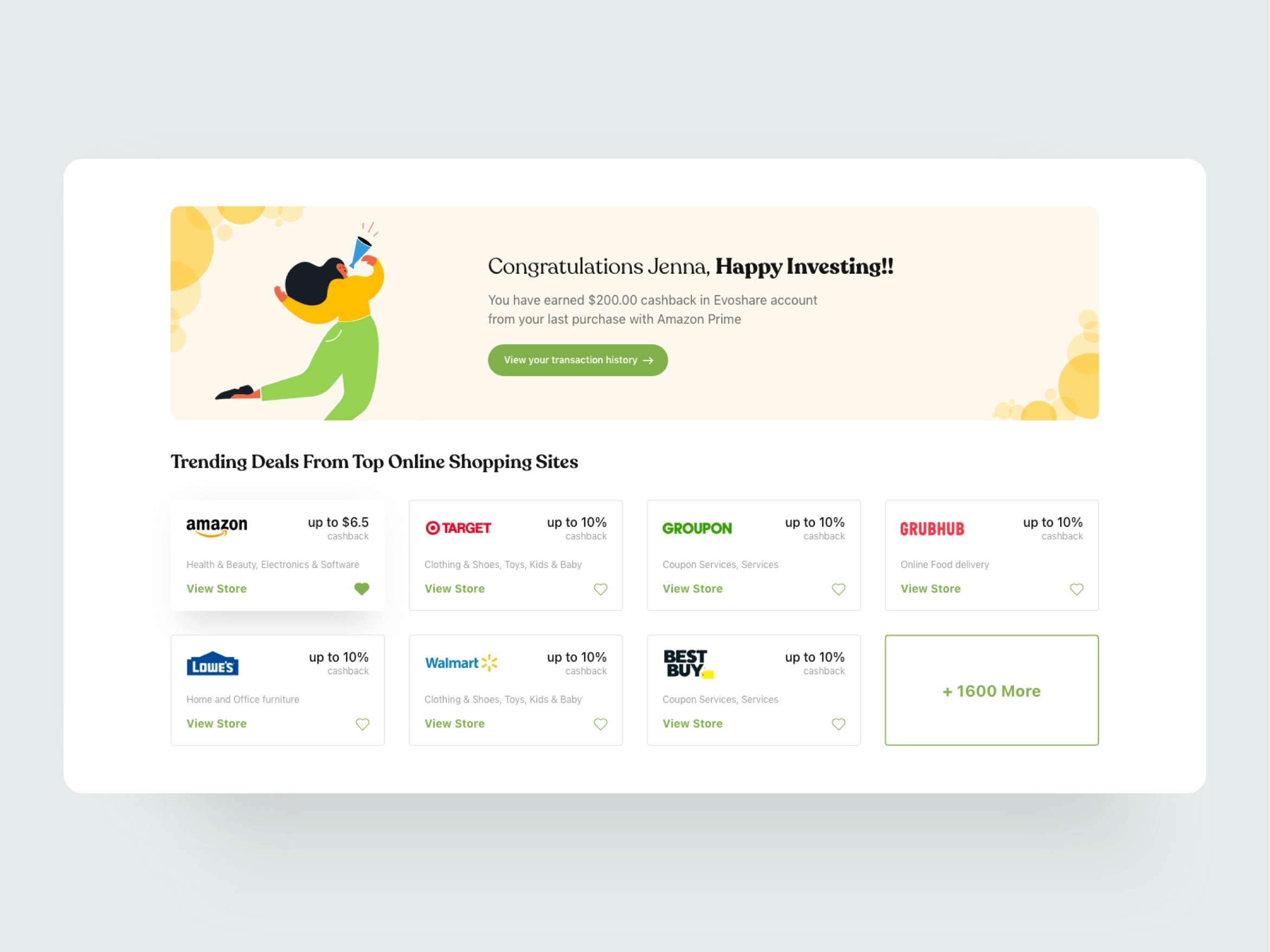
- We proactively used the landing page to communicate the trending deals and offers which act as an incentive and motivates the users to take the required actions.
- Throughout the website, we dedicated sections to educate users about installing the extension and mobile app of EvoShare.
- To curb the waiting time on the website by some degree, we displayed the offers on the redirecting screens to keep the users engaged.
- To guide users and offer a potentially great opportunity, we filled the empty states with calls to action like “Start Shopping”.
As briefed by the team, we created a website that was not only aesthetically pleasing, minimal but also offered effortless experience. Our efforts helped in creating seamless navigation for EvoShare by focussing on features and functionality of the product. Through comprehensive planning, our team could approach the brief in a precise, efficient way and thereby meet the expectations of the EvoShare team.
Our Role
Our role was to design a website that educates users, showcasing evoshare services and core philosophy effectively.
Product Design
Content
