Designing a kid-friendly app for BeWith.Family
Brand Overview
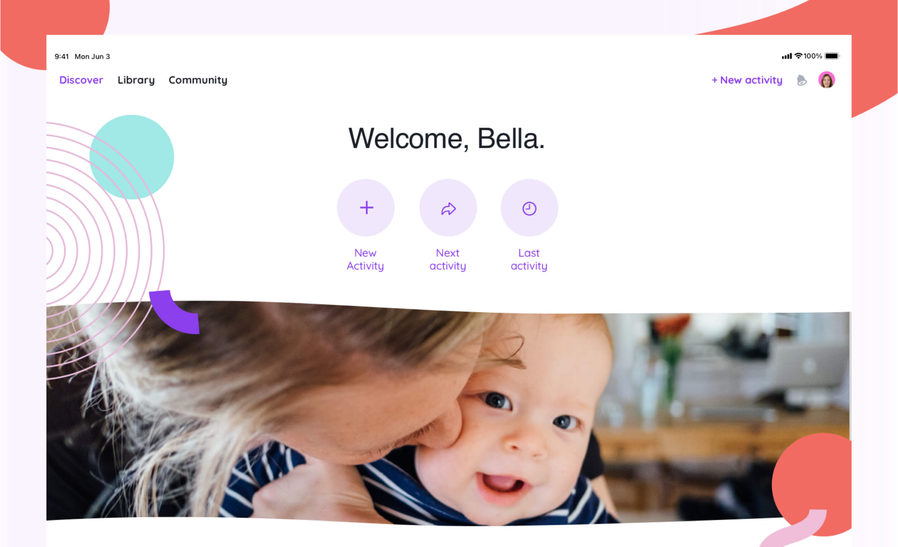
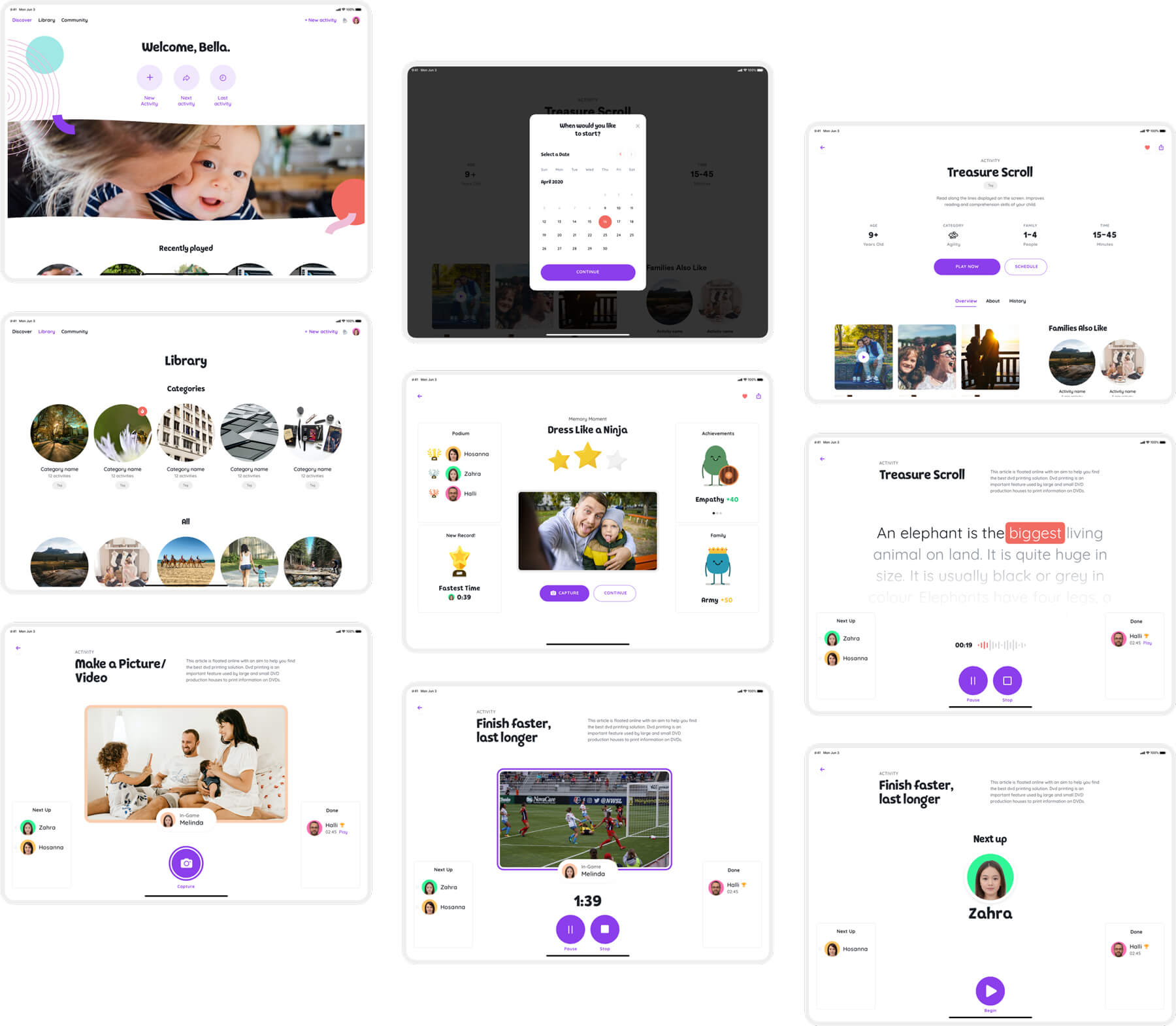
Be with Family is an iPad app that is directed at your kid’s development through entertaining experiences. The app guides your child through real-life situations on a screen and incorporates learning through fun. As a caregiver, you receive data and insights, which can help you guide your child to make better decisions in life.
Be with Family enhances your child’s interactions with their family members. The app explores familial dynamics through the use of technology, child psychology, behavioural sciences, big data, and analytics to direct guided activities in the real world. Be with Family operates within the healthcare and educational sub-markets of serious games — these are games that are designed for a primary purpose other than pure entertainment.
Brucira's Services
- Product Design
- User Experience (UX)
- User Interface (UI)
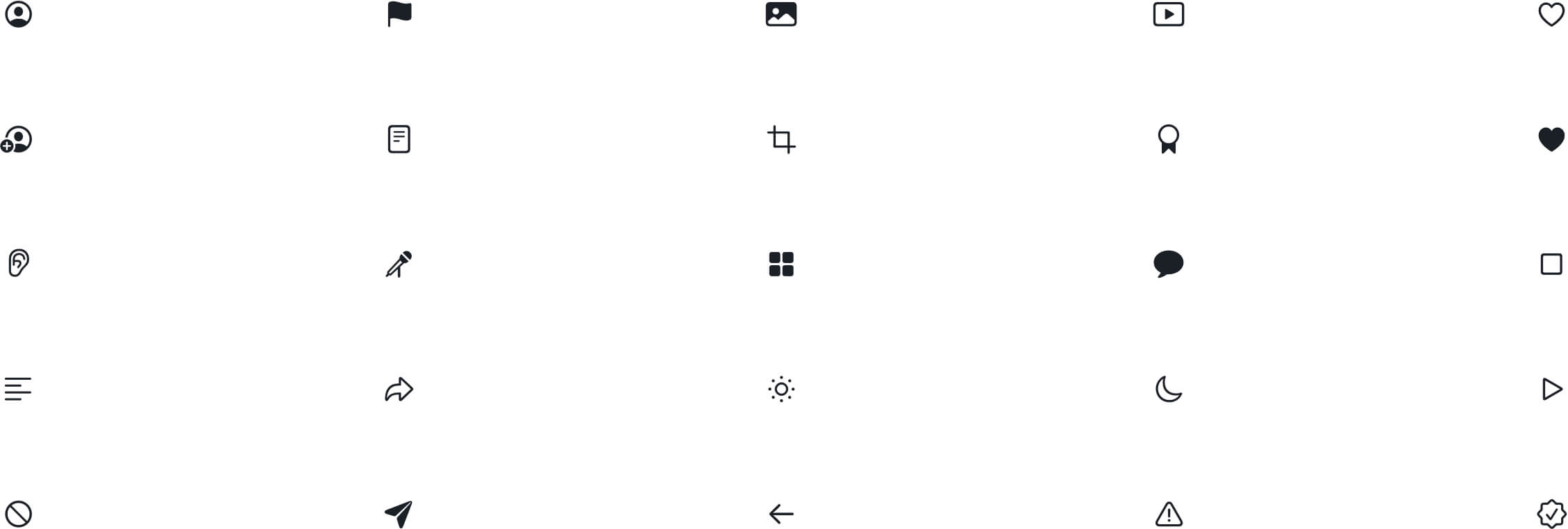
- Iconography
- App Design
The Challenge
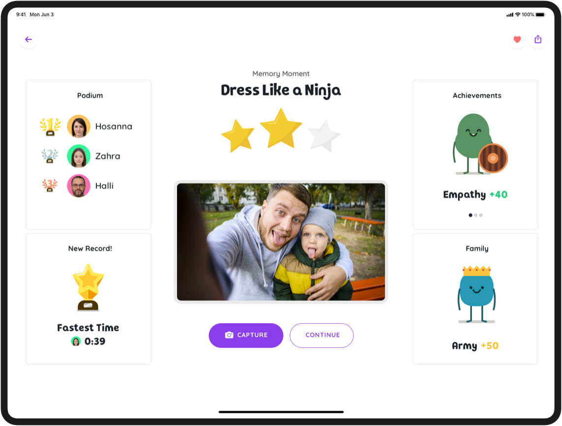
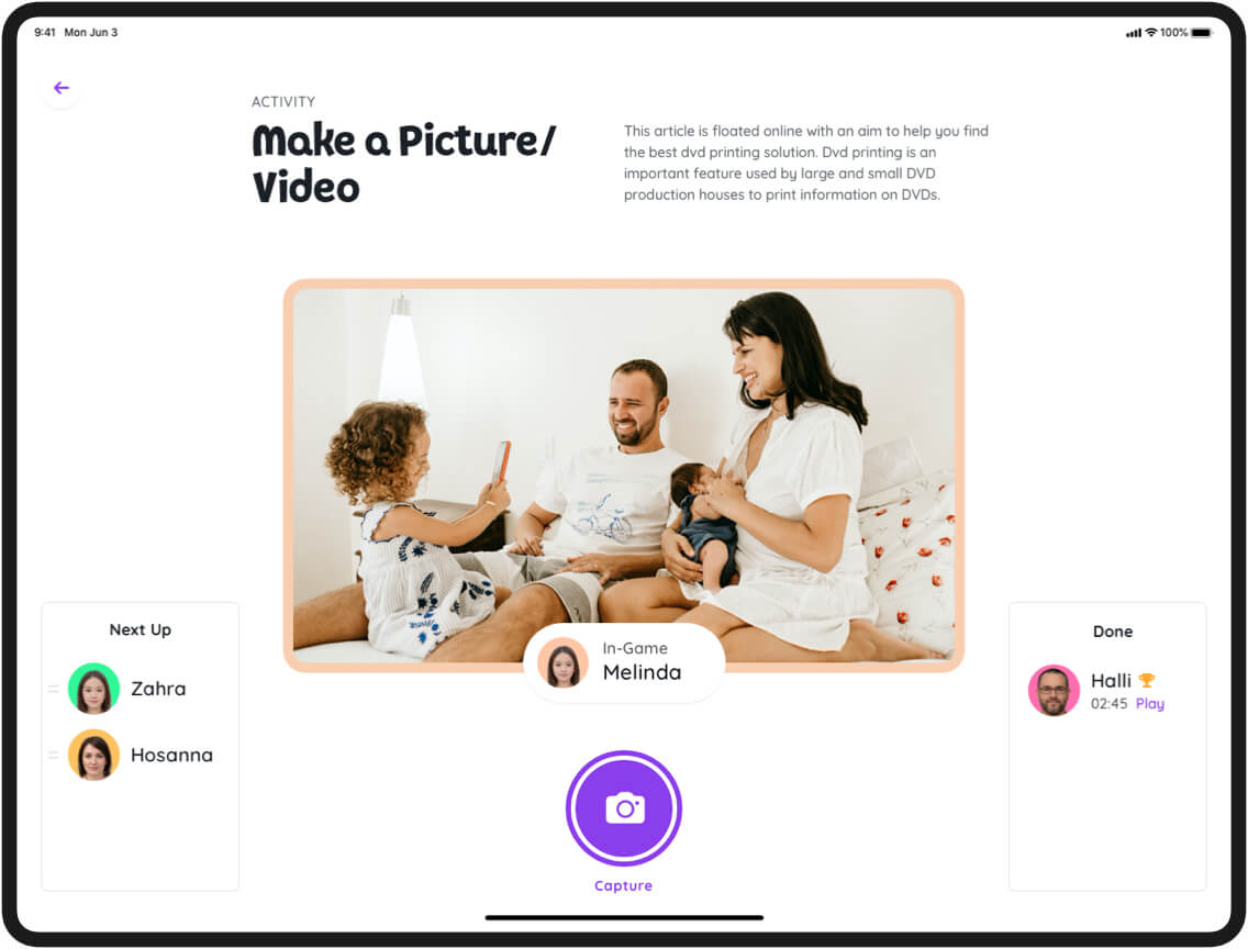
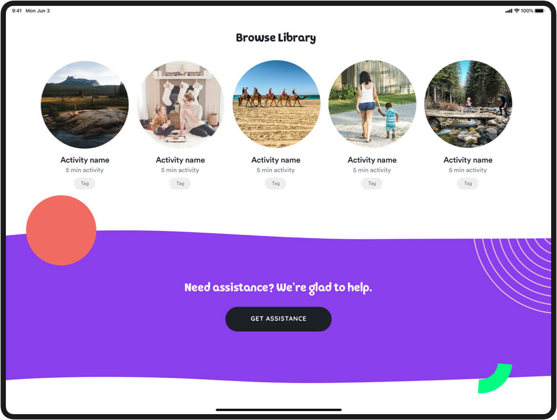
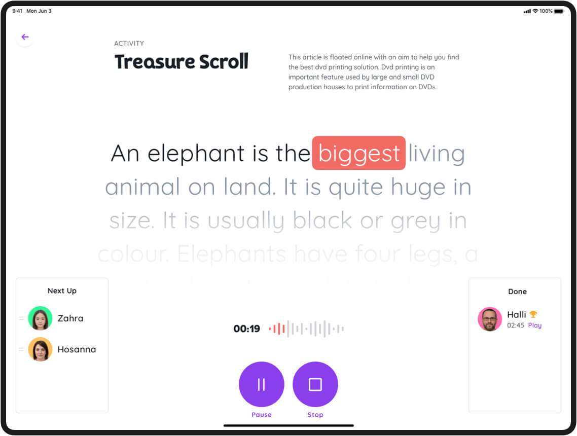
The task at hand was to design the entire app from scratch. Be with Family was developed to offer both educational development and entertainment for kids. Since this was to be launched primarily for iPads, the app had to be designed for iOS.
Some of the other challenges of the task included:
- Properly understanding the app’s architecture.
- Defining workflows and shaping the UI (User Interface).
- Identifying all user pain points and the functionality needed to address them.
- Ensuring the app was kid-friendly.
- Quick turnarounds.
Iconography
The Approach
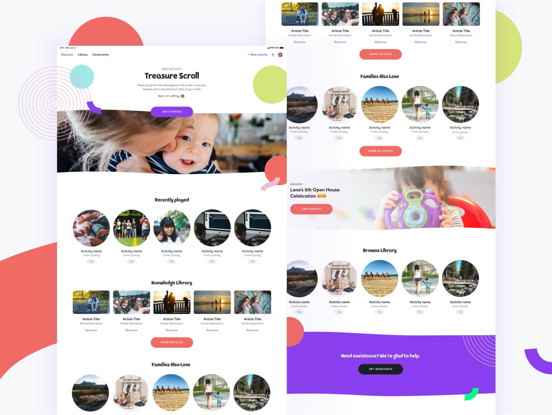
Brucira worked in tandem with the in-house team on a speed-design sprint to ensure that the app would be completed within an extremely tight deadline. Our approach included the following:
- Coming up with a Minimum Viable Product (MVP). An MVP serves as the most basic version of a product that can be offered to customers. This allows the company to collect necessary feedback about the product and address any pain points. In other words, it is the simplest version of a deployable product.
- After designing the app structure, a practical user-based style guide was developed. This was to make sure the haptics were kid-friendly and easy to use.
- Brucira incorporated different colours for functions like tap effects, highlights, disabled negative and positive states. The coloursBlue Purple,Raisin Black,Bittersweet, andSpring Greenwere chosen considering the primary users of the app would be kids.
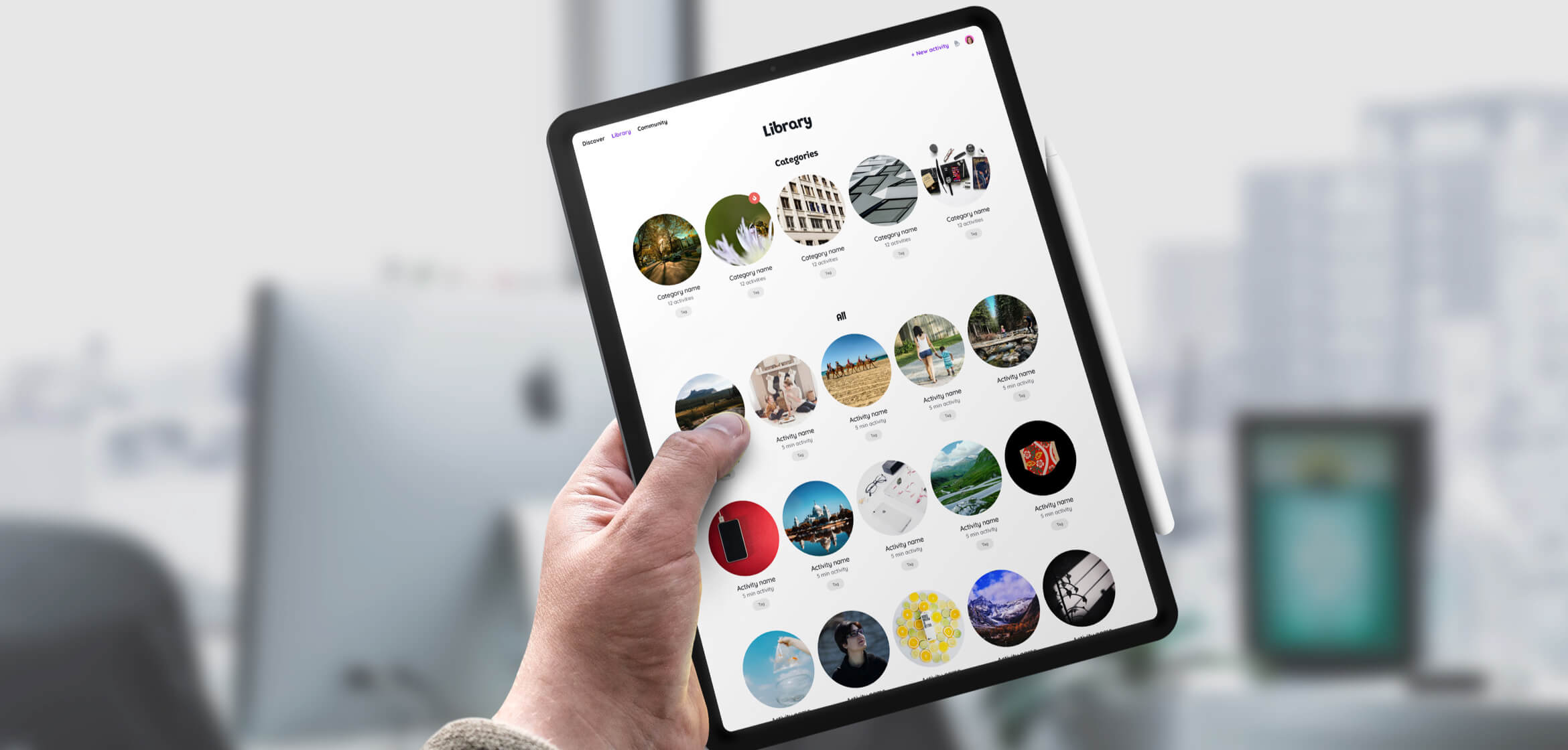
- Three differently sized icons were created to add visual content and enhance the user experience across all sections of the app.
The Impact
The in-app experience designed by Brucira was well-received by the internal team at Be with Family. Be with Family launched to a large number of sign-ups for the demo version of the iPad app.
As the world goes through a life-changing pandemic, the importance of family time has emerged quite strongly. Educational yet fun apps like Be with Family can serve as integral tools to boost the social and psychological development of kids everywhere.
Important Links
View Similar Case Studies
RuttlProduct by Brucira
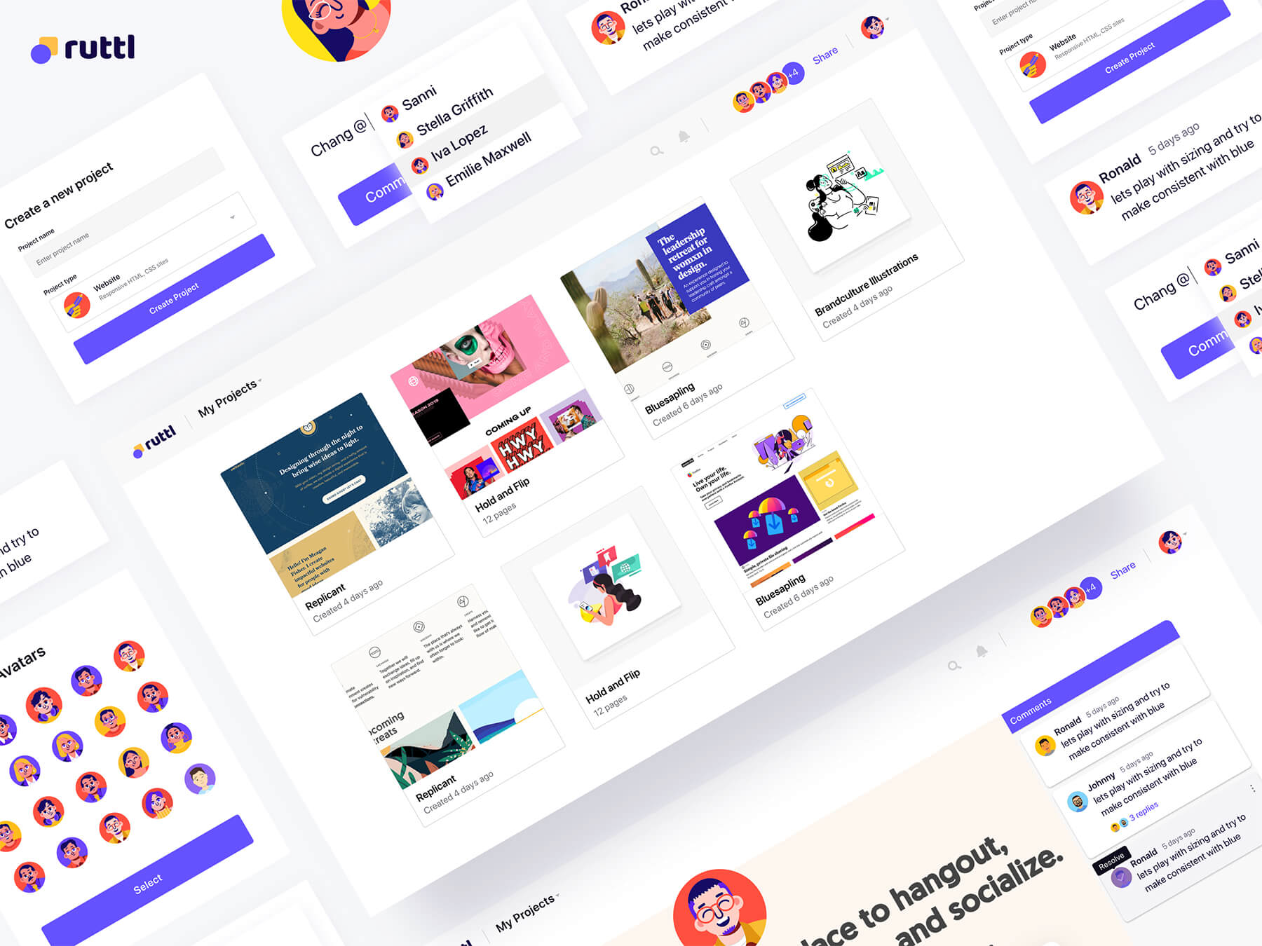
We have developed ruttl, which is a live website review tool.

Easy A Tutor's Panel
Built an app that catered towards both students and tutors, with innovative tutor dashboards and functionality.
FintechEvoshare
Helped Evoshare with research and redesign for their web, mobile and extension.


