Crafting cutting-edge
illustration for RazorpayX
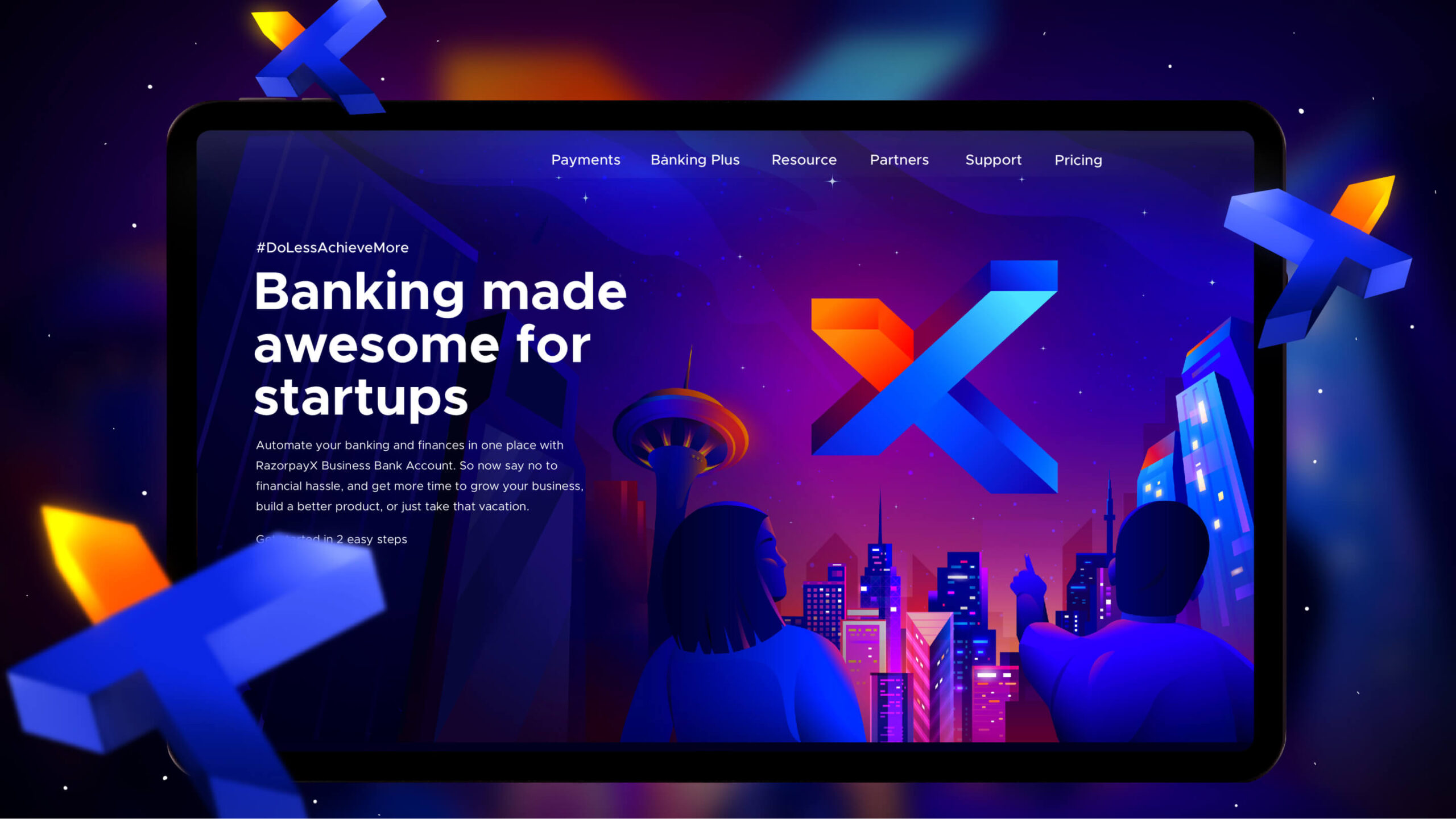
RazorpayX is Razorpay’s new product which helps businesses seamlessly automate their banking and finances. It was created to reduce financial bottlenecks that business owners face while growing their businesses.
- Fintech
- Illustration and Iconography
- UI/UX Design
RazorpayX partnered with Brucira to redesign their landing page with a fresh, engaging visual identity that clearly communicated their brand, offerings, & impact.
Razorpay approached us to redesign their landing page mainly because their existing design was not able to convey the essence of their brand and their offerings. They were not able to strike a connection with the audience or make any impact. We were entrusted to revisualize their landing page and make it user-friendly, creative and impactful.
Being a new offering of Razorpay, RazorpayX needed a fresh and out-of-the-box visual identity in terms of illustrations and iconography. The end goal was to convey the offerings of RazorpayX in an engaging manner so that it sparks the curiosity of users and nudges them to take action.
In line with Razorpay’s brief, we designed illustrations that conveyed the tech capabilities of RazorpayX with a nice touch of story. We had to strike a balance between the storytelling and the actual offerings of RazorpayX.
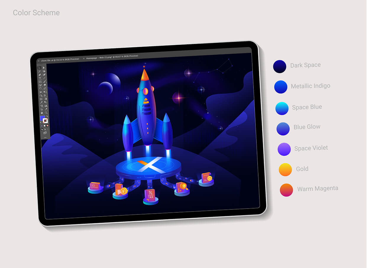
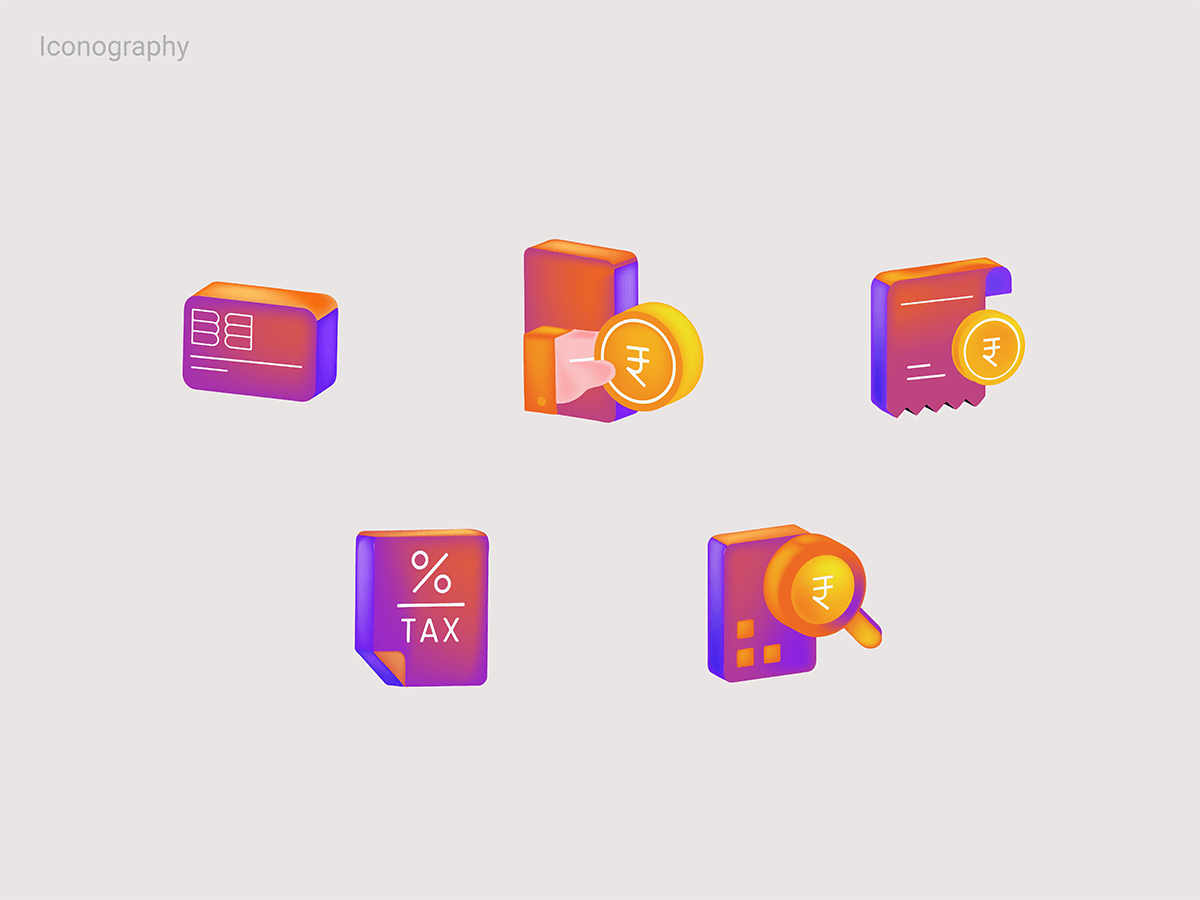
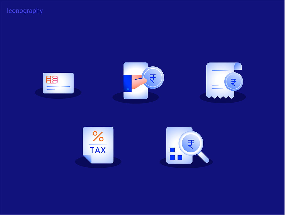
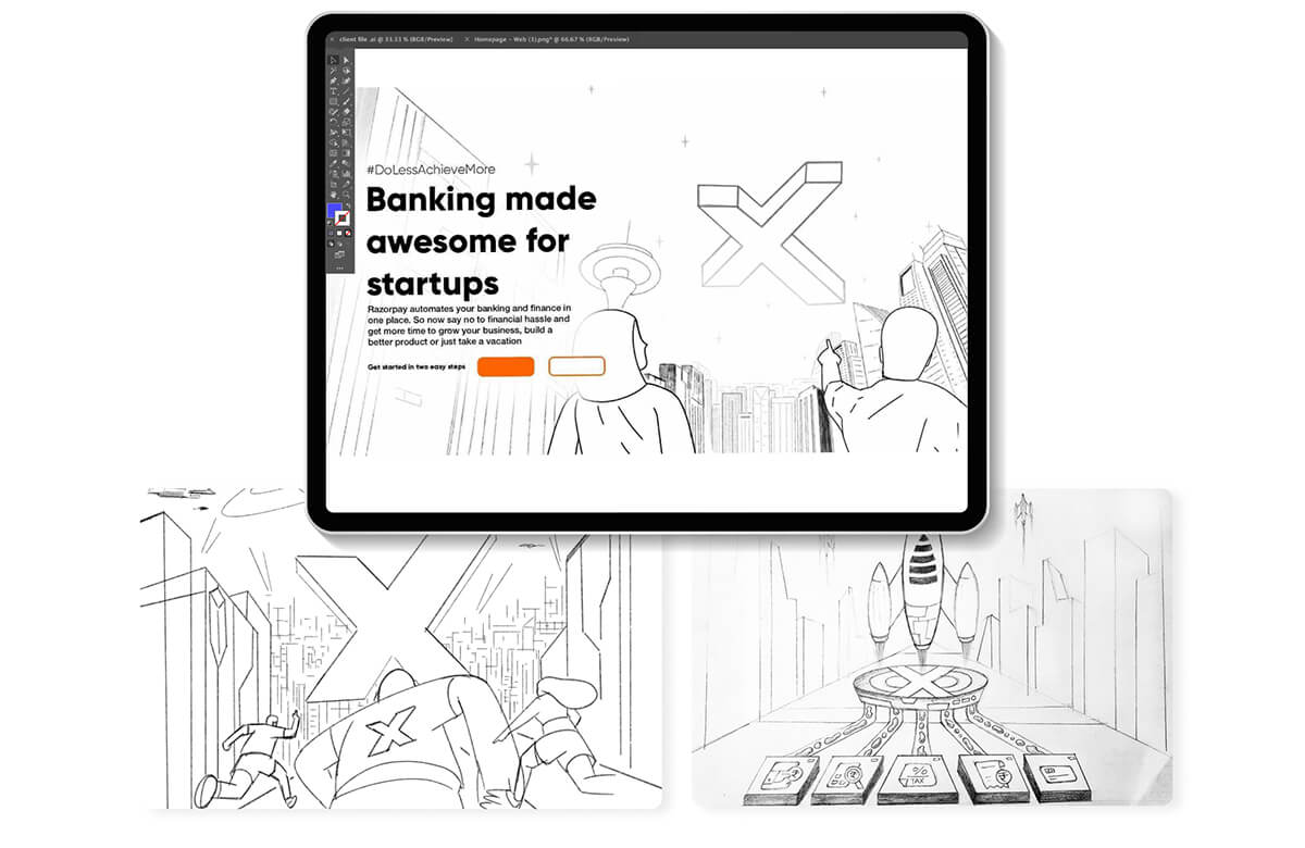
We thought of various sci-fi and tech-inspired elements for the illustrations. Our team along with team Razorpay initially ideated the concept of rocket launch which symbolised RazorpayX with five icons that depicted their financial solutions.
A modern blend of isometric icons which had human elements was selected. These icons had gradients which granted them a 3D effect. They leave a lasting visual impact on users without increasing any cognitive load. We tested out two variations of style and colour, one had a vibe of space and fantasy, the other was more realistic and then finalized one as per what actually suited the brand of Razorpay.
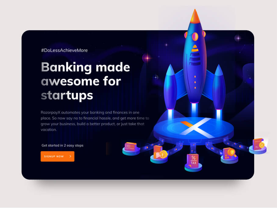
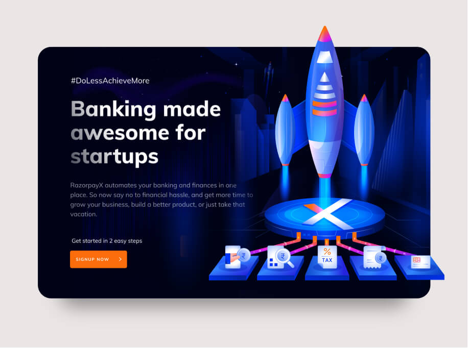
However, after some brainstorming, we realized that it can look too direct and storytelling can be further enhanced. So, we finally selected the thought of a space shuttle which is arriving from a distance. A dramatic scene with humans looking curiously at the arrival of the space shuttle which would appear in the shape of X.
Users might not always know what they need from Razorpay to streamline their lives. That’s why they use available options. However, when they are presented with better financial solutions they would be happy to try them out. We essentially wanted to show this through our designs. We extrapolated this idea and showed that X shaped space shuttle has landed and various offerings of RazorpayX have off-loaded from that space shuttle. We maintained the use of space and tech theme colors but also added warmth with orange and pink. This palette helped in highlighting the relevant elements in the illustration.
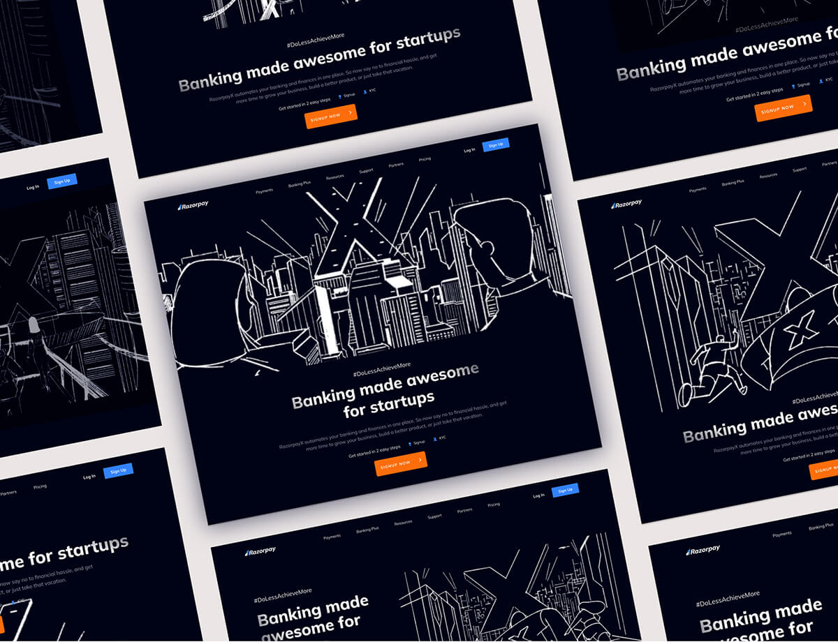
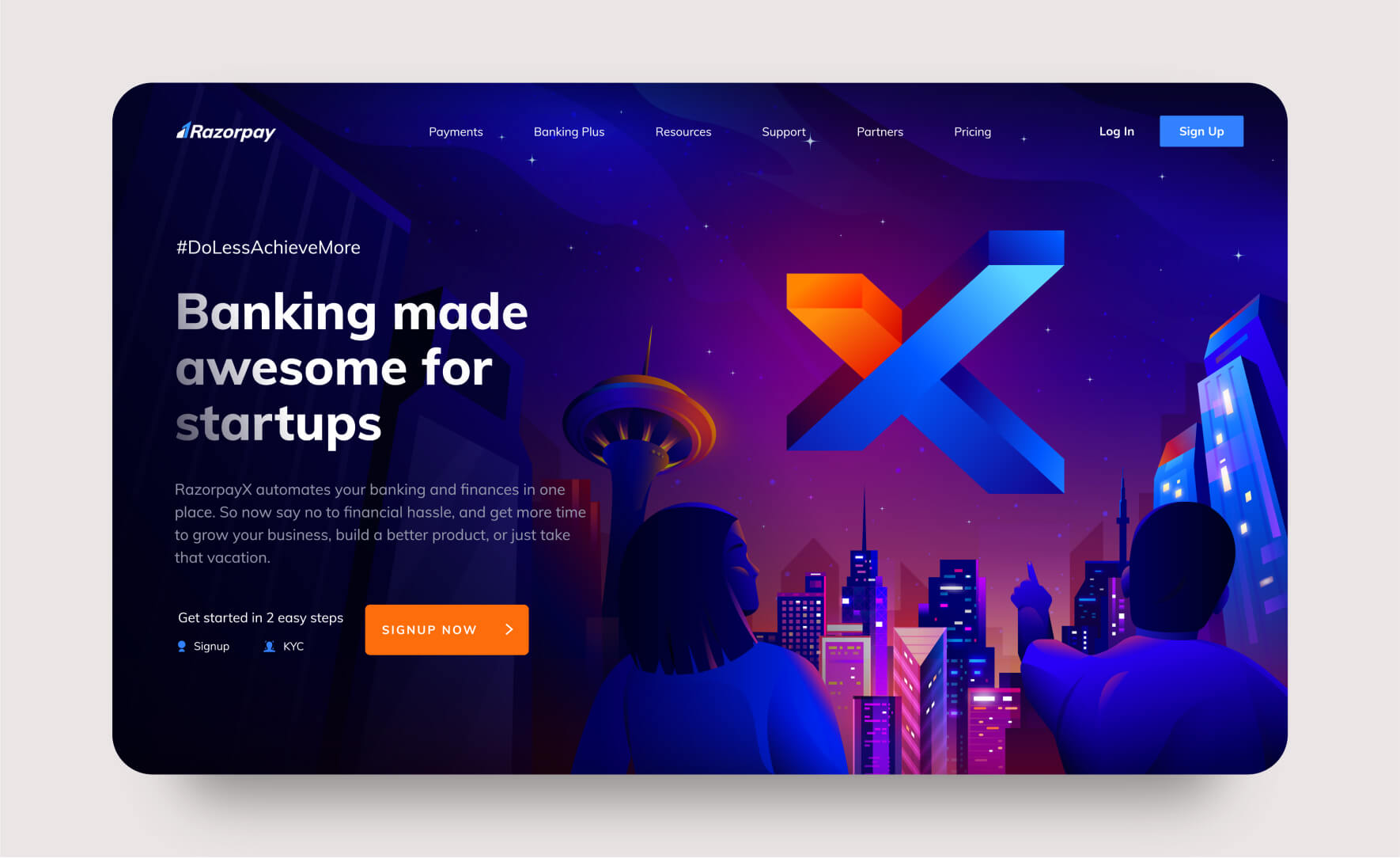
Our deliverables have led to an increase in engagement on RazorpayX’s platform and left an impact on the end users. Our technology/sci-fi-inspired yet contemporary illustrations and imagery not only met the expectations of the Razorpay team but also visually bolstered their new offerings. The storytelling done through illustrations impressed the team and strengthened our creative partnership with Razorpay.
Our Role
Our role was to redesign RazorpayX’s landing page with intuitive UI/UX, impactful illustration, and a visual language that drives engagement.
Product Design
Content
