Shaping a bold, sleek identity for Mokobara’s digital presence
Mokobara is an Indian direct-to-consumer luggage and travel accessories brand headquartered in Bengaluru, with a mission to bring thoughtful, stylish, and functional travel gear to modern travellers.
- Lifestyle
- Travel Luggage
- Brand Positioning
- Market Research and Competitive Analysis
- Web App/Website
Brucira partnered with Mokobara to refine and evolve their visual identity and digital presence. While the brand’s earlier visuals leaned loud and playful, the goal was to align the overall expression more closely with the thoughtful design and craftsmanship of their products.
Mokobara was looking to refresh its brand identity to better align with its target audience and strengthen its positioning as a premium player in the travel luggage space. Alongside a new website design, this meant evolving the brand’s visual language across imagery, layouts, and digital touchpoints to create a more cohesive and elevated presence.
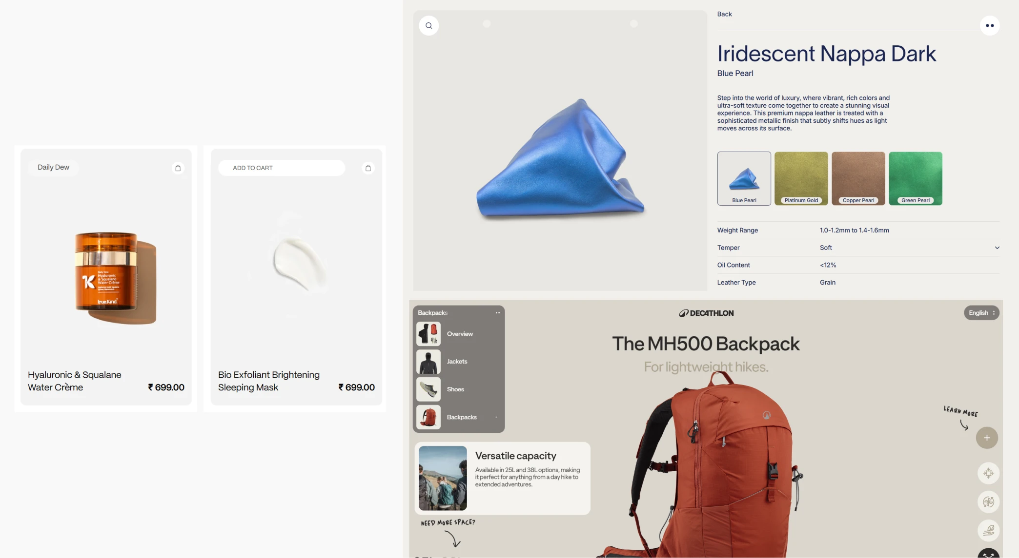
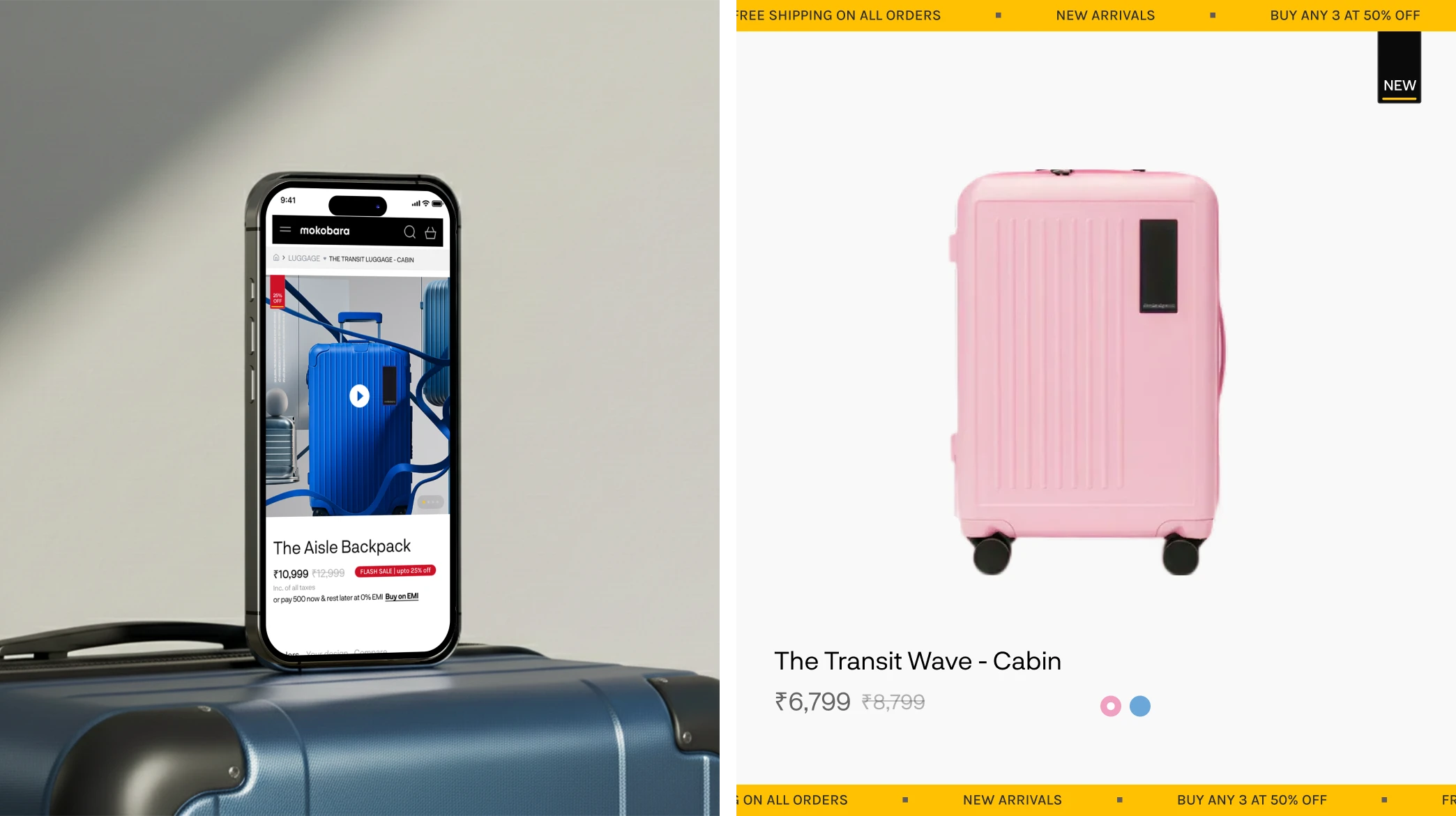
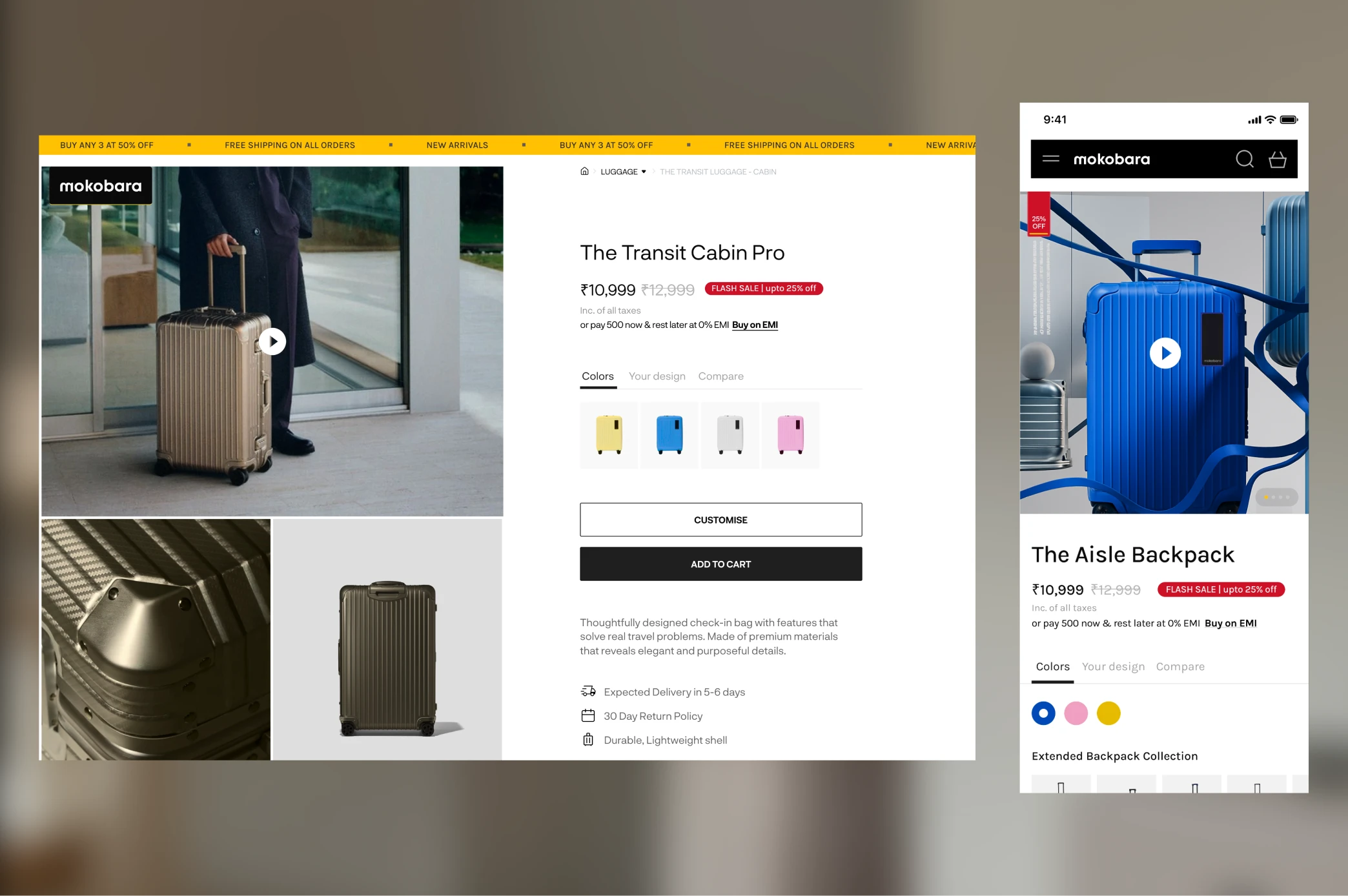
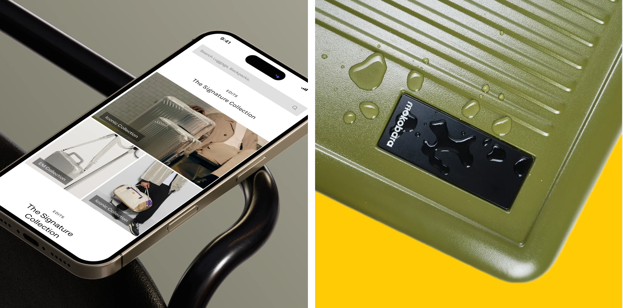
A key challenge was that a large portion of Mokobara’s customers were accessing the website on mobile devices, where discovering products and completing purchases felt less intuitive. This made it difficult for users to navigate the catalogue and move confidently towards a purchase, highlighting the need for a clearer, more streamlined mobile experience that could scale effectively to desktop.
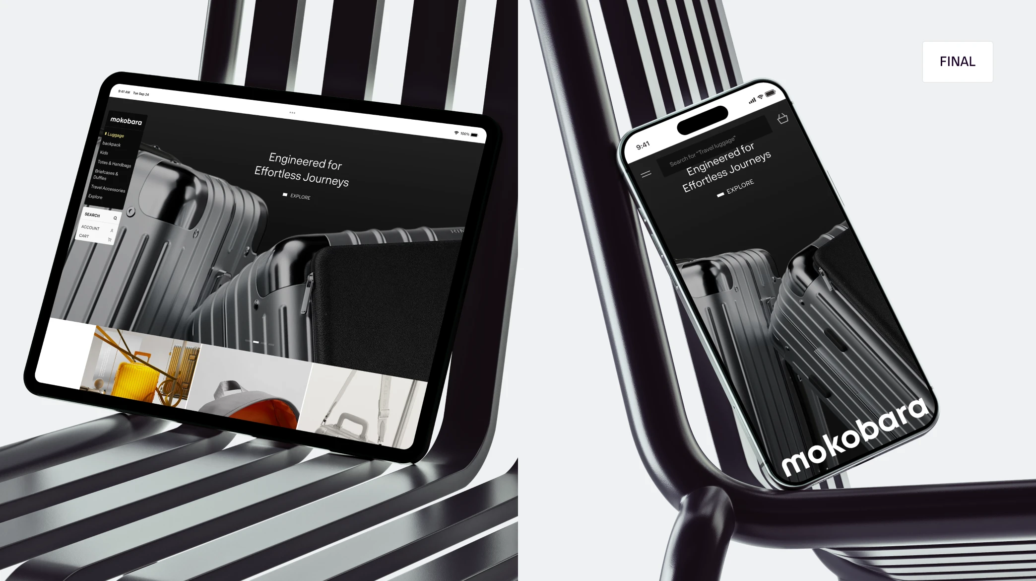
Brucira addressed these challenges by reimagining Mokobara’s brand identity alongside a mobile-first digital experience. The visual language was refined to feel bolder, more elegant, and more restrained, aligning the brand’s overall expression with the thoughtful design and craftsmanship of its products. Imagery, typography, and layouts were redesigned to create a cohesive and premium presence across touch points.
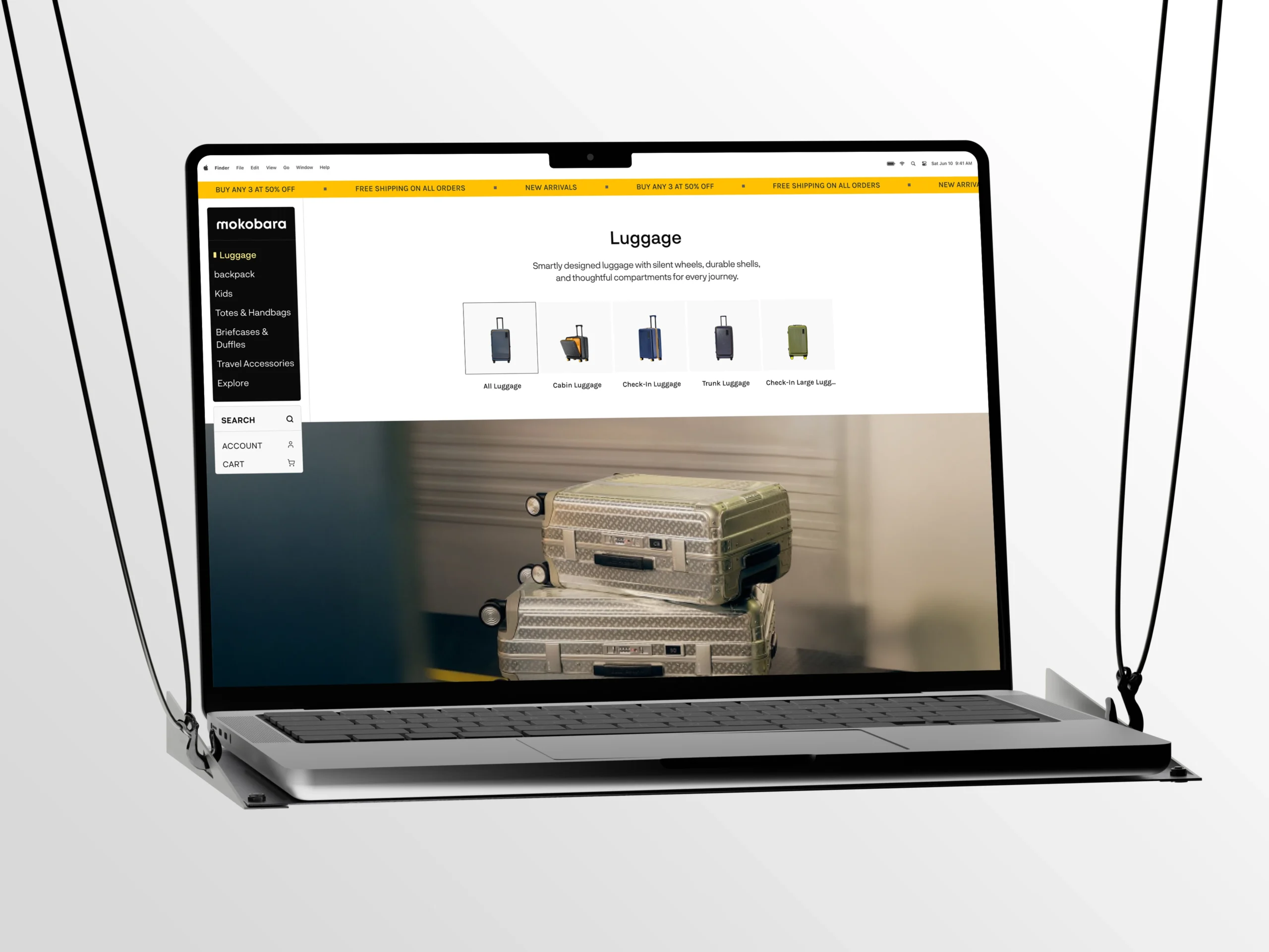
In parallel, the website was designed mobile-first, with a strong focus on simplifying navigation, clarifying product discovery, and streamlining the purchase journey for handheld devices. Once the mobile experience was established, it was translated into a fully responsive web experience, scaling seamlessly to larger screens while maintaining clarity, consistency, and visual impact.
Mokobara was exploring options for a new design partner and wanted to be confident about the direction before committing. Rather than pushing for an immediate onboarding, we focused on demonstrating value upfront. We prepared a tailored pitch that reimagined their website and app experience, grounded in their brand ethos, user needs, and business goals.
The team responded strongly to this approach and saw clear potential in taking the thinking forward into the final design. The clarity of our ideas and depth of execution aligned well with their vision, setting the foundation for a smooth onboarding and a collaborative partnership.
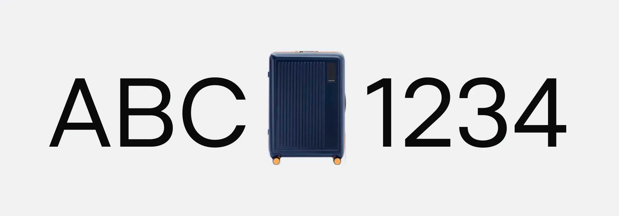
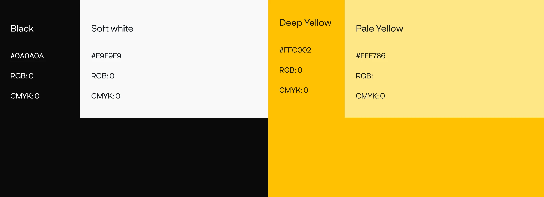
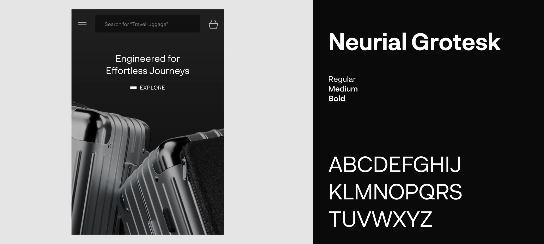
The moodboard was built around Mokobara’s core colour palette, with highly legible sans-serif typefaces bringing clarity and precision to the visual language. The use of a Grotesk typeface added a bold, contemporary edge, reflecting Mokobara’s design-first mindset while reinforcing its premium positioning.
To establish the visual direction, we began by iterating on the homepage and aligning closely with the Mokobara team. This involved a few rounds of exploration, with each iteration testing a different visual approach based on how the brand wanted to be positioned.
After couple iterations, we arrived at a polished, elegant direction where high-resolution imagery played a central role in expressing the brand. Clear visual guidelines were defined to ensure consistency across pages and touchpoints, helping the experience communicate a refined, premium perception that aligned with Mokobara’s vision for its customers.
The first variant was designed to appeal to a narrower audience, primarily older Gen Zs and younger millennials who resonated strongly with pop culture and contemporary fashion. However, as the homepage began to take shape, the Mokobara team revisited the direction internally and recognised the need to move beyond targeting a specific demographic.
Instead, the focus shifted towards establishing a distinct design philosophy for the brand and its products. This led to a sharper, more elegant visual direction, anchored in high-resolution imagery and refined layouts, giving the website a premium, timeless feel that could resonate across audiences.
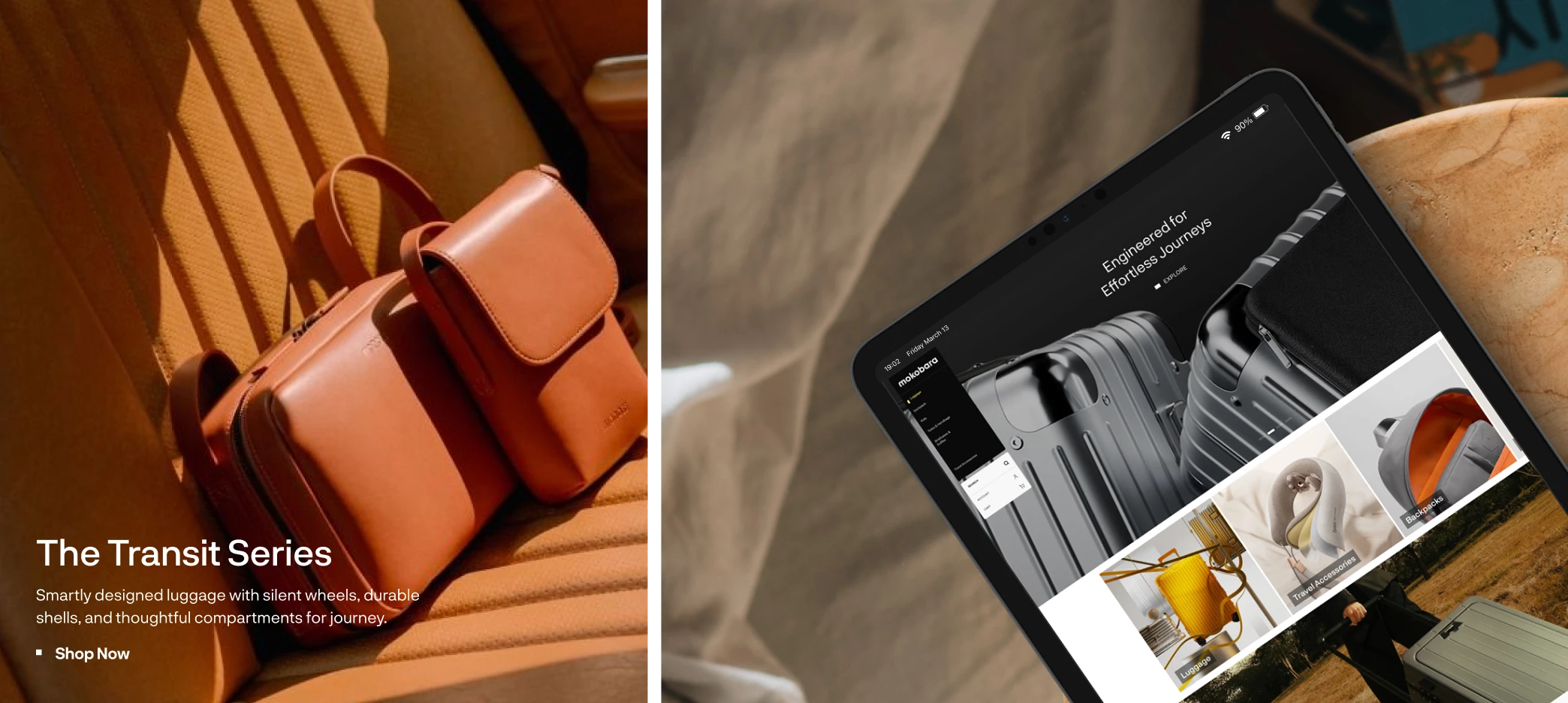
For Mokobara, we reimagined the digital experience from the ground up, leading with the mobile website redesign. Our work focused on shaping a cohesive visual language across typography and motion, supported by a photography direction that added warmth and authenticity to the brand’s digital presence.
Our role extended beyond web and app design. To ensure visual consistency across all touchpoints, Brucira guided Mokobara through a dedicated brand photoshoot. We created a comprehensive photography playbook, outlining composition principles, lighting guidelines, shot types, and technical specifications. This enabled the Mokobara team to produce high-quality, on-brand imagery that seamlessly integrated into the digital experience.
By aligning the visual identity with a mobile-first digital experience, Mokobara’s premium positioning was reinforced while users benefited from simplified navigation, clearer product presentation, and smoother purchase journeys across devices.
Our Role
Our role spanned refining mokobara’s visual identity and shaping a mobile-first digital experience, translating the brand’s design-led philosophy into a cohesive, premium online presence.
Product Design
Content
