Pitching Florzy’s farm-born authenticity into a premium digital narrative.
Florzy is a pioneering flooring platform, transforming how homeowners in India select and purchase flooring materials.
- Marble & Floor Tiles
- Brand Positioning
Florzy is an Indian flooring brand offering premium marble and tiles, bridging the gap between offline showroom experience and online discovery.
Florzy’s core challenge was bridging two worlds. While customers increasingly discover and explore flooring options online, the final purchase decision almost always happens offline in a showroom, touching the material, seeing it in light. The brand needed to hold its own in both spaces, feeling equally premium, trustworthy, and cohesive whether a customer encountered it on a screen or walked into a store.
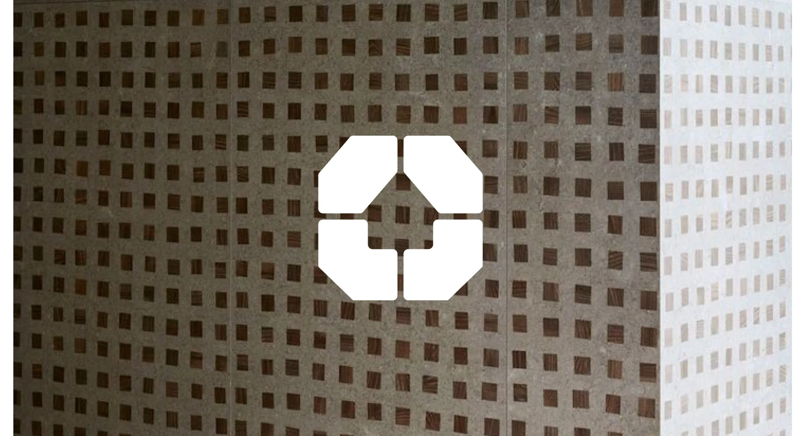
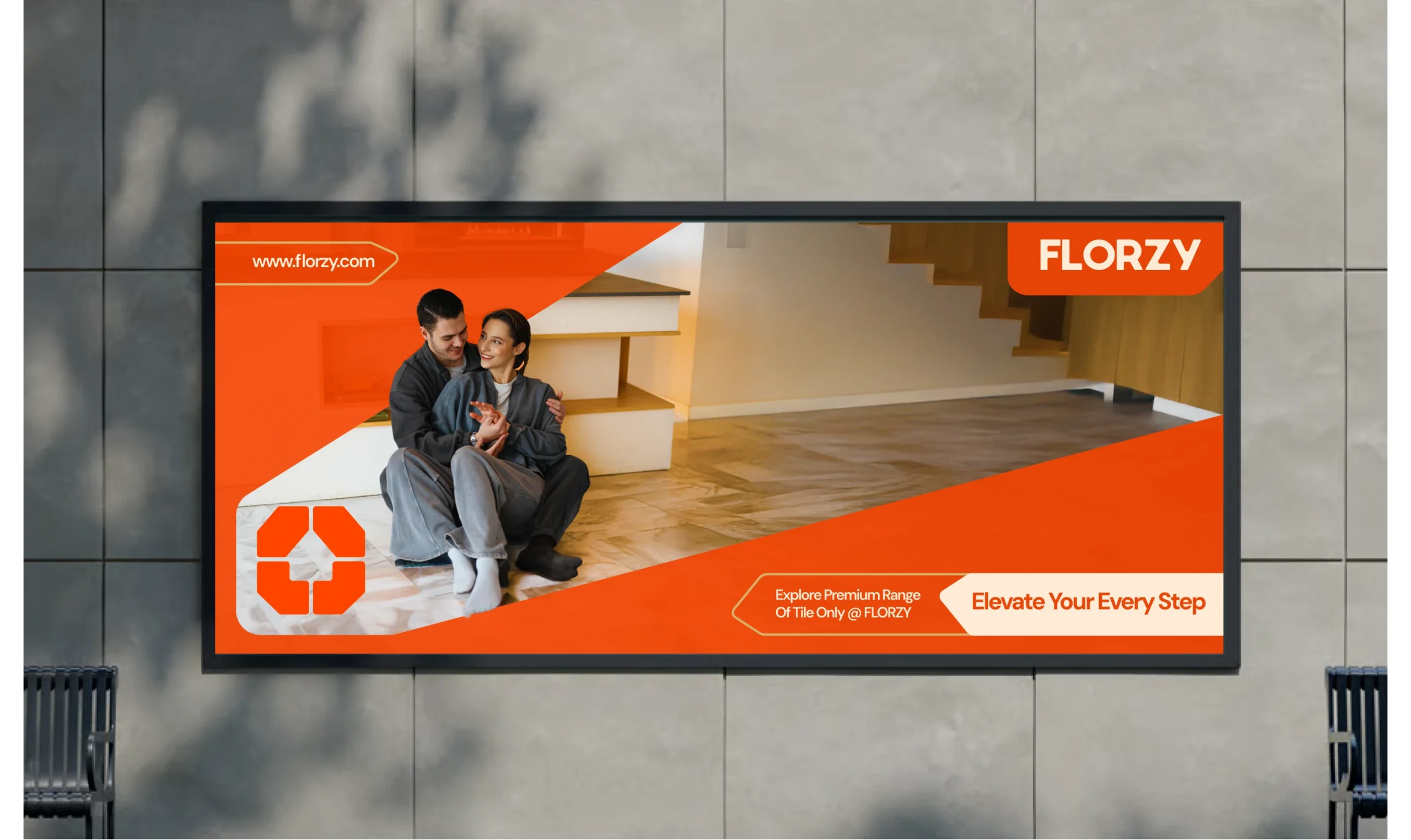
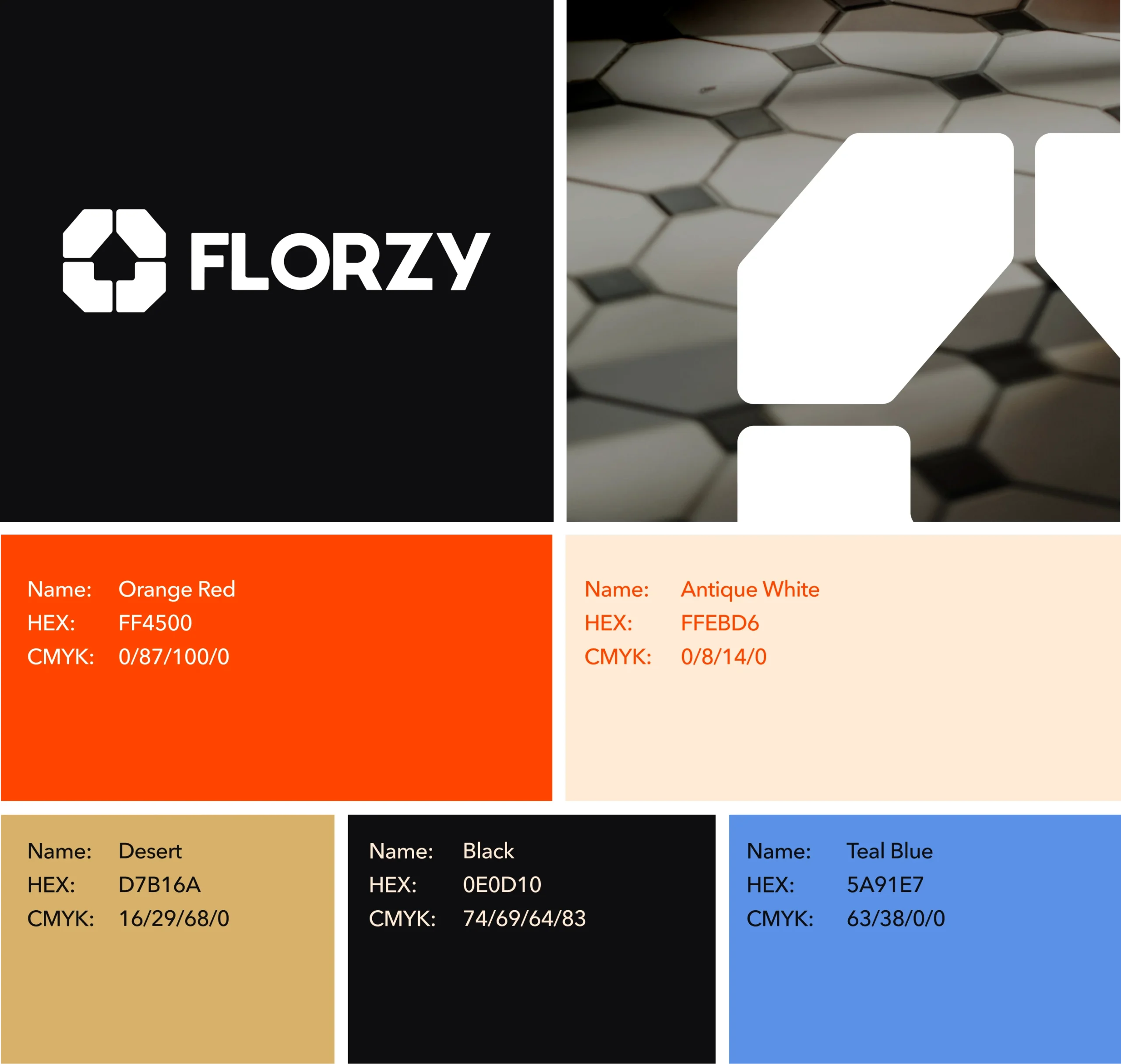
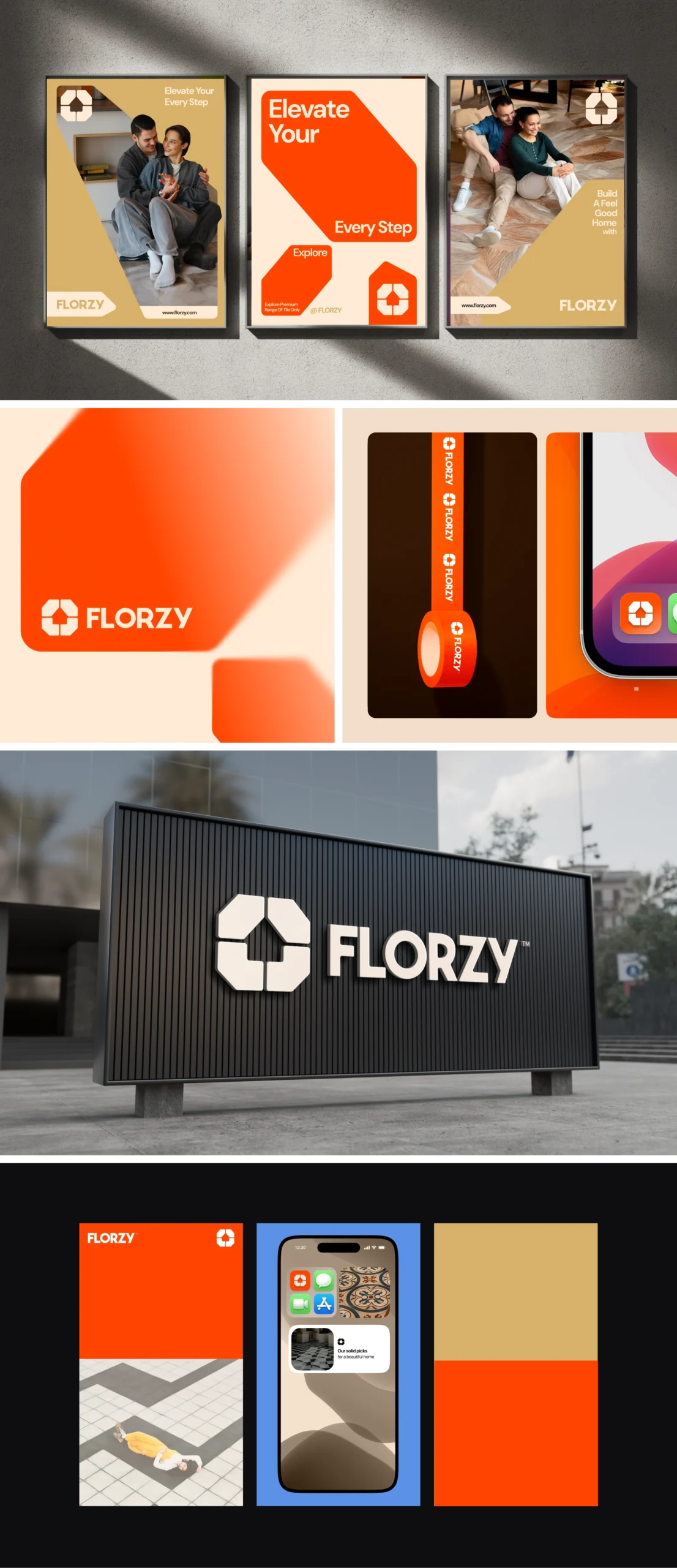
We built a visual identity rooted in meaning. The logomark combines a geometric tile interlocking pattern with a home shape at its centre, symbolising that every floor is the foundation of a beautiful home. The colour palette leads with Orange Red, bold and energetic, balanced with Antique White, Desert Gold, and Deep Black for warmth and premium feel. The identity was extended across billboards, app icon, merchandise, and showroom signage, ensuring Florzy shows up consistently whether online or in-store.
At this stage, we explored visual cues that captured the precision and permanence of premium flooring. Structured geometry, clean metallic surfaces, and sharp architectural lines became the foundation of the mood. These elements reflected the strength and craftsmanship embedded in every tile, setting the tone for a brand that feels built to last.
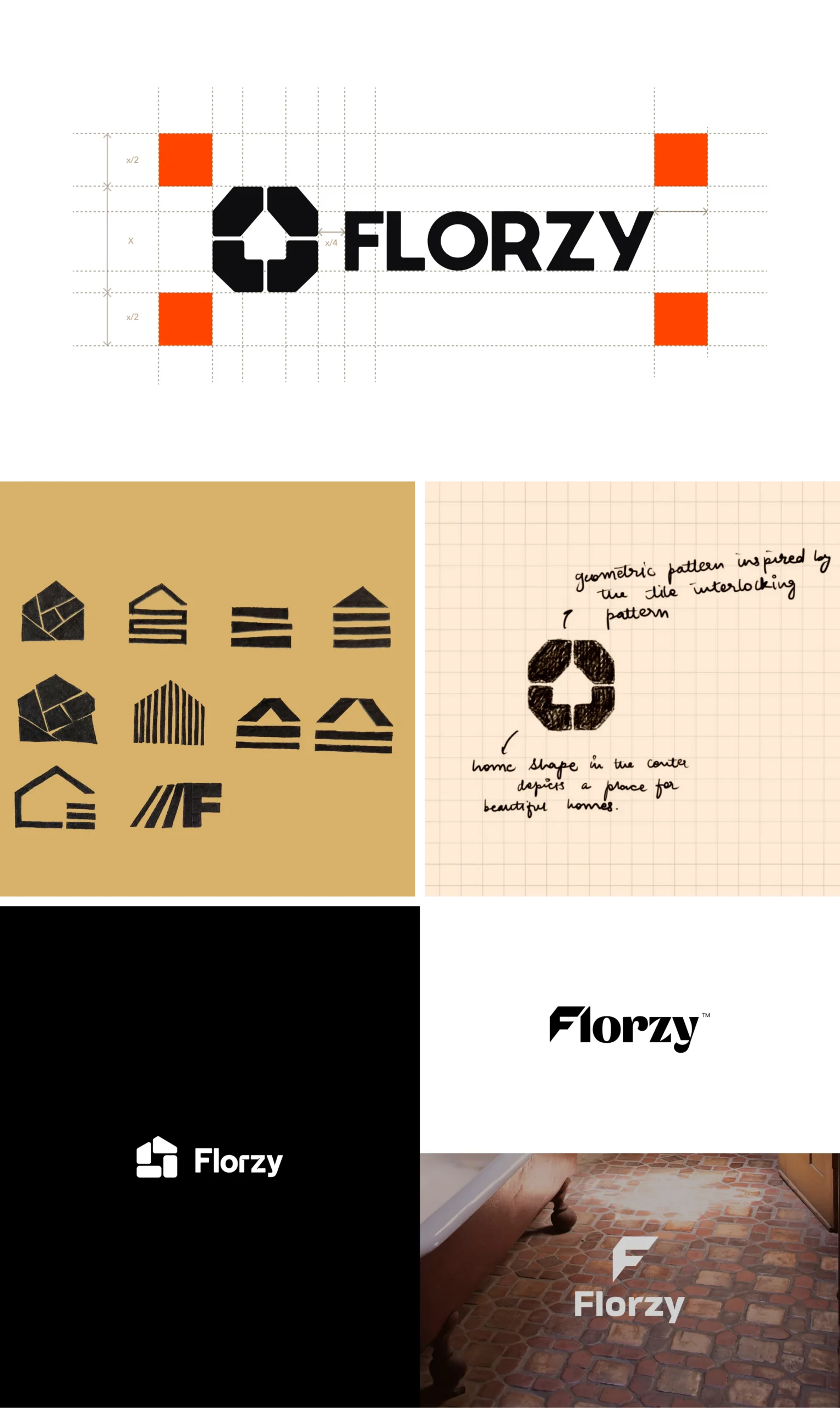
Every great mark begins with a question. For Florzy, that question was simple: what does a floor mean to the people who live on it?
We began with pencil and paper, sketching freely across ideas rooted in the world of flooring. Early explorations played with house forms, tile geometries, and interlocking patterns, each concept probing a different facet of the brand’s identity. Some directions leaned architectural, others felt more abstract, but all shared a common thread: the desire to create a symbol that felt both purposeful and ownable.
The breakthrough came when two ideas converged. The geometric interlocking pattern of a tile, and the shape of a home at its centre. Together, they told Florzy’s complete story in a single mark: a brand rooted in craft, built for beautiful homes.
Drawing from this inspiration, we translated the story into real, tangible banners that extend seamlessly across multiple touchpoints. Each design carries the raw textures, organic forms, and honest simplicity of the concept – ensuring the brand’s essence is consistently felt in every space it lives in.
Our Role
We partnered with Florzy to craft a premium brand identity that blends the raw, material beauty of marble and stone with contemporary confidence, transforming a flooring destination into a modern, aspirational experience for the Indian homeowner.
Content