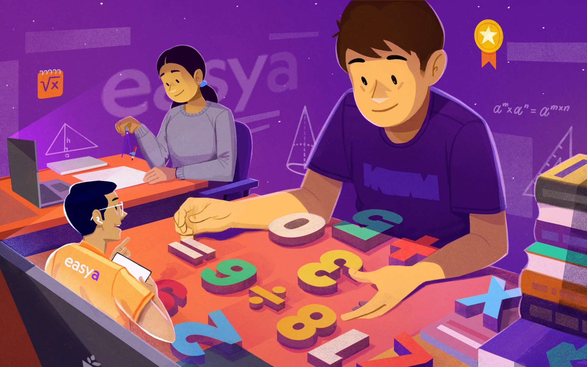
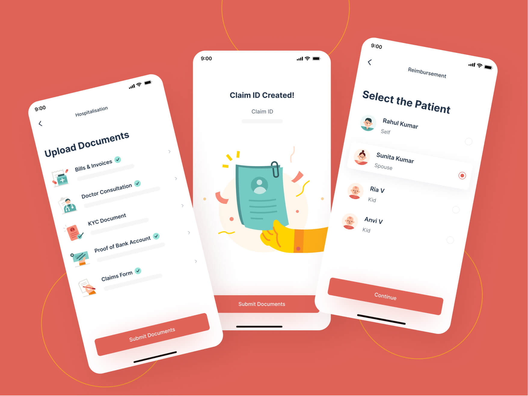
Helping Students Ace Their Exams with EasyA
EasyA offers a unique, modern, and easy approach to mathematical learning
EasyA is a London-based company. Offering on-demand 1:1 math tutoring to students, EasyA ensures that students get the required help they need to ace their exams. Students are able to connect with their tutors by merely snapping a photo of their maths question. They are then matched to a tutor who can help them. EasyA is founded by two Oxbridge and Ivy League university graduates who used to be former tutors themselves. EasyA is built on the idea that the sooner students get help, the better they learn.
Services
we provide
Website design
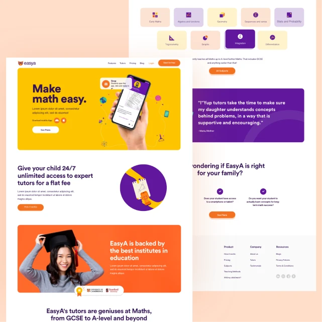
Crafted a user-friendly interface that allows visitors to navigate easily and accomplish their tasks without confusion or frustration.
App design
Designed a visually appealing and engaging to capture users' attention. Design simplified and streamlined user workflows, enabling users to achieve their goals quickly.
Iconography and illustrations
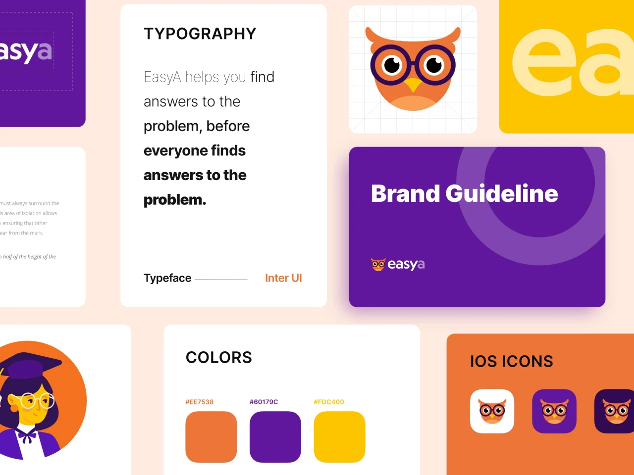
Utilized unique and engaging iconography and illustrations to make the app lively, inviting, and user-friendly, reinforcing the overall brand identity.
Logo branding
Designed a logo that represent the brand's identity and convey its unique personality, values, and positioning. We kept it distinctive and easily recognizable.
The
Challenges
Brucira began working on designing an attractive app for EasyA by accurately understanding the product itself and the reasons behind it. Researching the pain points faced by users when interacting with a tutor-student app was crucial for the success of the app .
We ensured that we appropriately understood the app-specific flows and interactions to present the relevant information on the app-screens. Designing the app to be student-friendly i.e., directed towards children and young adults. Creating an interactive, interesting app that would stand out among competitors. Ensuring it was responsive across all mobile devices. Communicating EasyA’s brand identity and ideals through the design.
Delivering world-class tutoring with redefined user experience for the app
The goal was to bridge the gap between students and quality tutoring by creating a user-centric app. We envisioned Easy A to make high-level education accessible and enjoyable.
We started by developing an MVP to pinpoint key features for quick, valuable learning experiences. Then, we enhanced the visual identity with engaging typography and a clean interface that uses friendly colors. This strategic design facilitated the creation of an intuitive and engaging app that truly supports students.

The
Approach
Brucira began by understanding the functionality needed for a virtual learning technology app. After collating all the information, we designed it into a process that was then represented in the app’s wireframes. These wireframes served as the perfect guidelines to build app-specific flows and interactions.
Brucira then used these wireframes to build an MVP (Minimum Viable Product) that helped us inch closer to the core purpose of the product: student users completing a lesson or solving a question with a tutor.
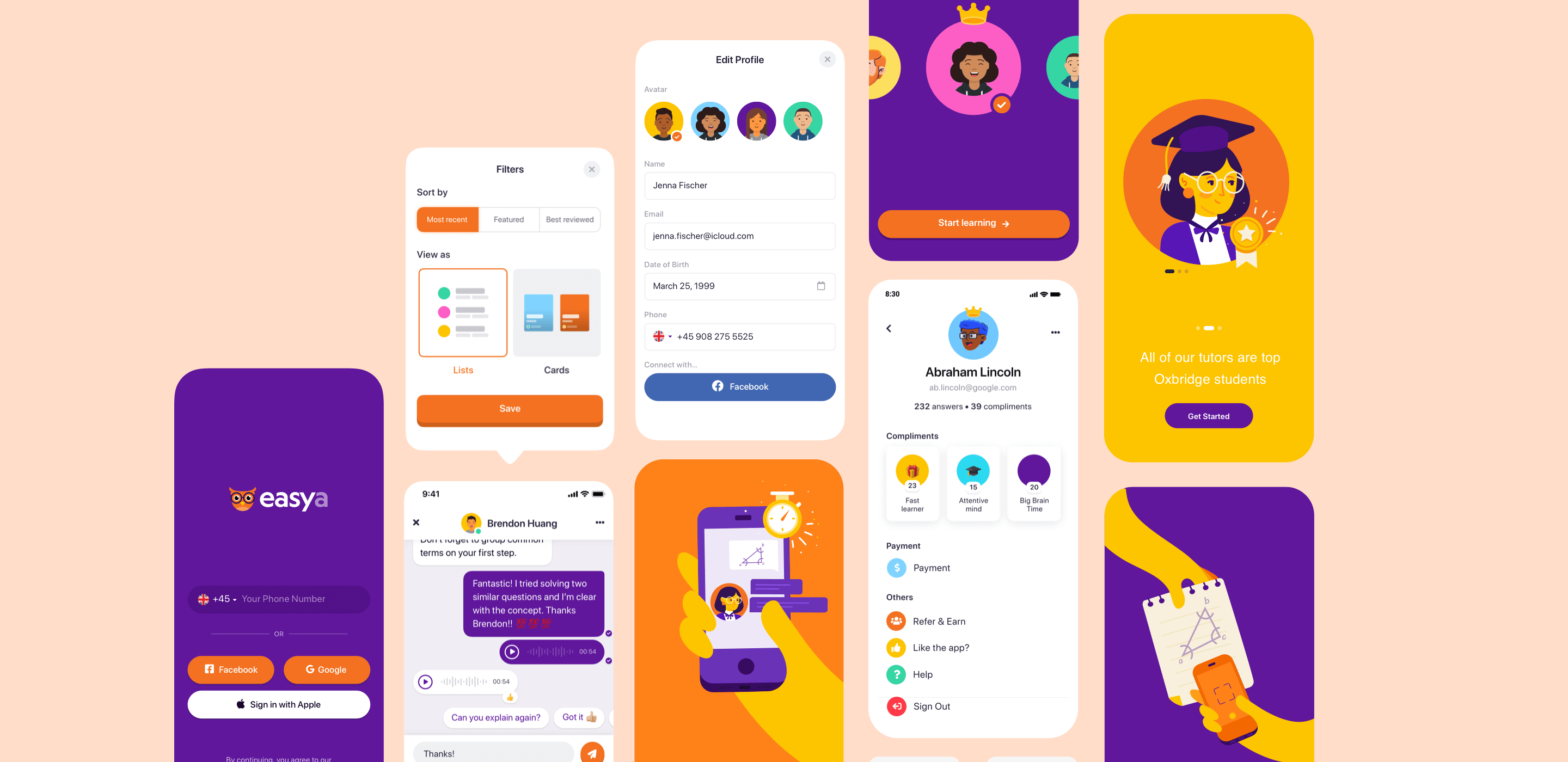
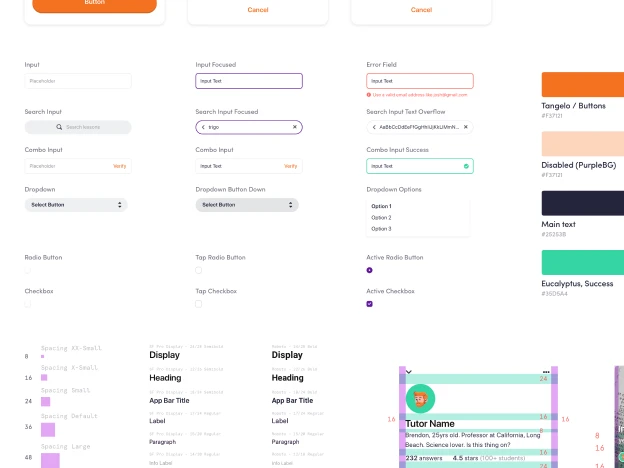
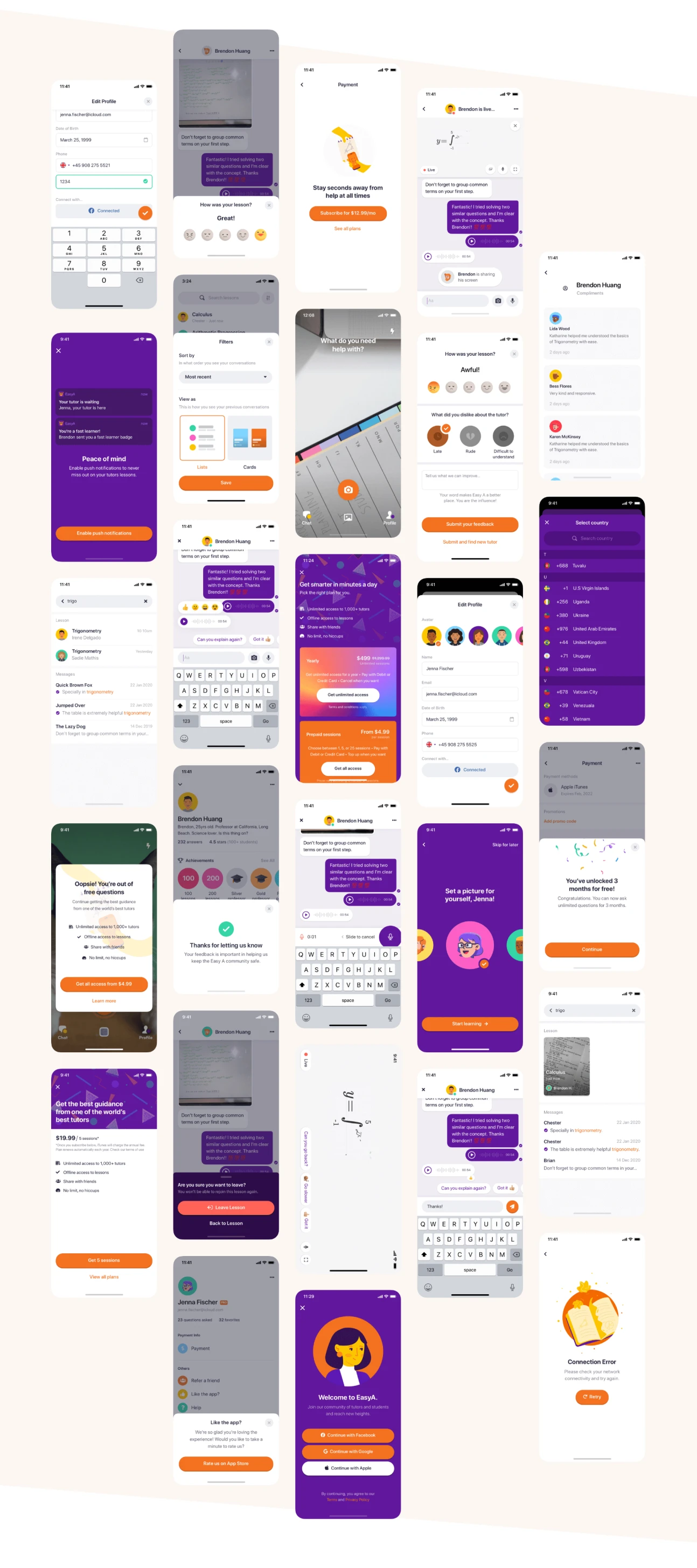
In order to make the app vibrant and attractive for students, we chose the app's primary colours to be bright and bold —Dark VioletandVivid Orange. Neutral colours like Black and White were used for in-app text conversations and text backgrounds. The cohesive effect of the colours used paired well with the modern, energetic appeal of EasyA’s visual identity.
Created seamless interactions to streamline interface and added unique functionality to set it apart from competitors
Our focus was to optimize key app sections. We designed a user-friendly home screen, allowing students to quickly ask questions. The tutor profile page established trust, while the search and activity tab enhanced subject exploration. Subject recaps provided helpful summaries, reactions facilitated instant feedback, and the built-in whiteboard feature brought the classroom to students' devices. Additionally, the feedback system ensured continuous improvement to make the app truly responsive to users' needs.
Best
Experience
We crafted an app that seamlessly connects students with world-class tutors for personalized and effective learning, utilizing intuitive features, and responsive design.
The
Impact
The EasyA app was appreciated by the client, particularly due to the care taken to ensure workflows and processes were interesting to students. The app was functional without compromising on a modern, attractive touch. This harmony created an app that was lauded by the students for its visual and functional appeal.
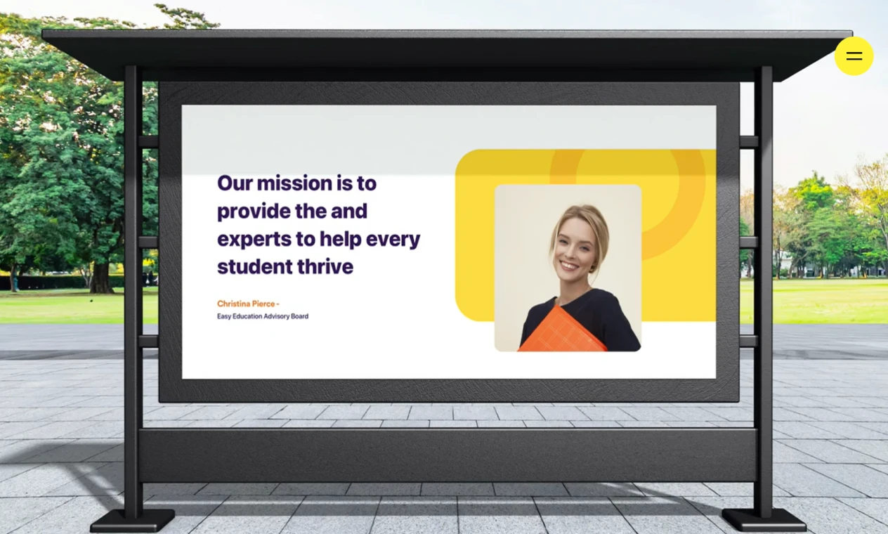
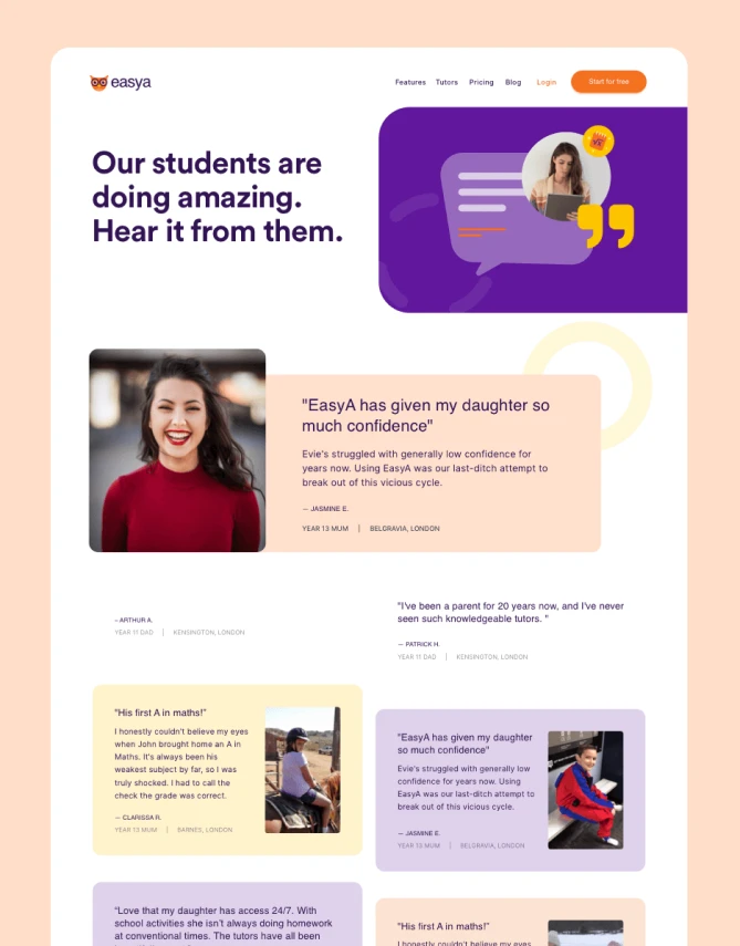
Instead of creating something generic for students and tutors, Brucira developed an interactive experience using photos that helps students feel more comfortable and the tutors, more approachable. This allows the students to seek the necessary help for their maths doubts without any hesitation.
Important
Links
Project featured in the article - The Best App Background Designs by DesignRush. The goal was to redesign their logo to match their bold and modern brand identity.
Brucira's team made our entire platform so exciting. The finesse executed by these professionals in the available time was something that surprised our entire team - including professors and students. Every illustration, every workflow was carefully looked into and beautified by this team. Looking forward for a chance to interact with them again, pretty soon!


