Crafting a modern digital sales experience for DHL

DHL is the world’s leading logistics provider, specializing in international shipping, courier services, and transportation.
- Logistics
- Illustration and Iconography
- Prototyping & Iterative Testing
- UI/UX Design
- Web development
To better position itself as a leader in the highly competitive market, the company came to Brucira for consulting and to rethink its brand, including new visual directions.
Print is expensive. DHL was spending absurd amounts of money on marketing and sales printed material. While static PDF files have been the norm when it comes to sales material, they were looking for a scalable way to not only remove inefficiency in the printing and distribution process but also manage brand style guide and positioning.
The new visual style had to reflect both the service and the brand: energy, simplicity, friendly, and humanity. It had to work equally well for a utility service used by millions and a company worth billions. Plus it had to be friendly to see and touch.
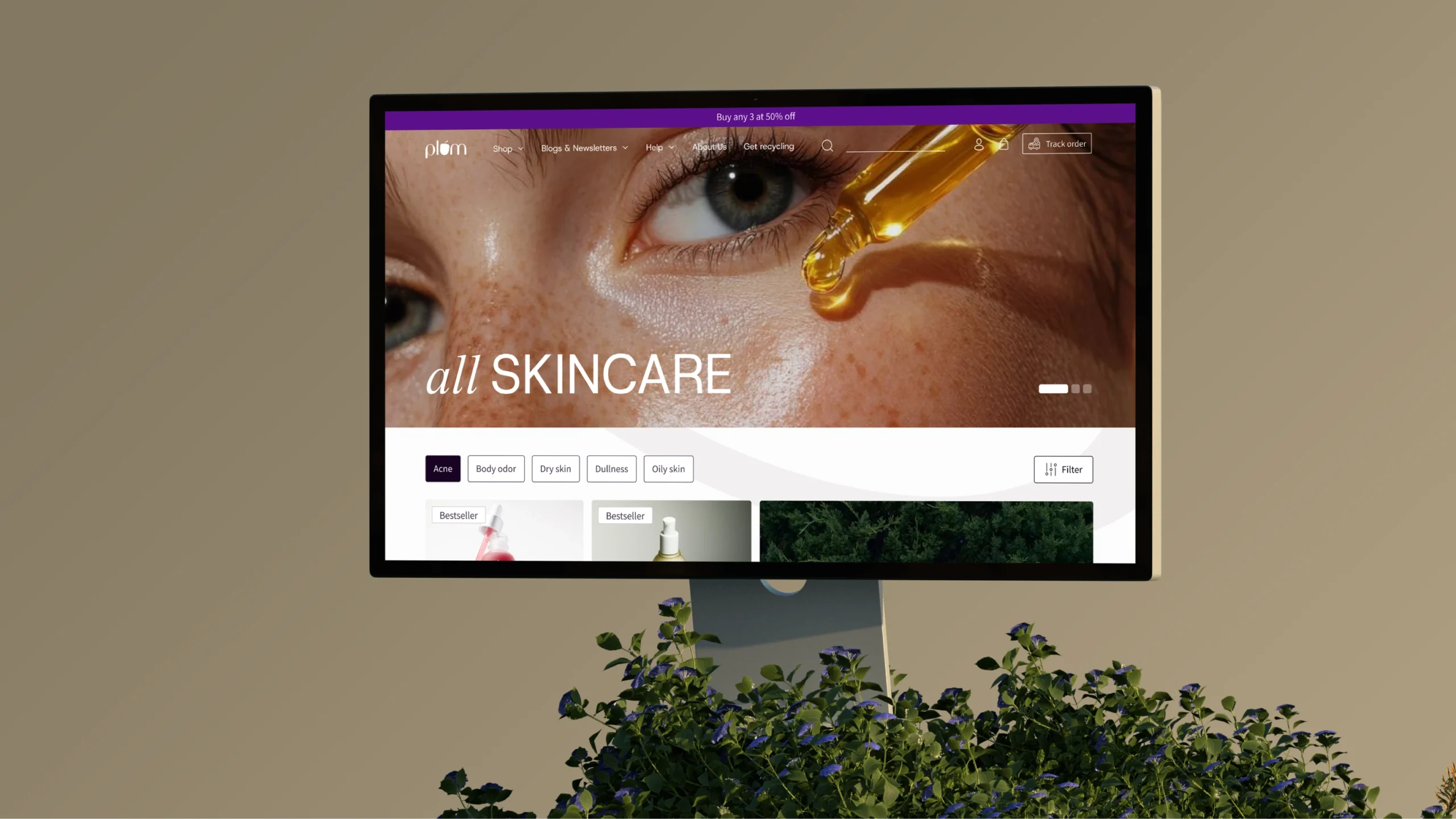
Because it involves so many elements, a website is often the clearest distillation of a brand. For DHL’s new website, we created several different photographs and illustrated directions with delightful animations for the in-house team to work with.
With a brand new responsive website, we decided to introduce the use of iPads in the chain of DHL’s employee training. This would decrease the cost of print packaging and eliminate physical damage and deterioration of the brand’s image.


The new illustrations are designed to be bold and energetic, while also maintaining a playful and human touch. This blend ensures they are visually striking, engaging, and relatable, enhancing brand communication effectively.

Our composition system is designed for simplicity and flexibility, defined by a grid that adapts easily across applications.
The typography, inspired by global transportation systems, is highly readable, recognizable, and impactful. It ensures consistency while remaining effortless to apply, making it both distinctive and practical for a variety of uses.
Our composition system is elegant in its sheer simplicity of use. By defining the grid, the system stays flexible and beyond easy to apply.
Our typography is as unique and easy to use as we are. Inspired by the world’s best used transportation examples, it was designed to maximize its impact across all applications while keeping it easy to read, ownable, and highly recognizable.
The Sales team was satisfied with the abundance of information in a single place. Frustration due to handling of various documents and piles of paper was gone. Sales collateral saw a growth of 55%.
Our Role
We designed a seamless user interface and experience, developed the website and mobile web, crafted illustrations, and implemented engaging interaction design.
Product Design
Development
Content


