Groww-ing users with illustrations

Founded in 2016, Groww is a new-age investment platform enabling millennials to invest in direct mutual funds at 0% commission, trusted by over 8 million users and backed by top investors like Sequoia Capital and Ribbit Capital.
- Fintech
- Brand Positioning
- Illustration and Iconography
Brucira partnered with Groww, one of India’s fastest-growing investment platforms, to create refined, sophisticated illustrations that simplify investing and reflect the brand’s vision of smart, accessible financial growth.
Since Groww’s target audience was Indian millennials, the illustrations they required for their website needed to reflect maturity and practicality without compromising on the visually enthralling elements that draw someone’s eye to an illustration. Groww’s team clearly communicated that the illustrations needed to be polished, refined, and sophisticated.
Brucira’s task was to design and develop illustrations that offered users a visually appealing look into the process of investments. As most of Groww’s target users were aged 35 and older, these illustrations had to stray away from Brucira’s usual ‘cute & beautiful’ style to fit a more mature audience.
Brucira crafted elegant and refined illustrations that elevated Groww’s digital presence. These visuals not only enhanced the website’s aesthetic appeal but also served as cohesive design anchors, guiding users through key sections and reinforcing the brand’s identity across its online experience.

We began by deeply understanding Groww’s service and audience — individuals seeking a smart yet simple way to invest in mutual funds. Since investing is often seen as complex, our goal was to visually convey clarity and confidence. Through research and sketching, we captured Groww’s unique value and translated it into relatable visuals with positive imagery, smooth and confident character forms, and a refined color palette. The use of bright yet cool hues added sophistication while complementing Groww’s brand identity, resulting in illustrations that felt modern, trustworthy, and approachable.
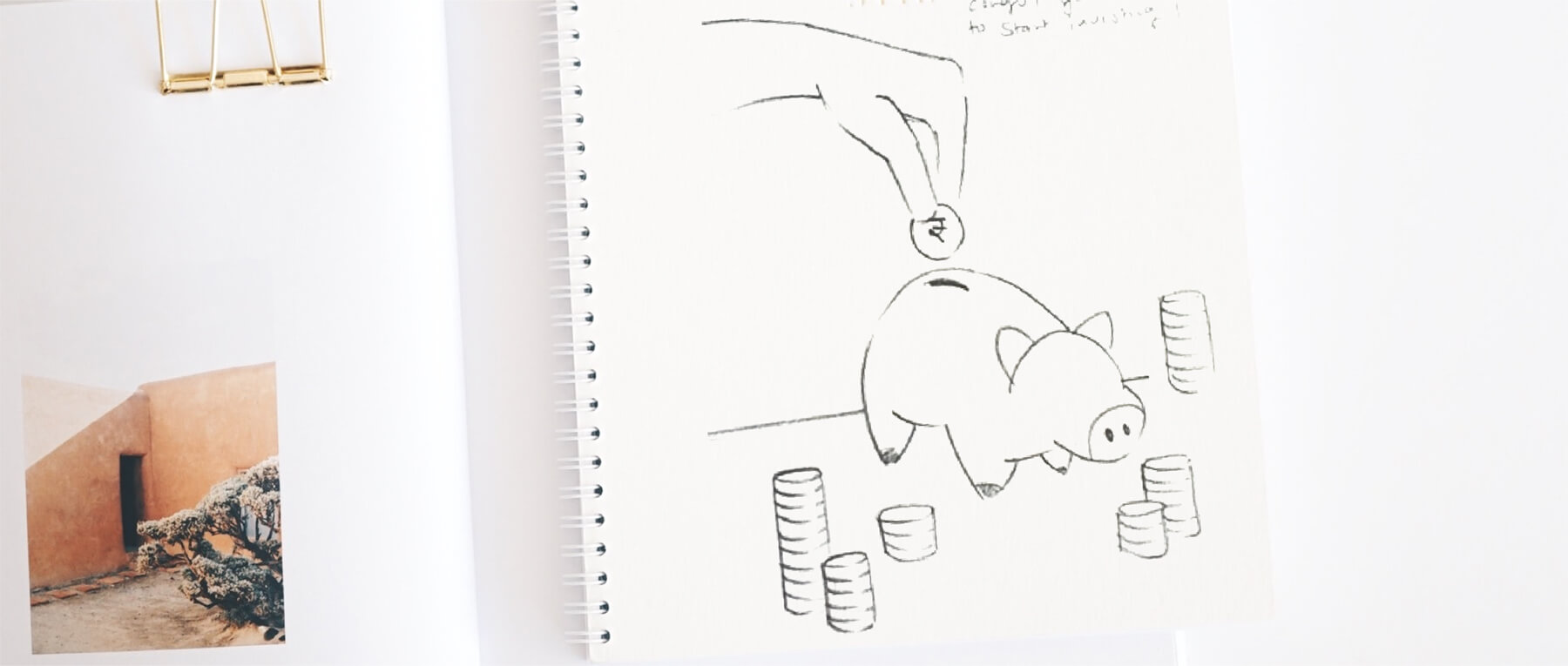
Our moodboard embraced a clean, modern aesthetic that reflected Groww’s vision of simplicity and confidence in investing. We explored cool, balanced color palettes, fluid character forms, and minimal yet expressive compositions to convey clarity and trust. The visual direction combined sophistication with approachability, creating a sense of ease and empowerment that aligned perfectly with Groww’s mission to make investing accessible to everyone.



At the core of Groww’s illustration design was the idea of making investing feel simple, confident, and empowering. The goal was to transform a traditionally complex financial process into an experience that feels approachable and intuitive. Through thoughtful illustration and design, we aimed to demystify investing, build user trust, and visually communicate Groww’s promise of smart, seamless financial growth.


We developed a clean, modern visual language that mirrored Groww’s vision of smart and effortless investing. Cool, balanced colors and smooth, confident illustrations conveyed professionalism and trust, while maintaining warmth and accessibility. Minimal layouts and cohesive design elements brought clarity and focus, resulting in a refined visual system that made the investing experience feel simple, intuitive, and empowering.

Brucira designed sophisticated yet appealing illustrations that perfectly matched Groww’s needs. These illustrations offered a stunning visual overhaul to the brand and was exactly what everyone at Groww had envisioned. Brucira’s work was so well-received that these illustrations are still being used on Groww’s website & app as well!
Our Role
We partnered with Groww to craft a sophisticated visual identity through custom illustrations — blending clarity, maturity, and approachability to create a seamless digital experience that simplifies investing and builds user trust.
Content
